
ALL IMAGES (ordered according to main image index page)
|
Some plots showing seismic data used to probe the Earth's interior (return to image directory page)
|
||||
 |
 |
 |
 |
 |
| AI (736 Kb) JPG (225 Kb) | AI (488 Kb) JPG (157 Kb) | AI (488 Kb) JPG (157 Kb) | AI (542 Kb) JPG (283 Kb) | AI (337 Kb) JPG (280 Kb) |
|
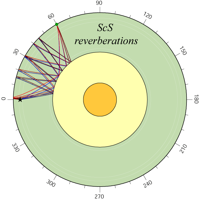
SH (blue) and SV (red) components of ScS and S or Sdiff are used to study seismic anisotropy in the deep mantle. If the data are abundant and clean, this permits interpretation of deep mantle convection currents. [PDF]
|
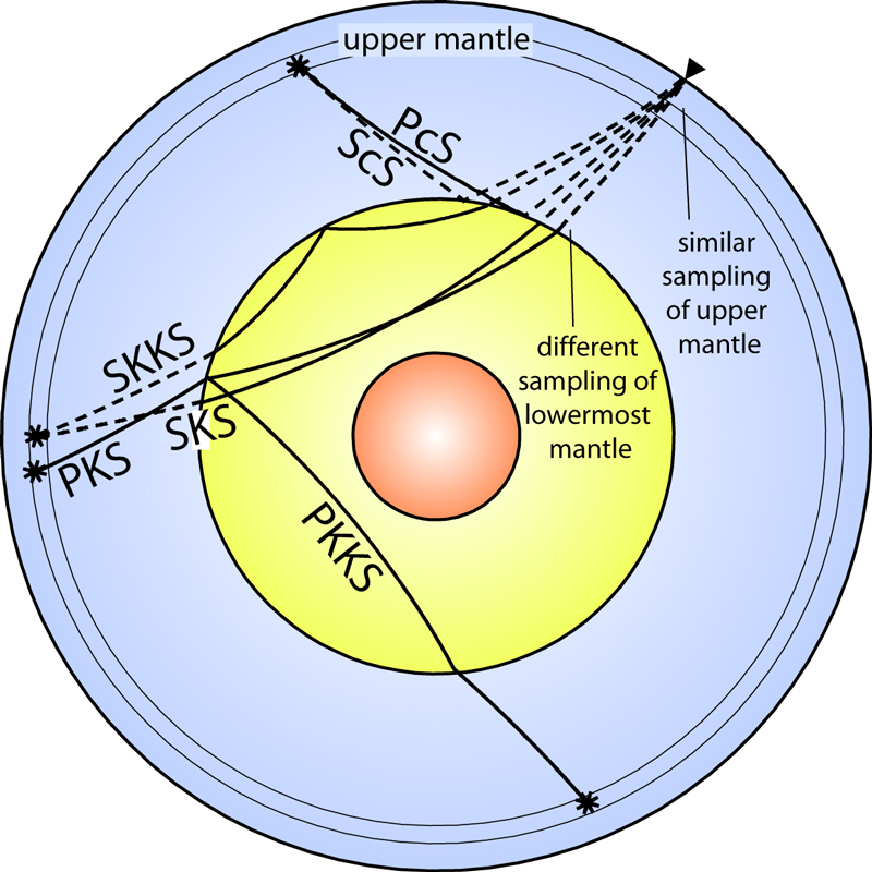
Differential analyses between ScS and S, as well as S(or Sdiff) and SKS, yield valuable information on deep mantle heterogeneity and anisotropy. These waves are used in forward and inverse modeling. [PDF]
|
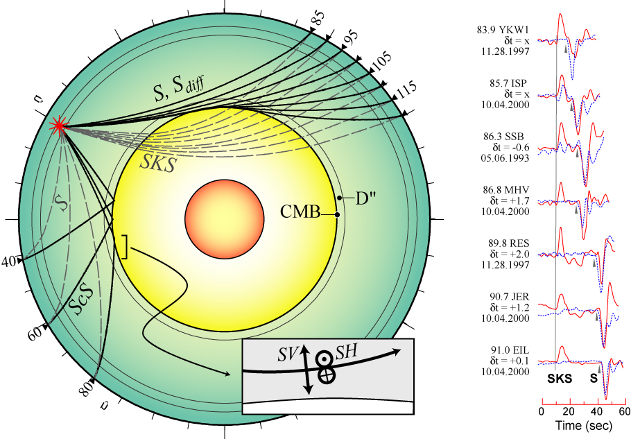
A variety of important seismic arrivals are present on the SV component of motion in the distance range from 90 to 130 degrees. Here they are compared to synthetic seismogram predictions on the left. [PDF]
|
||
|
Some plots showing seismic data used to probe the Earth's interior (return to image directory page)
|
||||
 |
 |
 |
 |
 |
| AI (414 Kb) JPG (214 Kb) | AI (647 Kb) JPG (148 Kb) | AI (674 Kb) JPG (419 Kb) | AI (2.4 Mb) JPG (218 Kb) | AI (748 Kb) JPG (333 Kb) |
|
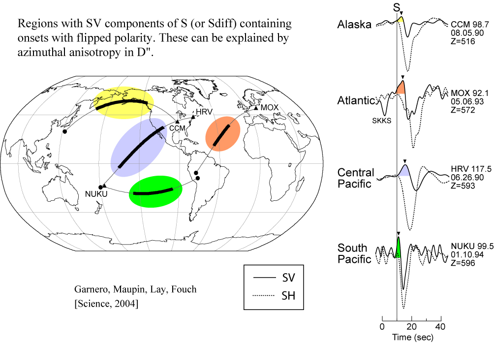
Azimuthal anisotropy in D" can give rise to coupling between the SH and SV components of the S wave. Here we present several regions that show such behavior. [PDF]
|
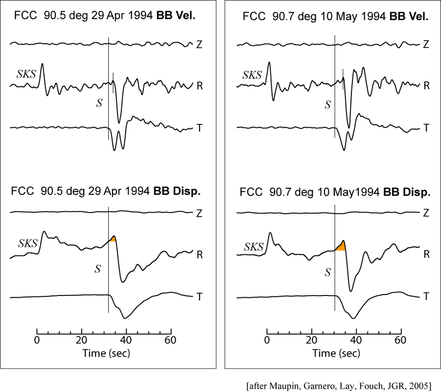
Station FCC of the Canadian network is shown, both in velocity (top panels) and displacement (bottom) panels. The SV precursory pulse is easily visible in the latter. [PDF]
|
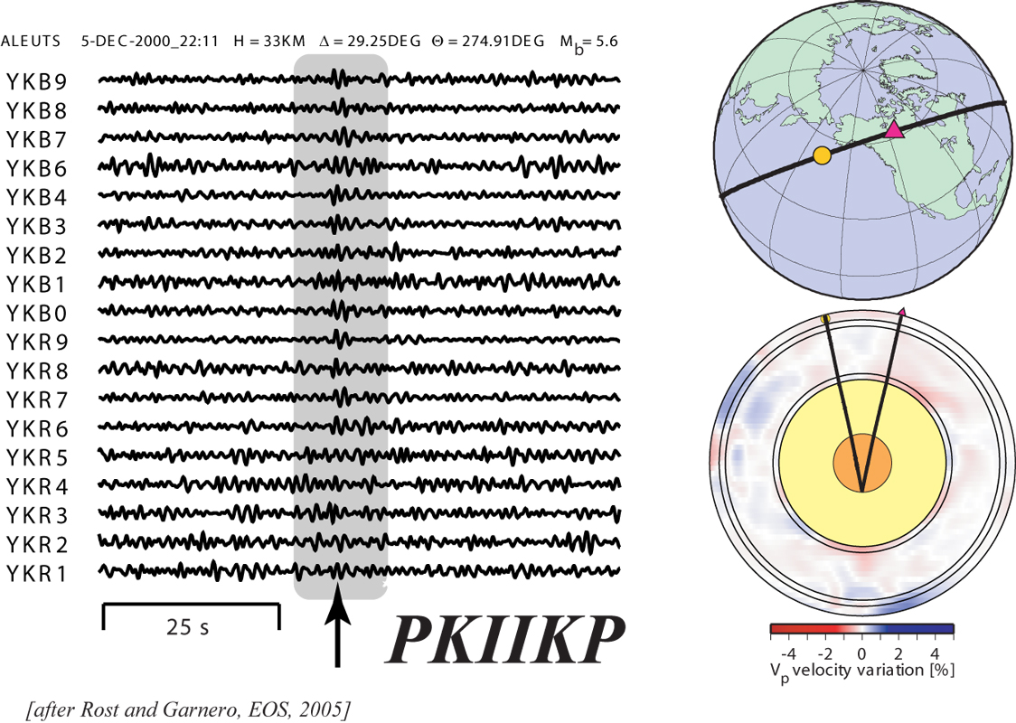
Array analyses of seismic data permit the sometimes observability of very faint seismic waves, like PKIIKP, which reflects from the inside of the inner core. [PDF]
|
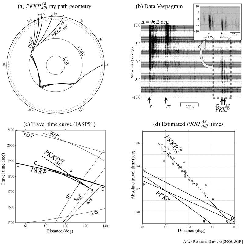
Again, using seismic arrays, a wave reflected from the underside of the CMB is seen as it diffracts at the CMB, called PKKPab_diff. This wave can be used to study ULVZ structure.
|
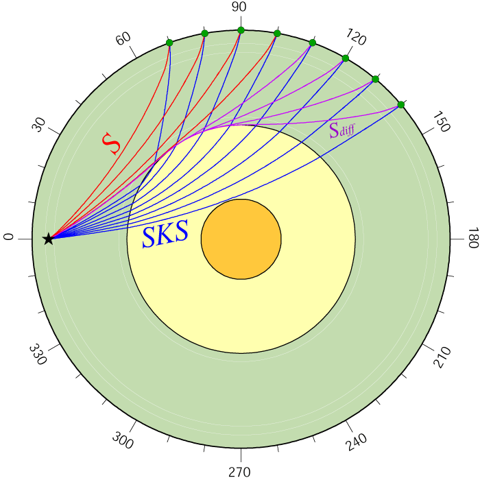
For decades, S waves referenced to SKS have been useful for mapping both deep mantle heterogeneity and anisotropy. Here, shear wave splitting is investigated. [PDF]
|
|
Some plots showing seismic data used to probe the Earth's interior (return to image directory page)
|
||||
 |
 |
 |
 |
 |
| AI (403 Kb) JPG (212 Kb) | AI (330 Kb) JPG (299 Kb) | AI (1.1 Mb) JPG (547 Kb) | AI (273 Kb) JPG (93 Kb) | AI (260 Kb) JPG (152 Kb) |
|
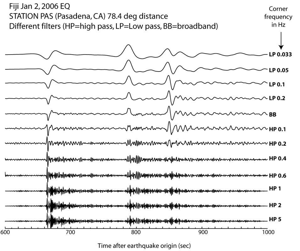
Here we see a vertical component seismogram from Pasadena CA of a deep Fiji earthquake filtered different ways. The three arrivals are P, pP, and sS.
|
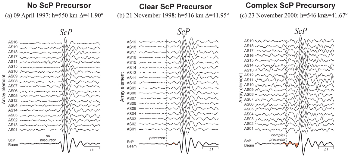
Here is another example of ScP array recordings, this time at the Warramunga (WRA) array, in Australia. These data argue for a very localized ULVZ that is partial melt in origin. [PDF]
|
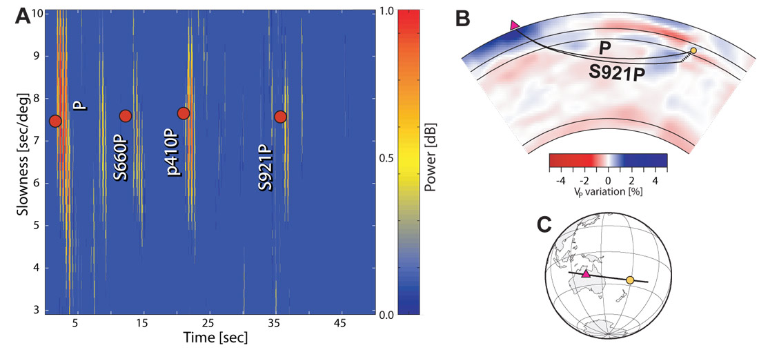
Array analyses permit detection of otherwise difficult to detect energy. Here, we see an S wave converted to a P-wave some 900+ km into the mantle. The figure on the left is a "vespagram". "Slowness" equates to arrival angle. [PDF]
|
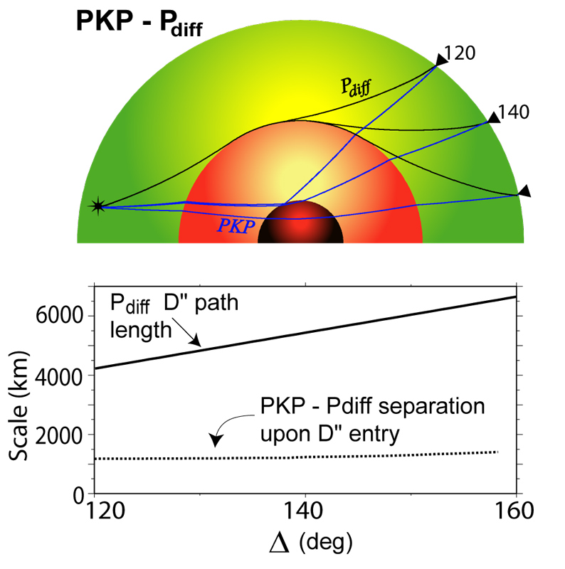
PKP is a seismic P-wave that penetrations deep into the core of the Earth. It is often referenced to a diffracted P-wave (Pdiff). This image shows some physical scale aspects of the pair of waves. [PDF]
|
|
|
Some plots showing seismic data used to probe the Earth's interior (return to image directory page)
|
||||
 |
 |
 |
 |
 |
| AI (231 Kb) JPG (158 Kb) | AI (234 Kb) JPG (158 Kb) | AI (243 Kb) JPG (160 Kb) | AI (259 Kb) JPG (152 Kb) | AI (225 Kb) JPG (126 Kb) |
|
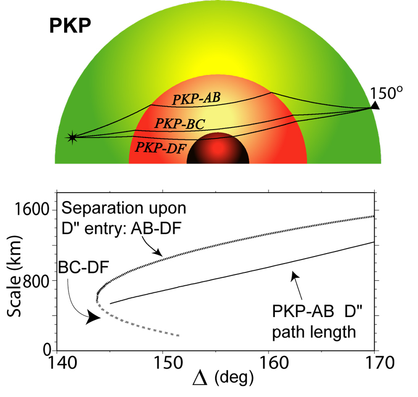
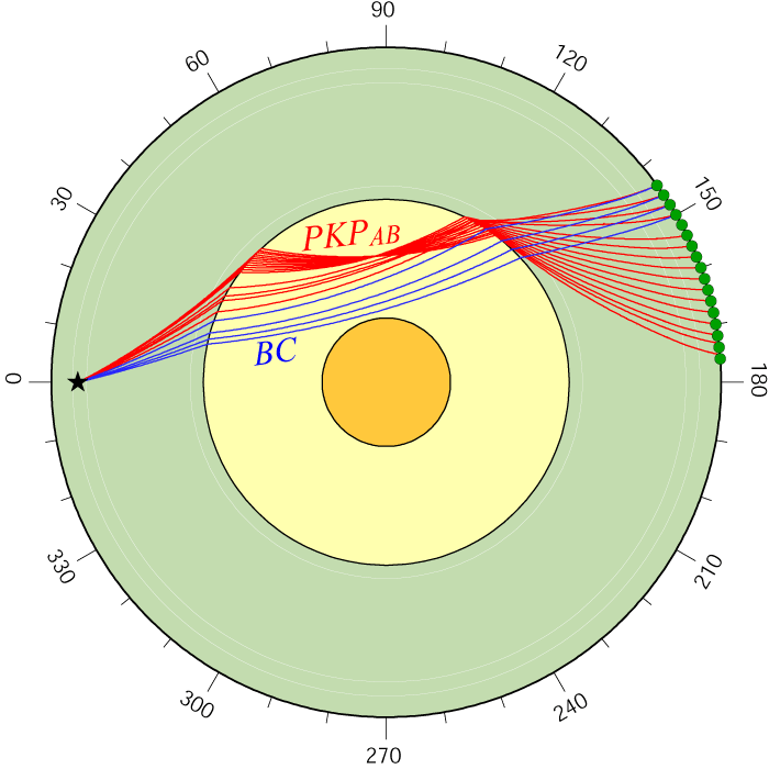
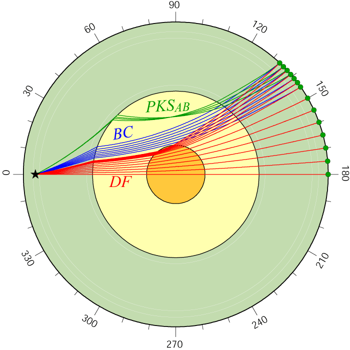
The three common "branches" of PKP are shown here, along with some of their physical scales. the BC and DF branches are often used together to study the outermost inner core. [PDF]
|
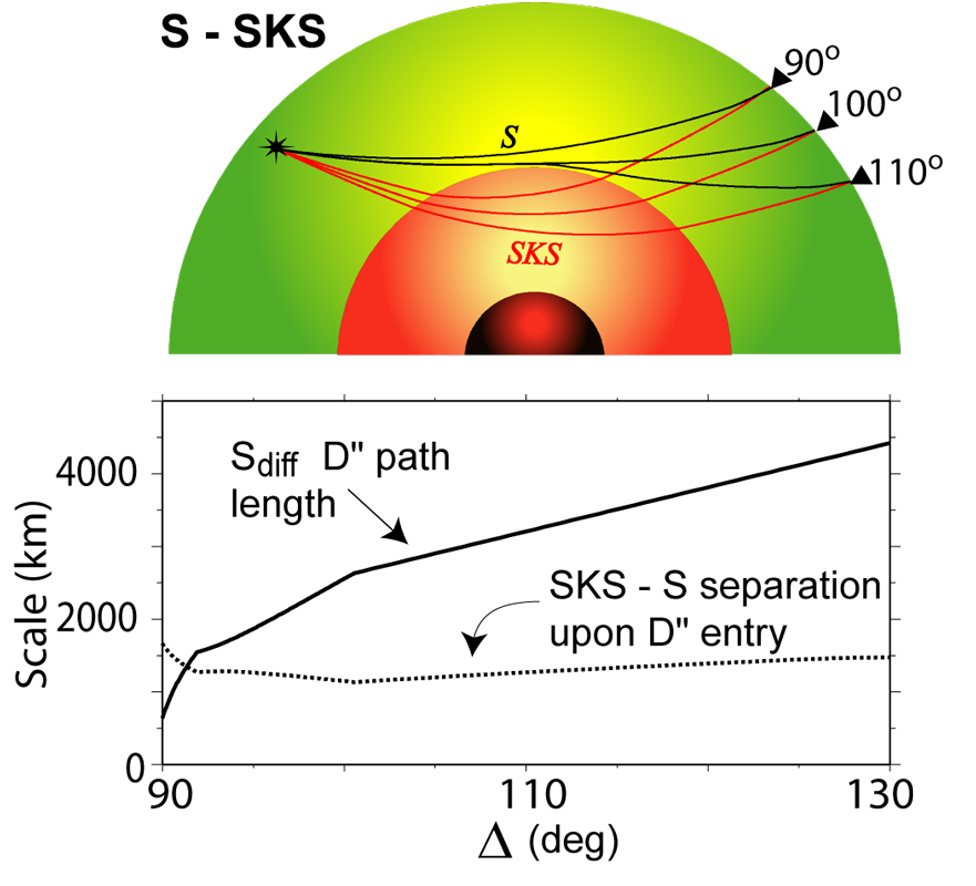
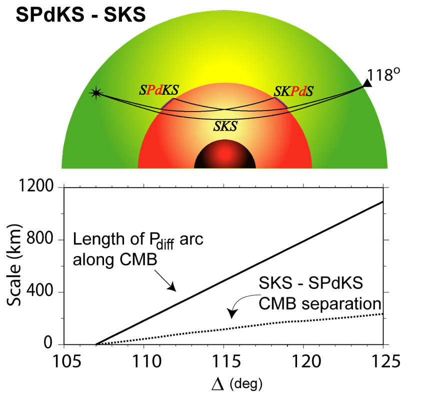
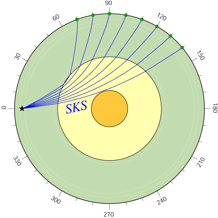
S and SKS were my bread and butter as a graduate student. SKS is used as a reference wave to study S (or diffracted S), which tells us about the deepest mantle. [PDF]
|
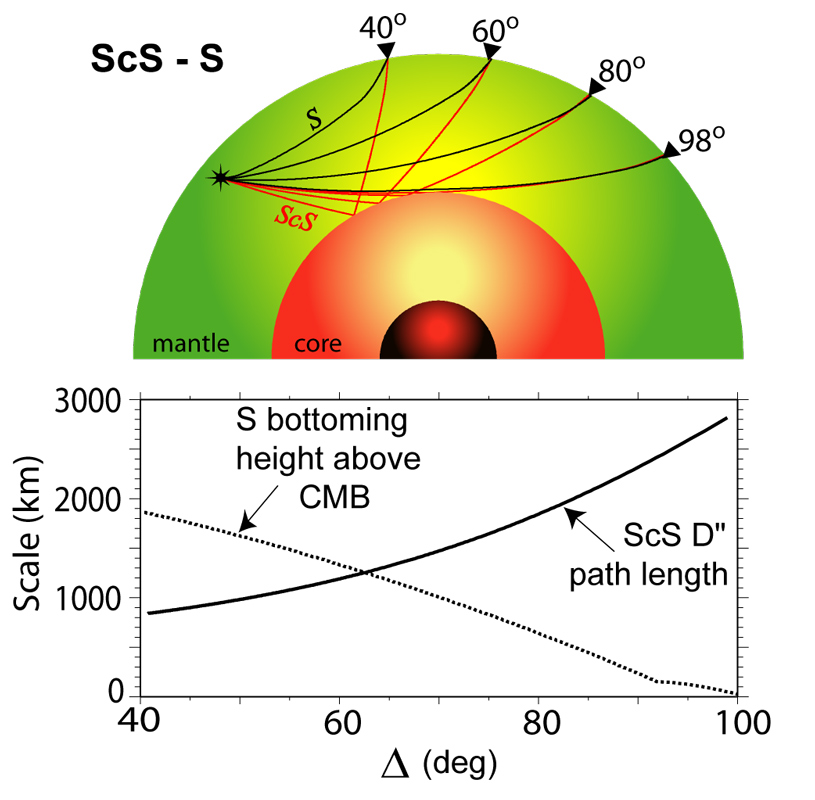
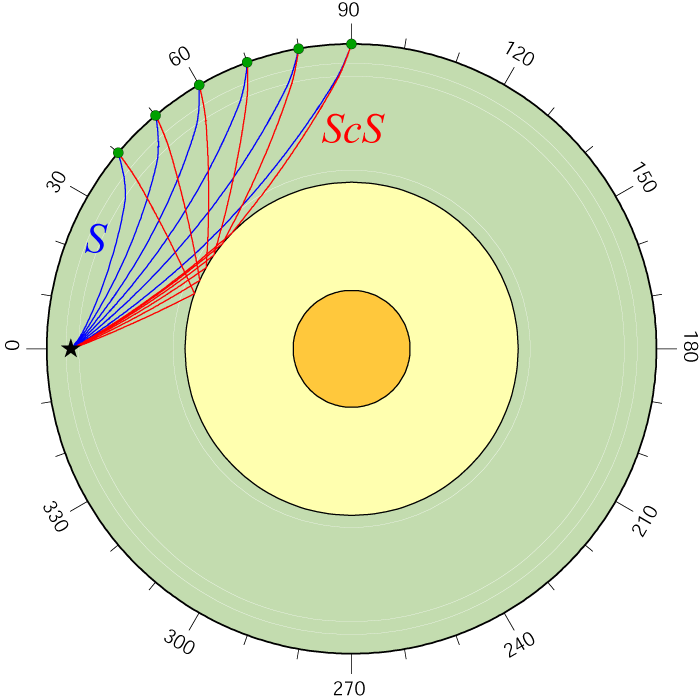
S and ScS are used much in the same way S and SKS are used, except S is the reference, and ScS becomes the probe. My group with the group of Thorne Lay use this probe a lot these days. ScS is usually a strong arrival. [PDF]
|
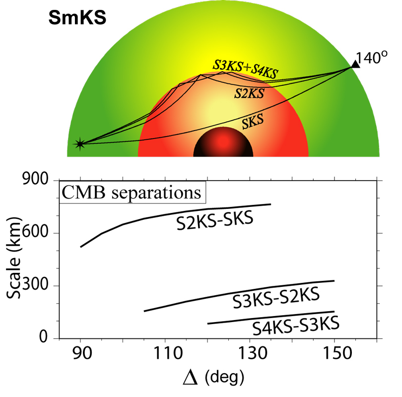
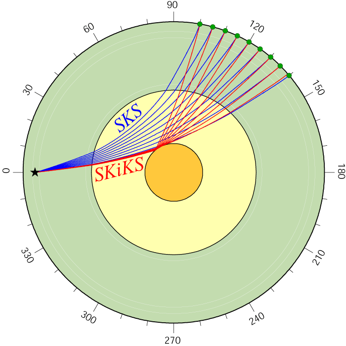
The core mantle boundary is a great reflector of energy from the top, or from underneath. Here, we see underside reflections:, SKKS, SKKKS, SKKKKS, etc. These are great for studying the outer core. [PDF]
|
PKP is a seismic P-wave that penetrations deep into the core of the Earth. It is often referenced to a diffracted P-wave (Pdiff). This image shows some physical scale aspects of the pair of waves. [PDF]
|
|
Some plots showing seismic data used to probe the Earth's interior (return to image directory page)
|
||||
 |
 |
 |
 |
 |
| AI (1.2 Mb) JPG (554 Kb) | AI (1.2 Mb) JPG (529 Kb) | AI (1.8 Mb) JPG (587 Kb) | AI (893Kb) JPG (321 Kb) | AI (538 Kb) JPG (83 Kb) |
|
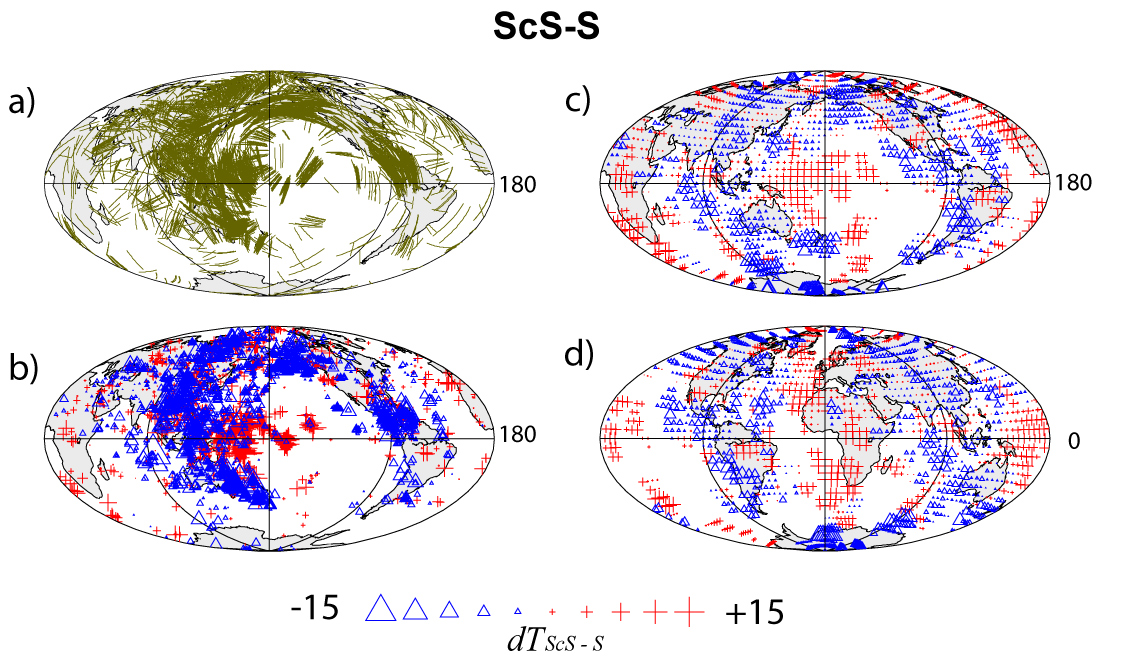
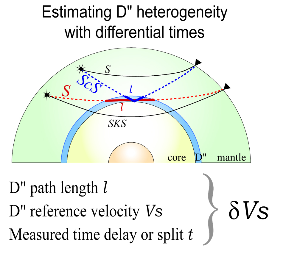
Here we see ScS-S travel time anomalies displayed along the D" portion of the ScS path (raw time anomalies on the left, and smoothed on the right). More info: PDF
|
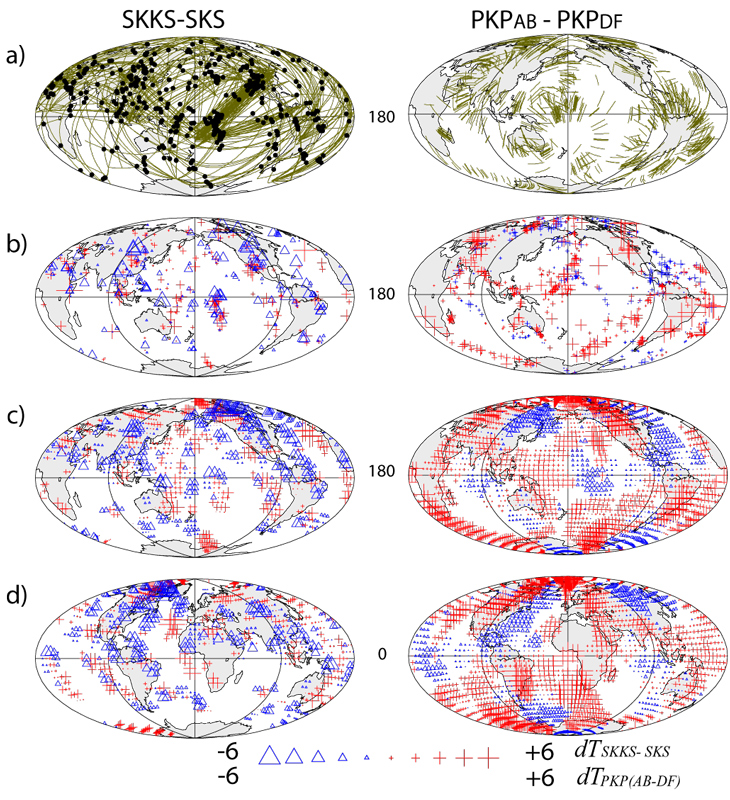
SKKS-SKS and PKPab-PKPdf differential time anomalies are shown, which are sensitive to seismic wave anomalies in the deepest mantle. More info: PDF
|
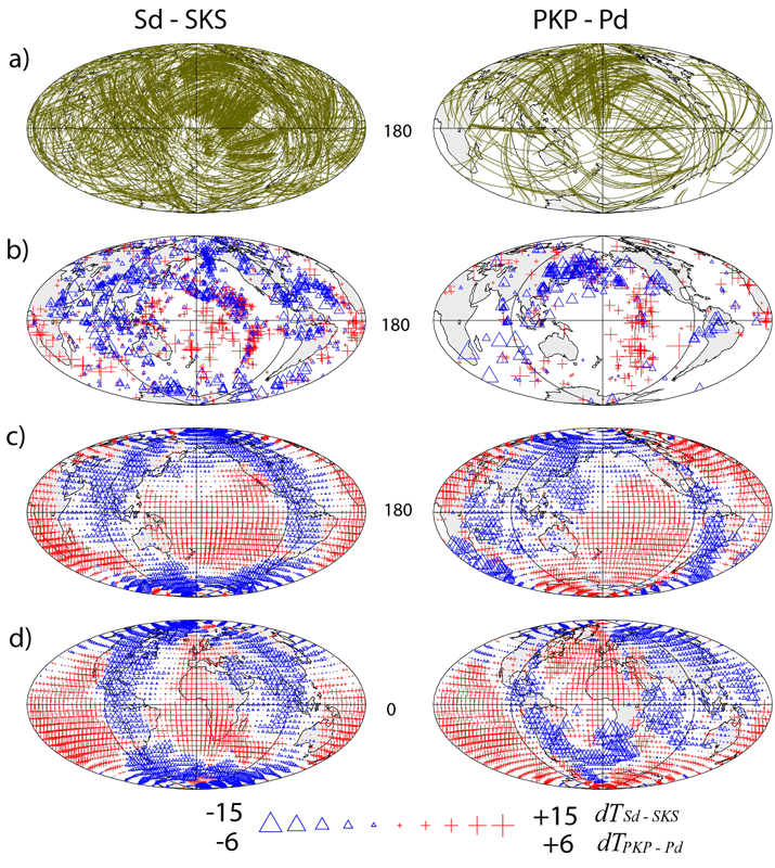
Sdiff-SKS and Pdiff-PKP times are shown. It is pretty cool: in the smoothed times (bottom panels), you see the characteristic "ring around the Pacific". More info: PDF
|
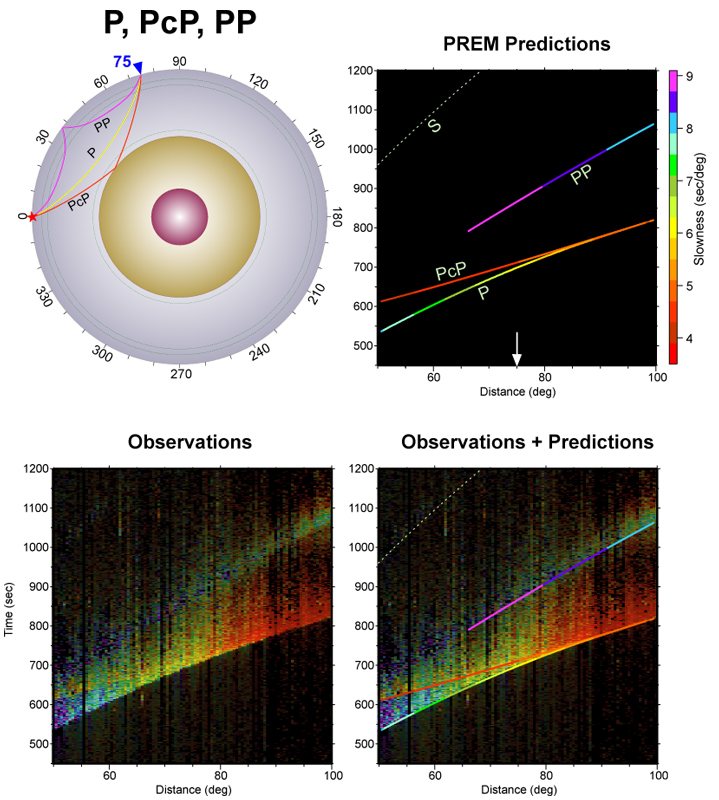
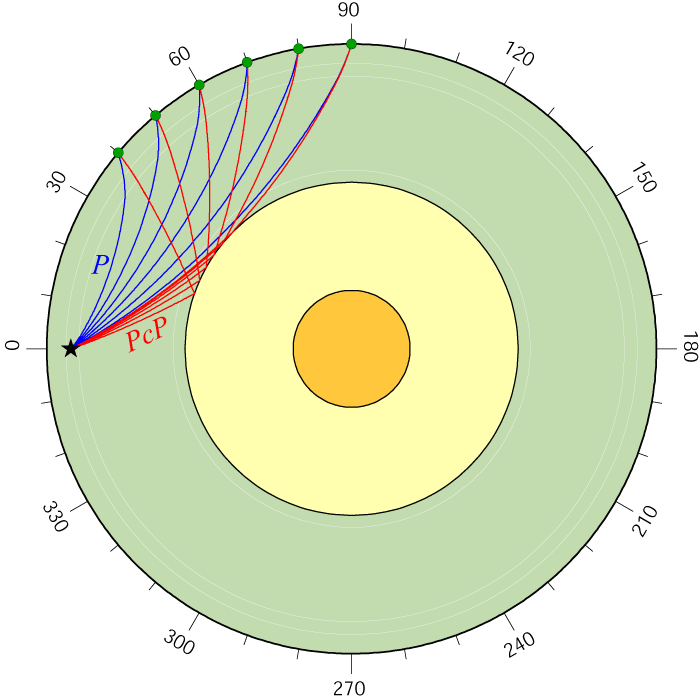
This sweet of figures is from an SRL note w/ Mike Thorne and Sebastian Rost. The show the power of the information in array recordings, here, P, PcP, PP. Read the paper at PDF
|
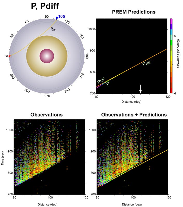
P and Pdiff are shown. Note the intense coda energy to the Pdiff, which is probably due to scattering in D". PDF
|
|
Some plots showing seismic data used to probe the Earth's interior (return to image directory page)
|
||||
 |
 |
 |
 |
|
| AI (542 Kb) JPG (225 Kb) | AI (619 Kb) JPG (264 Kb) | AI (709 Kb) JPG (302 Kb) | AI (503Kb) JPG (265 Kb) | |
|
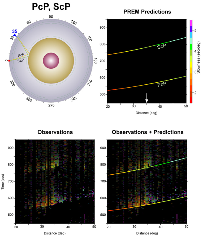
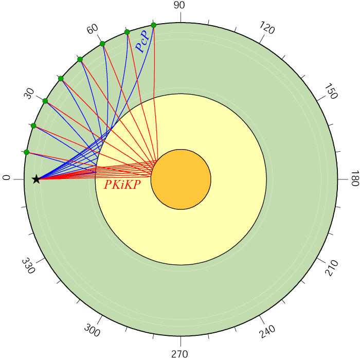
Here, the PcP and ScP wave fields are shown. Not quite as robust as some of the other panels. But we regularly use these waves to study the deep Earth. PDF
|
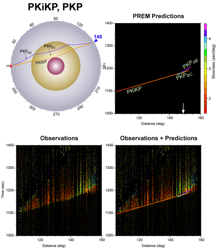
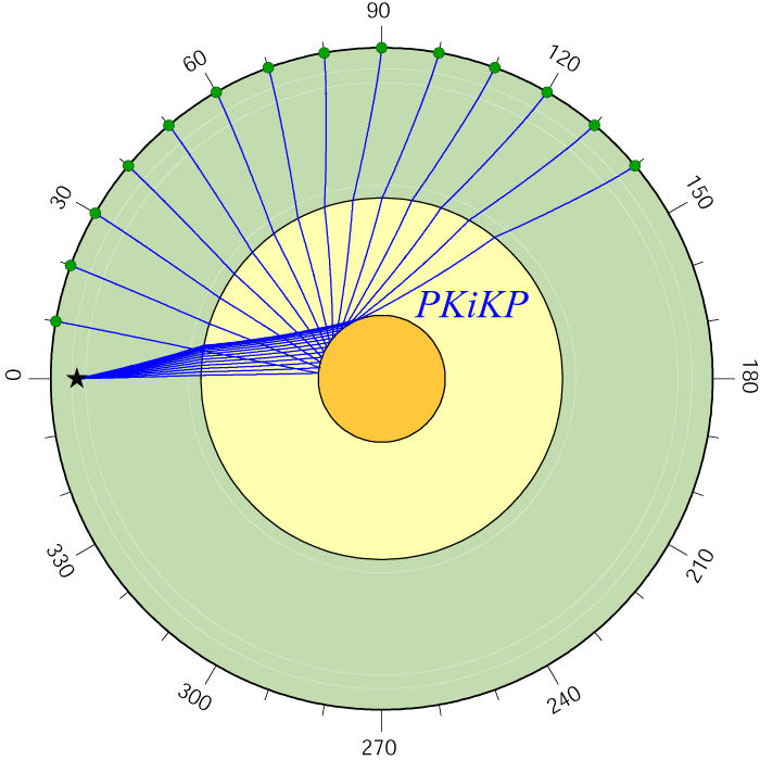
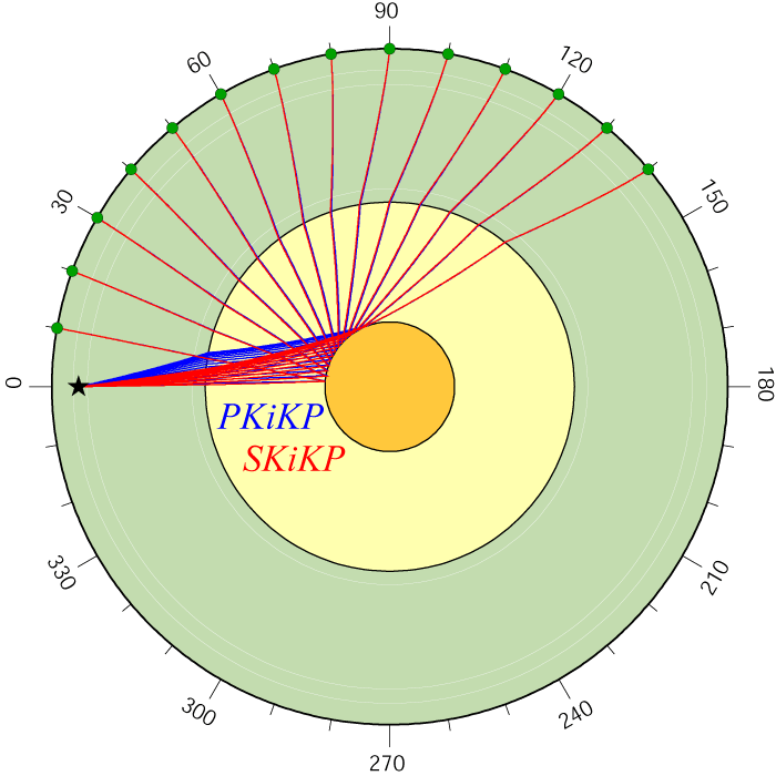
PKiKP is great for looking at the inner core, and the boundary between the inner and outer core. Here we show it transitioning into the PKP triplication. PDF
|
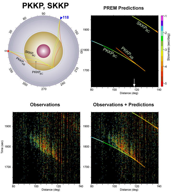
PKKP and SKKP are shown here. These are less commonly studied, but certainly are important for deep Earth study. PDF
|
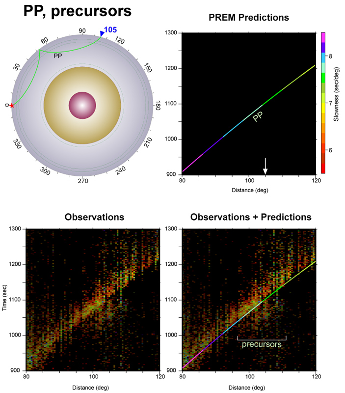
The wave PP is shown, along with precursors between 100 and 110 degrees. We used these to study slabs in the lower mantle in this paper: PDF
|
|
|
Some plots showing various interpretations or depictions of Earth's interior (return to image directory page)
|
||||
 |
 |
 |
 |
 |
| AI (315 Kb) JPG (213 Kb) | AI (9.5 Mb) JPG (344 Kb) | AI (369 Kb) JPG (323 Kb) | AI (14 Mb) JPG (481 Kb) | AI (15 Mb) JPG (429 Kb) |
|
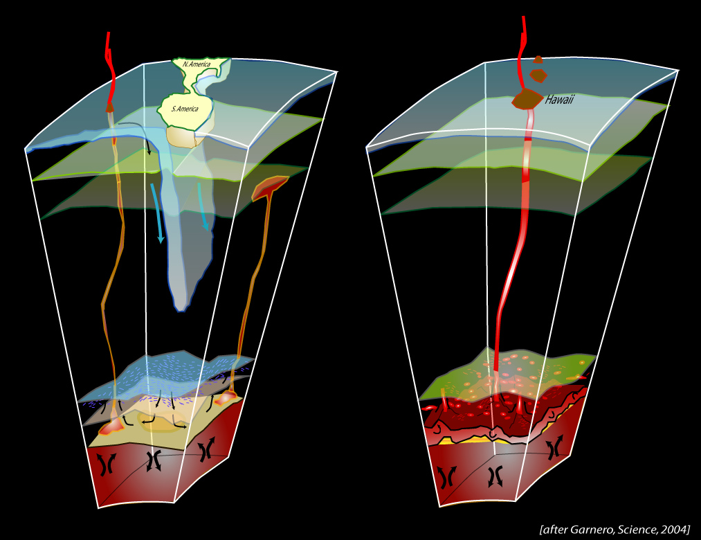
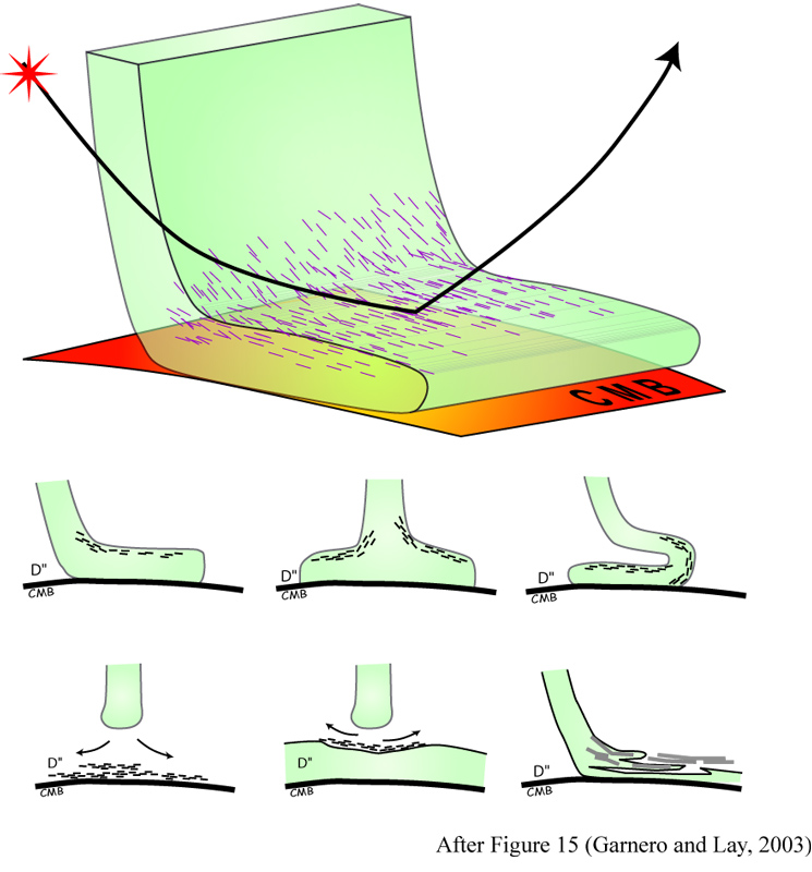
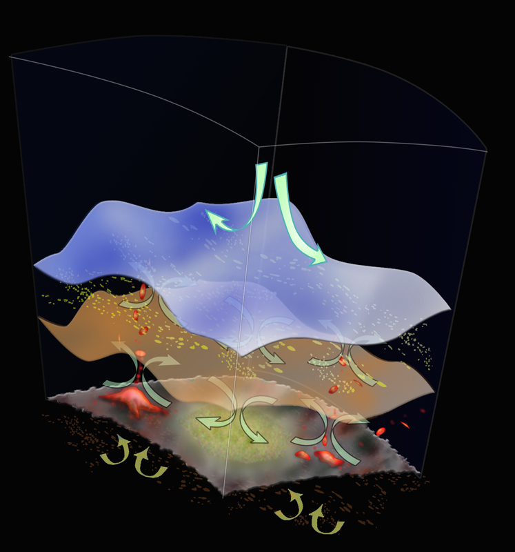
Downwelling material associated with subduction, as well as upwelling plume material, are underlain by lowermost mantle structure characterized by strong heterogeneity, anisotropy, and seismic wave scattering. [PDF]
|
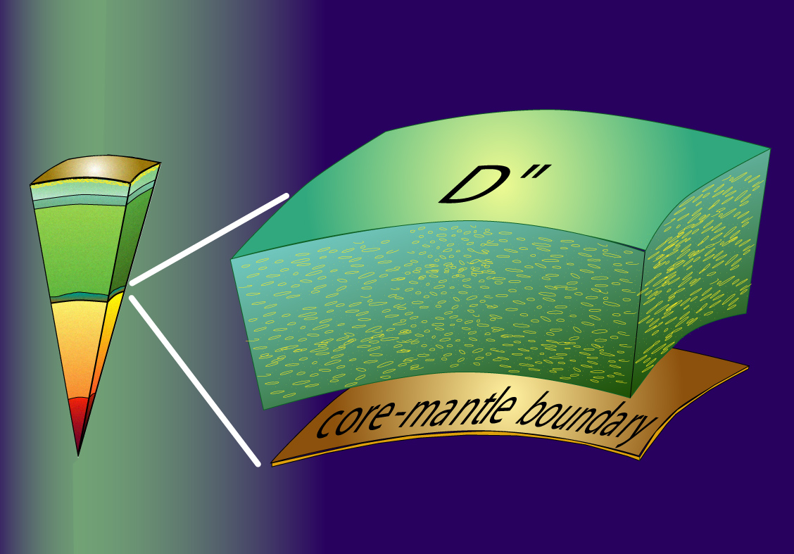
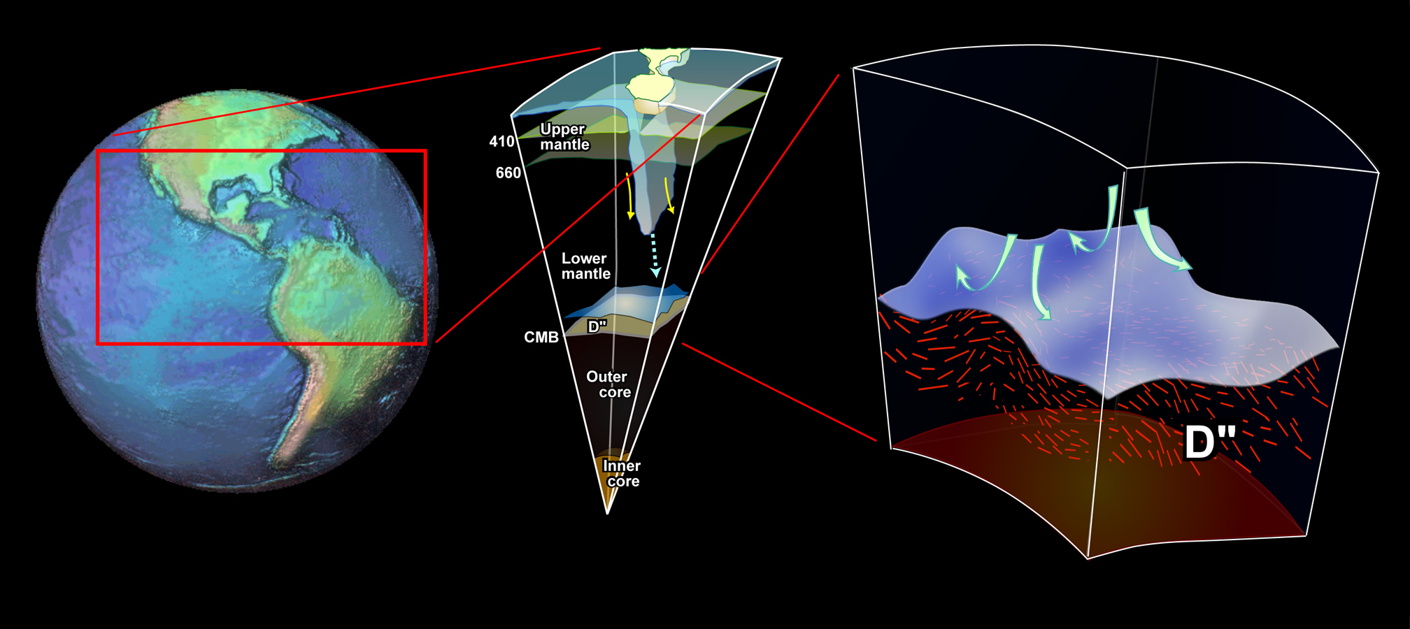
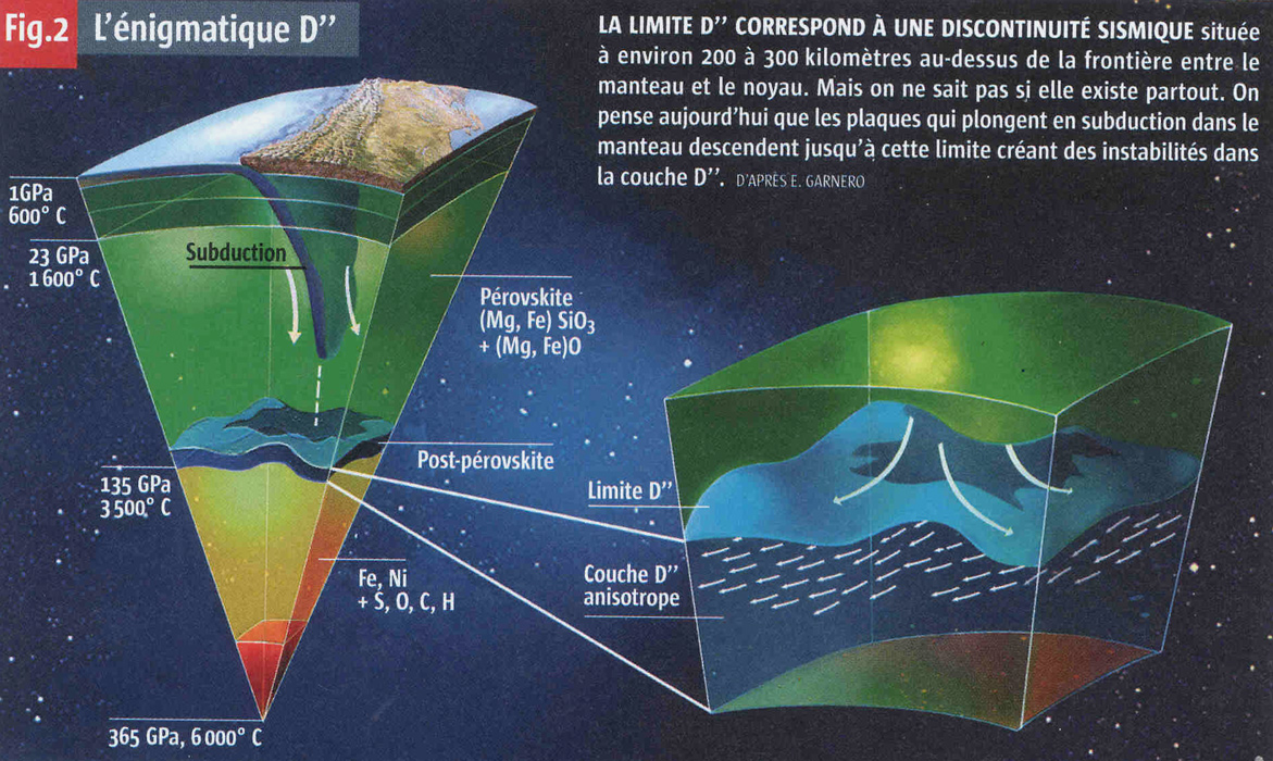
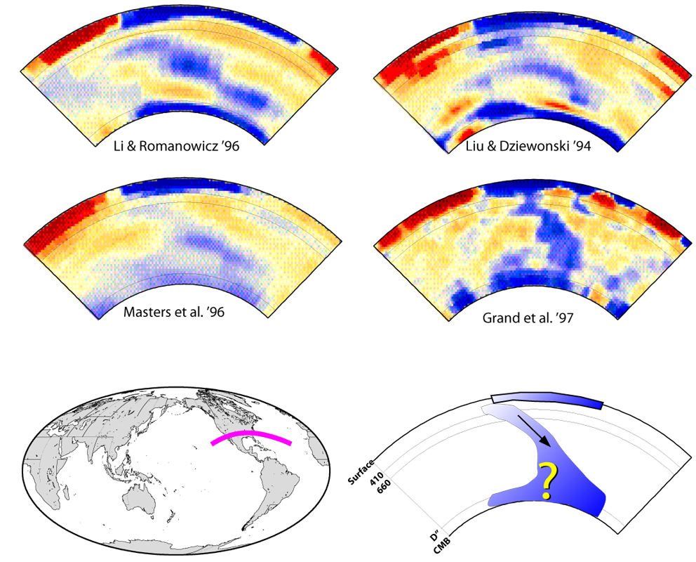
D" ("dee-double-prime") is the anomalous lowermost 200-300 km of Earth's mantle, and is home to the largest heterogeneities within the planet below the upper mantle. Here it is overly simplified as a spherical shell.
|
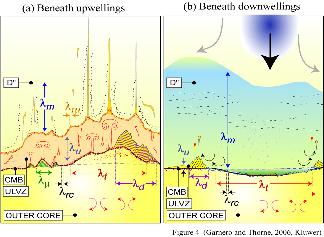
A multitude of scale lengths of dynamical processes and resulting structure may occur at the CMB. Here, possibilities beneath slabs and plumes are contrasted. I know, it's a very busy figure, perhaps this 4 Mb PowerPoint file helps.
|
This is a bit goofy: I wrapped an image of gallium crystals onto the CMB. You might have seen these in COMPRES literature. Of interest is an EOS article by R. Liebermann on the future of high pressure research.
|
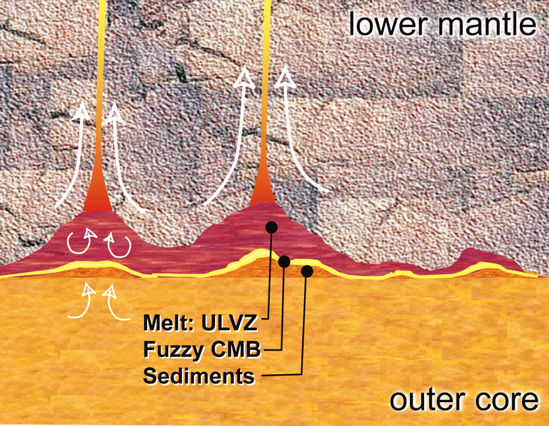
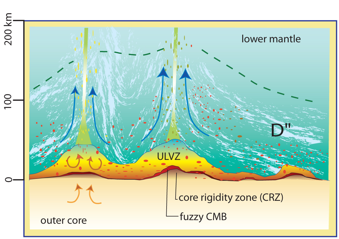
Fine layer at Earth's core-mantle boundary can exist as partially molten material, giving rise to ultra-low velocity zones (ULVZ). Blurring of the CMB, as well as under-plating of the CMB are also possible.
|
|
Some plots showing various interpretations or depictions of Earth's interior (return to image directory page)
|
||||
 |
 |
 |
 |
 |
| AI (251 Kb) JPG (163 Kb) | AI (9.3 Mb) JPG (172 Kb) | AI (595 Kb) JPG (229 Kb) | AI (310 Kb) JPG (163 Kb) | AI (220 Kb) JPG (168 Kb) |
|
The figure speculates on possible ways to produce both a reflector off of the top of D" (thus precursors to ScS), as well as anisotropy (depicted by short stiples) within D". [PDF]
|
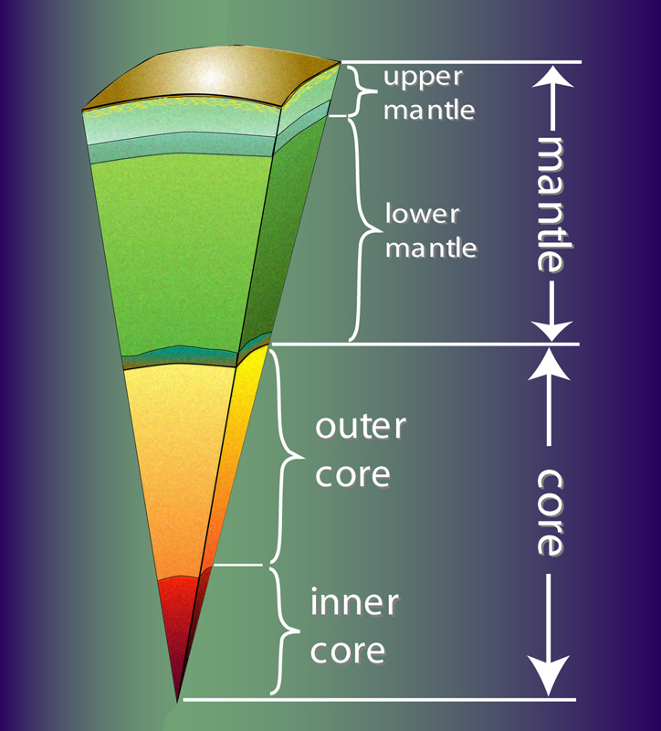
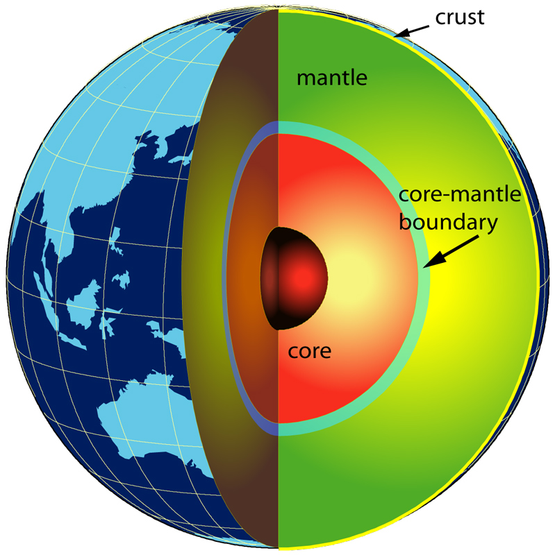
The simple figure depicts the main divisons within the Earth's interior. Here, shells only vary in the radial direction. But in fact, recent seismological analyses show that strong variations exist laterally.
|
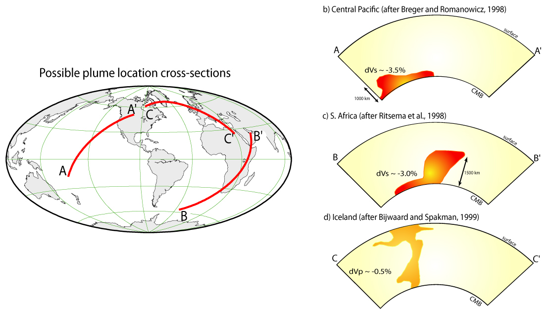
In this image, we exploit the possibility that plumes originating in the deep mantle may originate near the edges of the low velocity structures (red). Thorne et al [2004] shows this is at least statistically true for the Earth.
|
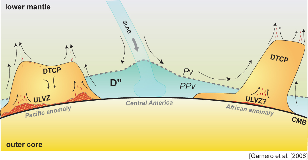
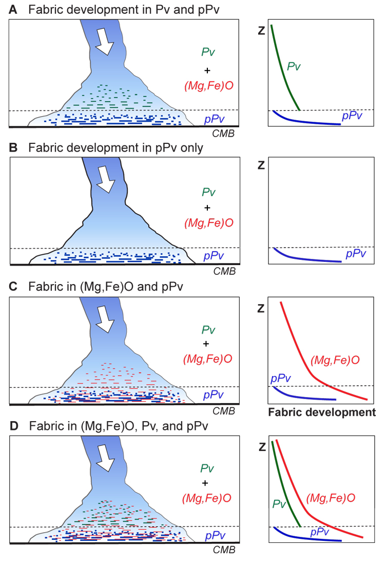
One of those 'kitchen sink' figures, attempting to tie together several observables (DTCP=dense thermochemical piles; Pv=perovskite; PPv=post-perovskite; ULVZ=ultra-low velocity zone; CMB=core-mantle boundary).
|
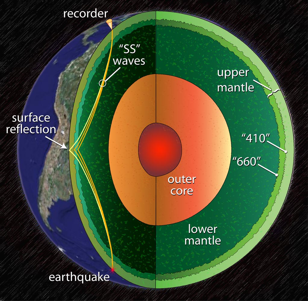
The transition zone (the mantle between the 410 and 660 km discontinuities) is probed using precusors to SS waves. Its thickness is studied as a possible approach in distiguishing between upper vs. whole mantle plumes.
|
|
Some plots showing various interpretations or depictions of Earth's interior (return to image directory page)
|
||||
 |
 |
 |
 |
 |
| AI (231 Kb) JPG (220 Kb) | PSD (16.1 Mb) JPG (203 Kb) | JPG (229 Kb) | AI (2.7 Mb) JPG (229 Kb) | AI (368 Kb) JPG (266 Kb) |
|
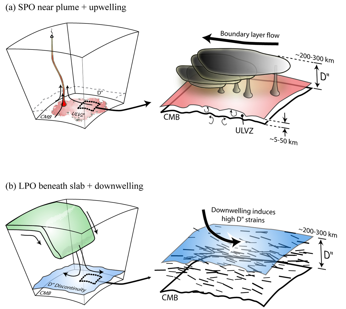
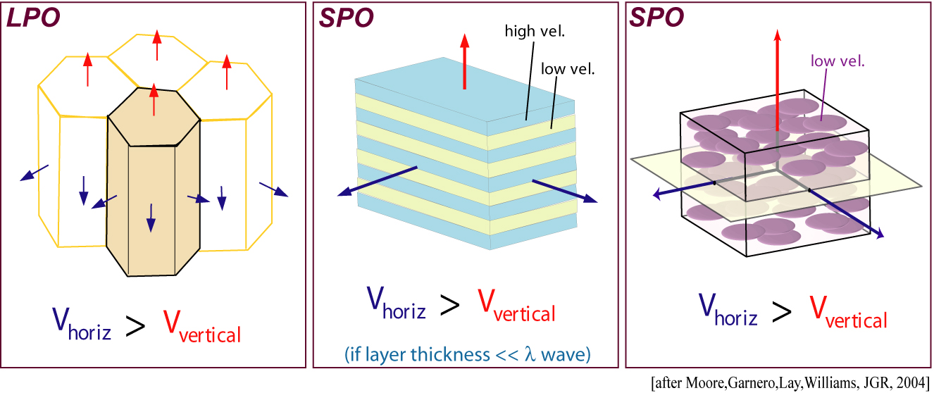
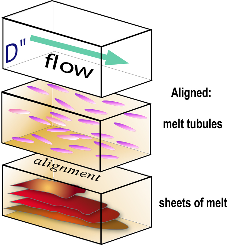
"Shape Preferred Orientation", or SPO, can cause shear wave splitting in seismic waves, in the the SV and SH waves respond to the heterogeneity differently. SPO can be invoked by strong boundary layer flow.
|
This figure is intended to highlight a variety of complexities that can occur in D", including a shear wave velocity discontinuity (blue), a deeper discontinuity (tan), and possible blebs of melt. This is more fantasy than anything.
|
I somehow lost the AI file for this one. Anyway, this is meant to emphasize that beneath active subduction, strong pressure forces might induce lattice preferred orientation (LPO) in the deep mantle D" layer.
|
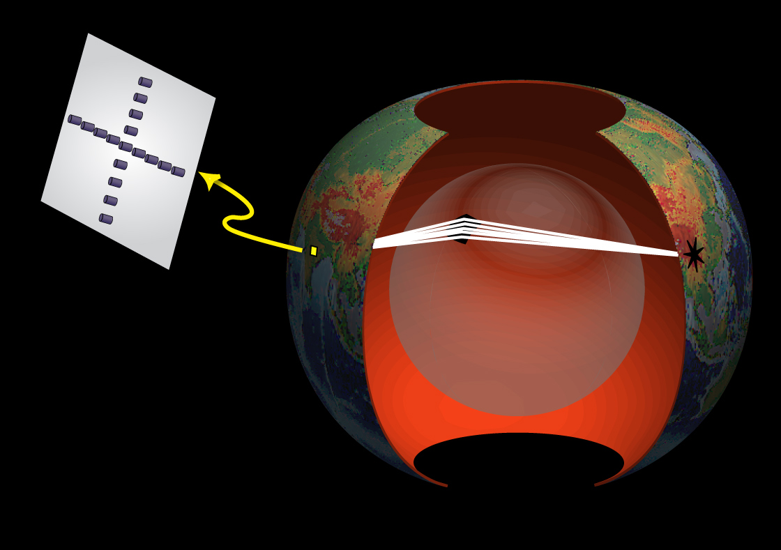
This figure is meant to motivate how seismic arrays can be "focused" to study a specific spot inside the planet. Here's a PowerPoint file that may be useful to general audiences.
|
Here's a really basic Earth interior image with the fundamental internal layering.
|
|
Some plots showing various interpretations or depictions of Earth's interior (return to image directory page)
|
||||
 |
 |
 |
 |
 |
| AI (2.0 Mb) JPG (287 Kb) | AI (1.3 Mb) JPG (491 Kb) | AI (4.0 Mb) JPG (313 Kb) | AI (876 Kb) JPG (188 Kb) | AI (195 Kb) JPG (207 Kb) |
|
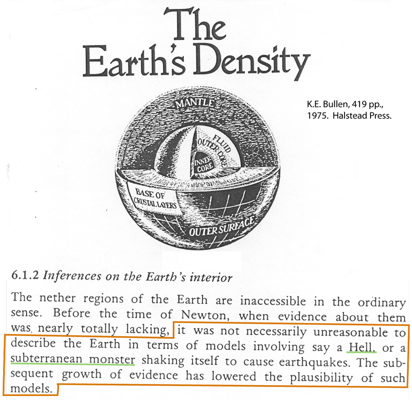
I love this quote by Sir Harold Jeffries, from his book on Earth's Density. It emphasizes that everything we know is still not fact. Check it out!
|
The core-mantle boundary may be exceedingly complex. This image is meant to emphasize this in the bottom 200 km of the mantle [PDF]
|
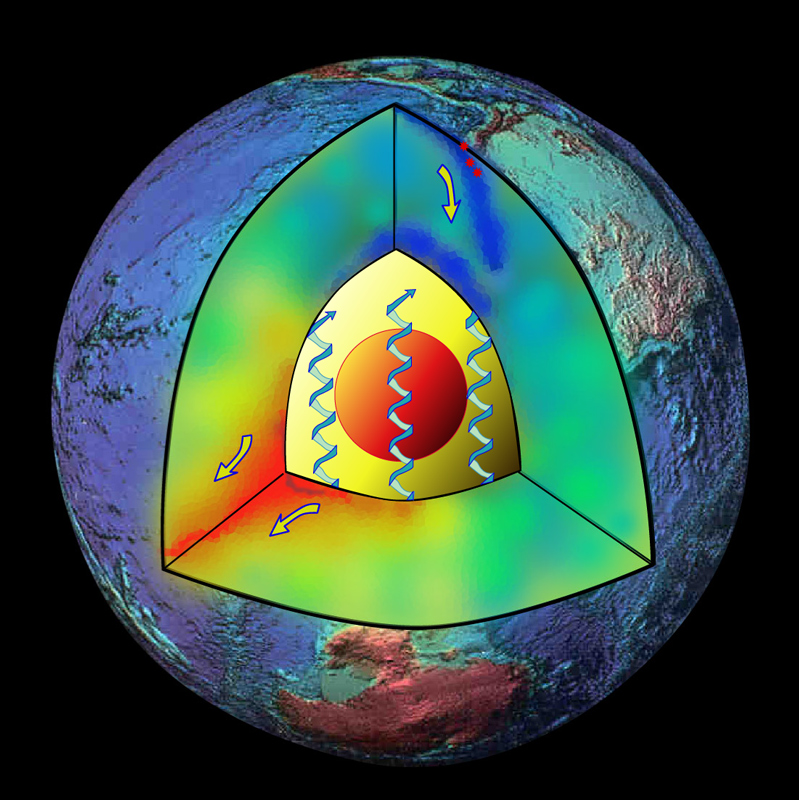
Down and upwelling material flow in the mantle is depicted by blue and red, respectively. The inner core is the red ball in the middle, and coil-arrows in the outer core depict fluid core flow.
|
Beneath the Cocos Plate, just west of Central America, the base of the mantle is imaged as having an offset in the D" reflectance. We interpreted this as a folded buckled ancient slab. [PDF]
|
This figure is a tad old, but I still see folks using it, so I'll leave it posted. I depicts lowered shear wave speeds in a few studies that might relate to plumes or upwellings.
|
|
Some plots showing various interpretations or depictions of Earth's interior (return to image directory page)
|
||||
 |
 |
 |
 |
 |
| AI (2.8 Mb) JPG (362 Kb) | AI (3.9 Mb) JPG (388 Kb) | AI (398 Kb) JPG (452 Kb) | PSD (18.6 Mb) JPG (1.2 Mb) | PSD (14.5 Mb) JPG (119 Kb) |
|
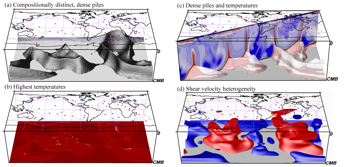
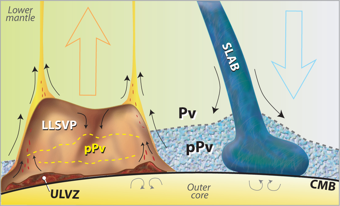
This image is a busy one, but summarizes many of the recent findings of the deep interior: from Dense Thermo-Chemical Piles (DTCP) to Slabs to Ultra-Low Velocity Zones (ULVZ) [PDF]
|
The possibility of dense thermo-chemical piles at the bottom of Earth's mantle relates to a number of things, including geographical locations of plume roots, and probable locations for ULVZ [PDF]
|
This figure is a bit out-dated, but I still see it getting used, so I'm leaving it up. It emphasizes at least in this cross-section that high shear wave speeds are seen from the surface to the CMB, suggesting deep mantle slab penetration.
|
Yes, this image is a bit over the top, but who knows? This is supposed to dramatically depict a chemical pile sitting on the core, w/ plumes coming off, a post-perovskite layer within (blue), and even a skinny ULVZ (pink) [PDF]
|
Nick Schmerr used 10's of 1000's of SS precursors to map the relief on the 410 and 660 km deep phase boundaries (purple=deepened, white=elevated). We used these patterns to argue for water in the mantle. [PDF]
|
|
Some plots showing various interpretations or depictions of Earth's interior (return to image directory page)
|
||||
 |
 |
 |
 |
 |
| AI (9.2 Mb) JPG (180 Kb) | AI (639 Kb) JPG (377 Kb) | PSD (132 Mb) JPG (576 Kb) | AI (347 Kb) JPG (313 Kb) | AI (388 Mb) JPG (305 Kb) |
|
This is a simple image of Earth's interior, showing the paths of SS waves and their precursors (for Nick Schmerr's work). These are the type of data used to make that previous image [PDF]
|
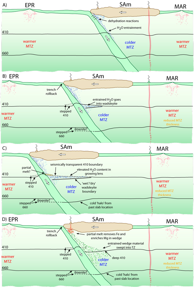
A number of possibilities exist for causing a phase transition to occur at a shallower or deeper depth. This image shows two possibilities: Iron or water content, from Nick's paper again [PDF]
|
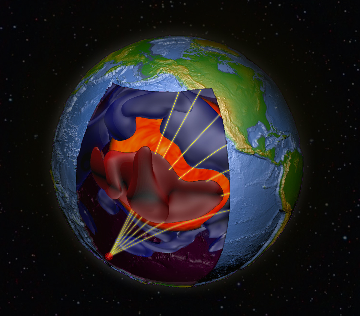
Seismic ray paths are shown going through a big red blob! But seriously... The blue and red features are high and low velocity material, from tomography. Allen McNamara and I were trying to get the cover image (unsuccessful, I might add!) [PDF]
|
Beneath downwelling material, many interesting possibilities exist for building up strain that might manifest as seismic anisotropy, especially in the vicinity of a phase transition. [PDF]
|
There are several possible causes for seismic anisotropy in the deep mantle. Here, Melissa Moore depicts shape and lattice preferred orientation (SPO and LPO, respectively) [PDF]
|
|
Some plots showing various interpretations or depictions of Earth's interior (return to image directory page)
|
||||
 |
 |
 |
 |
 |
| AI (1.3 Mb) JPG (180 Kb) | AI (1.2 Mb) JPG (391 Kb) | AI (204 Kb) JPG (219 Kb) | AI (1.4 Mb) JPG (219 Kb) | AI (170 Mb) JPG (195 Kb) |
|
This is a "we've come a long way" cartoon. In just over a hundred years, our understanding of the mantle has going from homogeneous mantle plus core, to just about anything you might imagine!
|
This image is not different from previous ones, just perhaps more colorful. It shows the dominant features that may exist in the deep mantle.
|
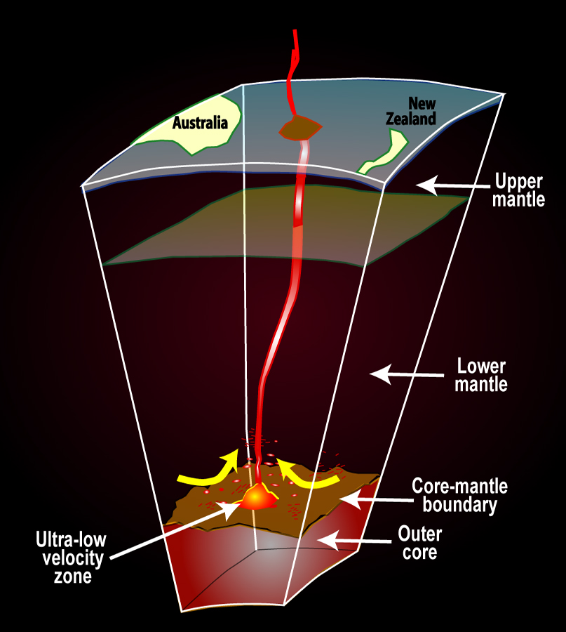
This image was drawn to suggest that partially molten ultra-low velocity zones at the CMB might give rise to plumes that feed hot spot volcanos (though keep in mind: this is just a cartoon). [PDF]
|
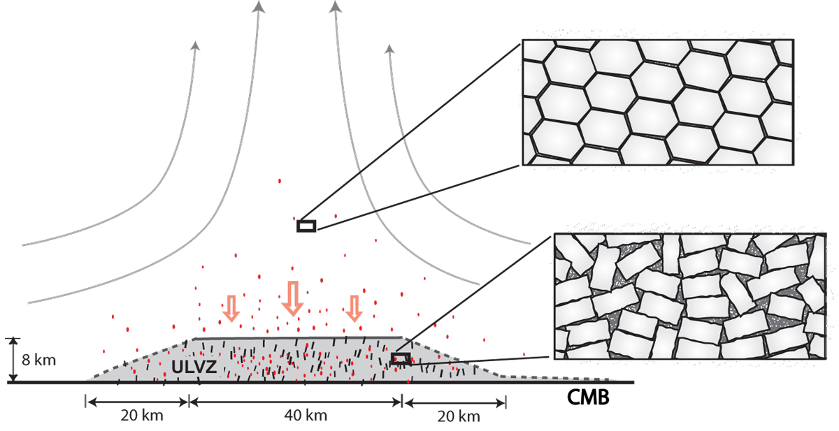
If an ultra-low velocity zone is partially molten, how might a reasonable (observable) thickness be maintained? Here we hypothesize a scenario involving interlocking crystals beneath a plume. [PDF]
|
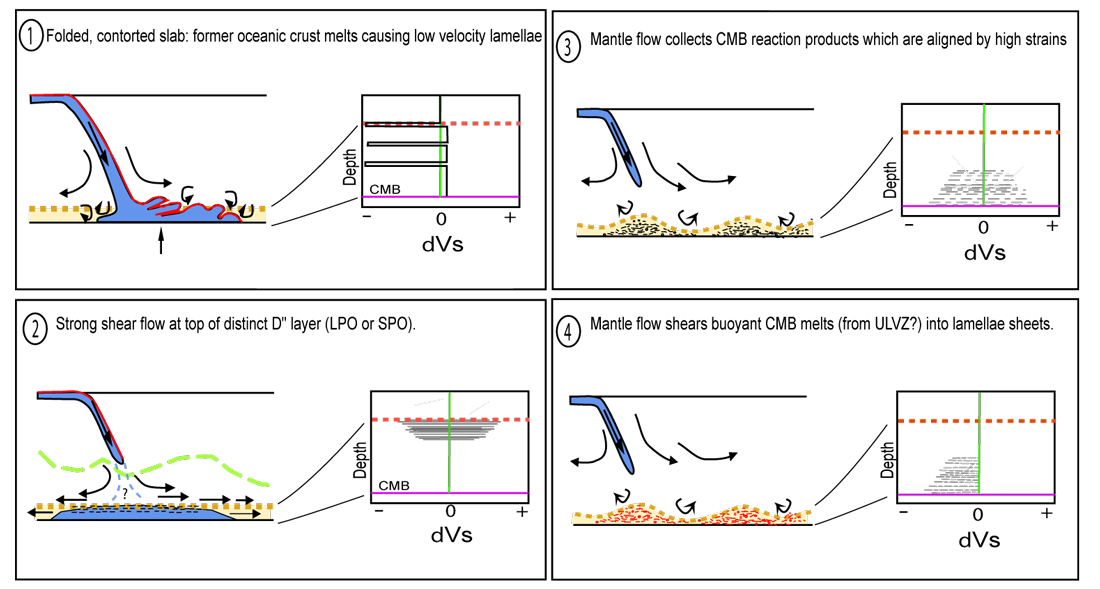
A number of possibilities exist that might give rise to anisotropy in the lowermost mantle beneath subduction. Here are a few than involve heterogeneities, melt, and high strains [PDF]
|
|
Some images relating to seismic anisotropy in Earth's interior (return to image directory page)
|
||||
 |
 |
 |
 |
 |
| AI (177 Kb) JPG (254 Kb) | AI (262 Kb) JPG (251 Kb) | AI (173 Kb) JPG (307 Kb) | AI (220 Kb) JPG (298 Kb) | AI (527 Kb) JPG (322 Kb) |
|
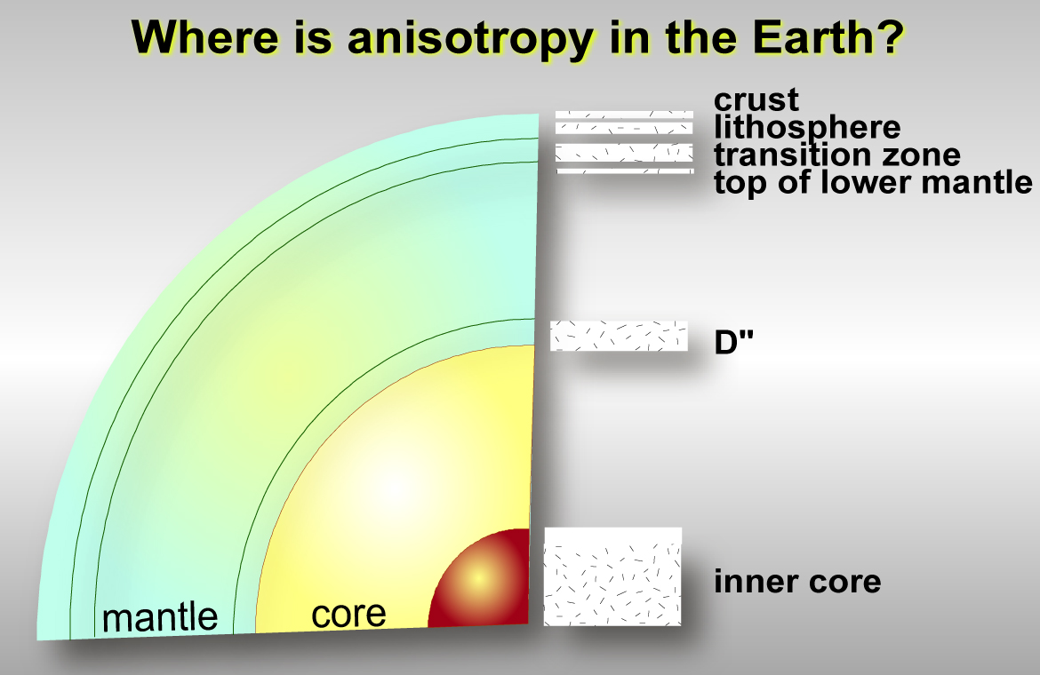
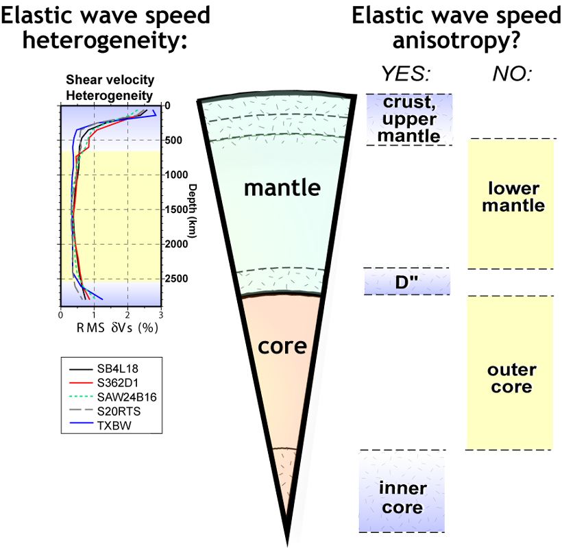
This is a simple figure showing different depth shells within Earth for which seismic anisotropy has been reported.
|
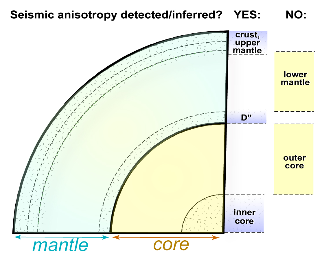
Here is another version of the figure to the left. This figure more specifically hints at the possibility that the outermost inner core might be isotropic, and the top of the lower mantle might be anisotropic.
|
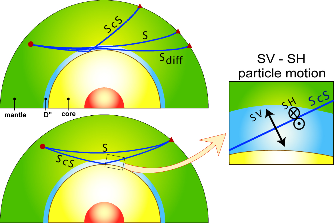
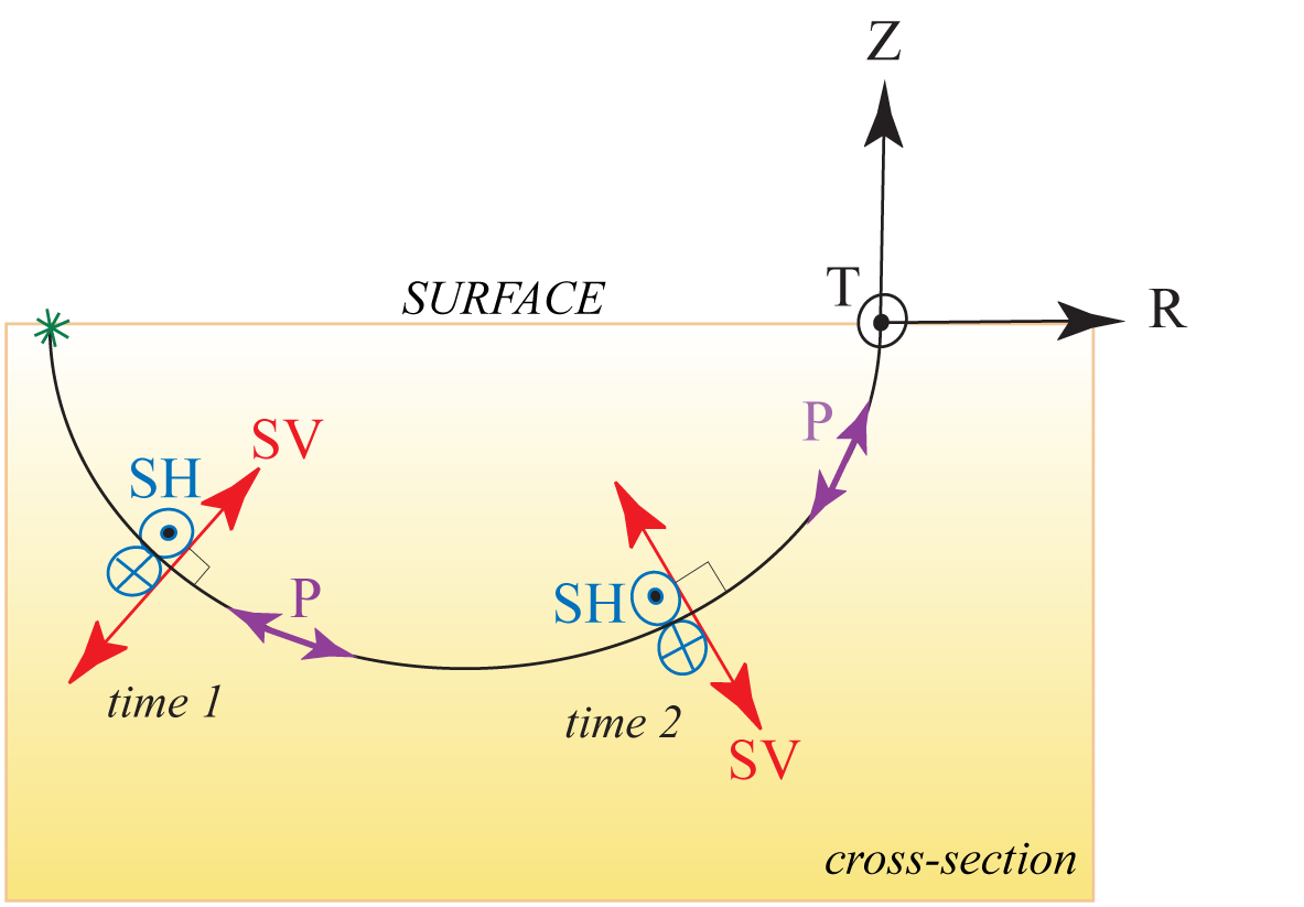
The most commonly used probes of deep mantle seismic anisotropy are displayed, with a zoom of the D" region showing the SV and SH particle motion.
|
If the deepest mantle is anisotropic, then it may affect waves used to study upper mantle anisotropy (and visa versa). This figure was from a proposal aimed at studying both simultaneously (it didn't get funded... oh well).
|
Fairly similar to 2 panels to the left, this figure also shows some SKS and S wave data (SV traces are red, SH blue). Since SKS is close to S at the closer distances, it is hard to resolve the depth of the onset of D" anisotropy.
|
|
Some images relating to seismic anisotropy in Earth's interior (return to image directory page)
|
||||
 |
 |
 |
 |
 |
| AI (187 Kb) JPG (265 Kb) | AI (232 Kb) JPG (279 Kb) | AI (315 Kb) JPG (350 Kb) | AI (147 Kb) JPG (151 Kb) | AI (178 Kb) JPG (156 Kb) |
|
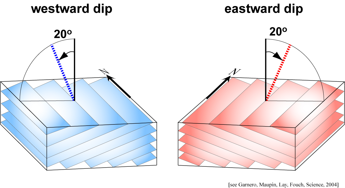
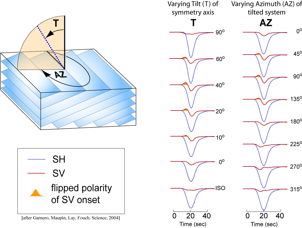
For our work under the Caribbean, stight tilts of the VTI symmetry axis either towards the east or west well-explained observed SV (or SVdiff) precursor behavior. [PDF]
|
This figure shows how the SV component of S waves can cycle through different shapes depending on the tilt and azimuth of the transverse isotropy symmetry axis. [PDF]
|
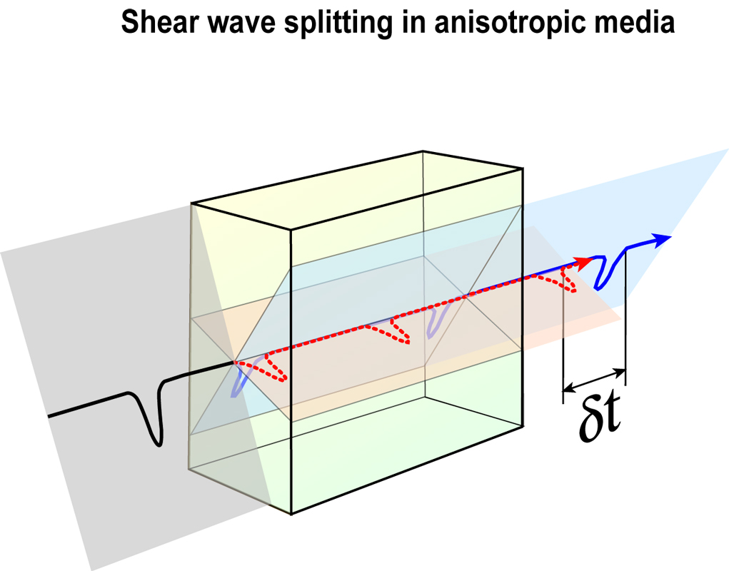
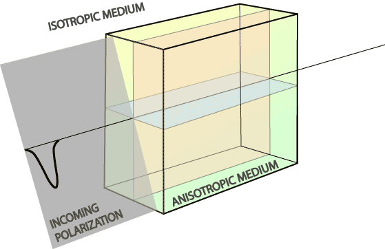
I basically redrew the famous Crampin (1981) figure, in color. The next two figures are simply differing presentations of the same. Here's a PowerPoint sequence of these images. Click HERE for an animation.
|
The blue pulses represent the faster wave, the red pulses the slower wave. They bifurcate upon encountering the anisotropic medium.
|
When the two pulses reach an observatory, seismologists measure the differential time and polarzation of the energy.
|
|
Some images relating to seismic anisotropy in Earth's interior (return to image directory page)
|
||||
 |
 |
 |
 |
 |
| AI (357 Kb) JPG (195 Kb) | AI (273 Kb) JPG (357 Kb) | AI (164 Kb) JPG (239 Kb) | AI (453 Kb) JPG (444 Kb) | AI (205 Kb) JPG (314 Kb) |
|
Here the connection is made between anisotropic and heterogeneous zones in the mantle: the "ends" of the mantle are the most heterogeneous, and possess the clearest evidence for anisotropy.
|
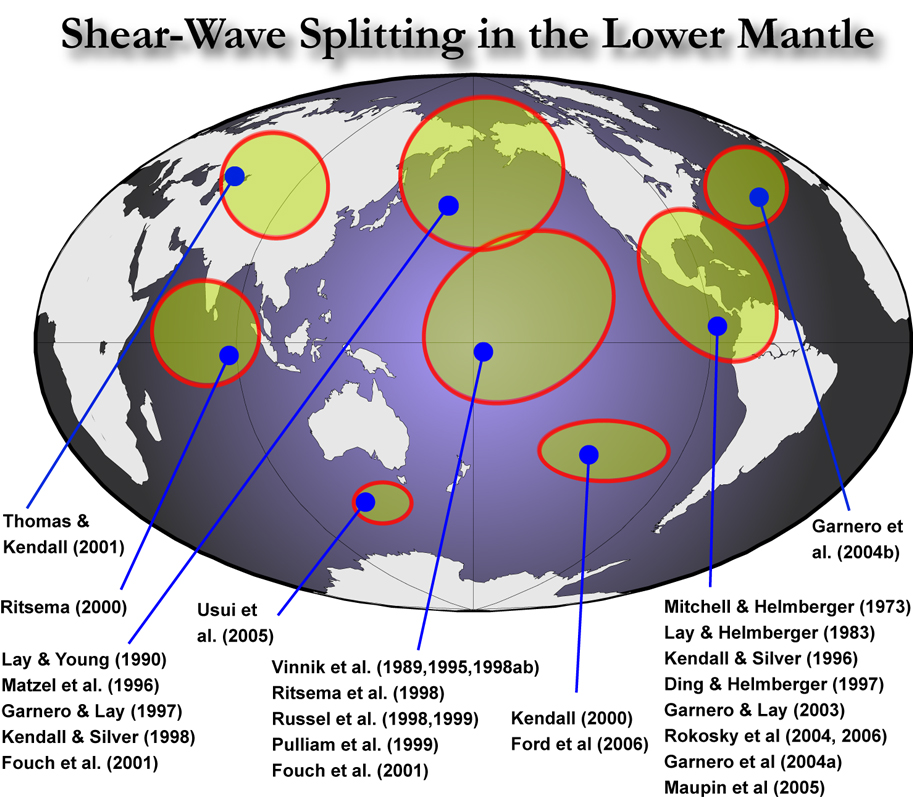
Regions where deep mantle anisotropy has been studied are shown. I apologize in advance if any work is missing from this figure (This figure needs updating!).
|
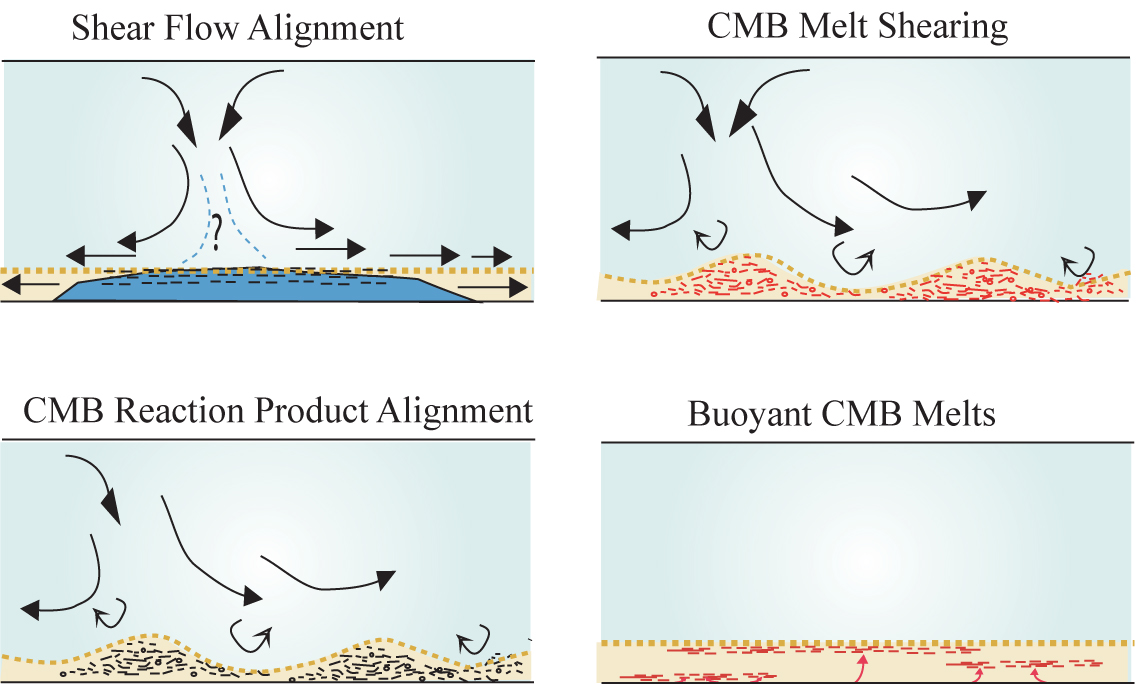
A variety of possibilities exist for the origin of seismic anisotropy (e.g., see reviews by Lay et al., 1998; and Kendall, 2000). Here, we speculate on some involving SPO (shape-preferred orientation) of materials. [PDF]
|
Both up- and down-welling regions show evidence for seismic anisotropy (middle and left panel, respectively). SPO and LPO (lattice-preferred orientation) have been discussed as causes to anisotropy in up and down-welling flow, respectively. [PDF]
|
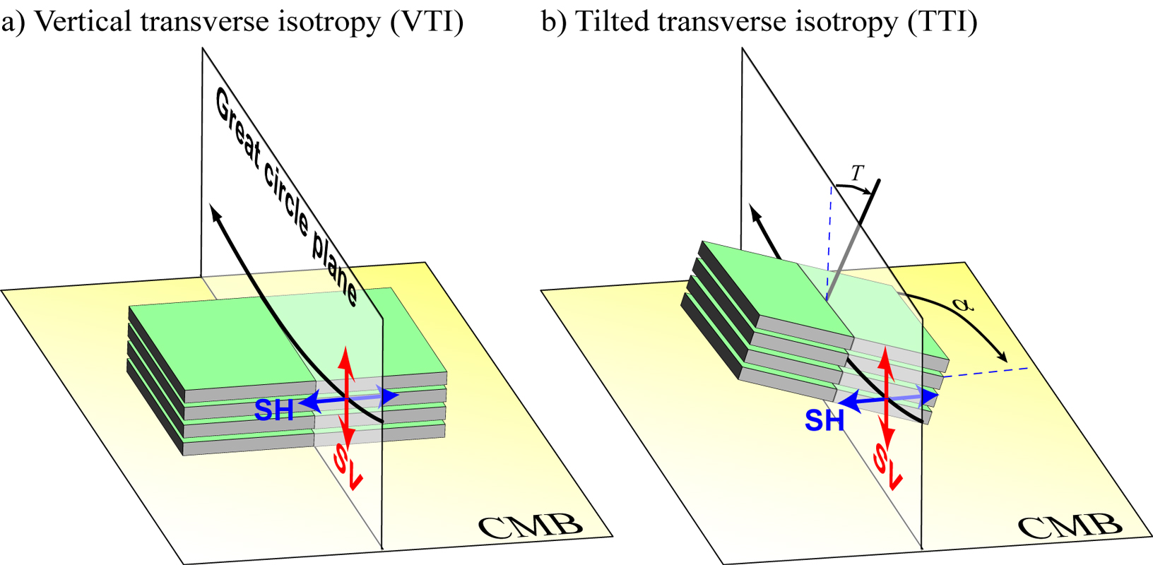
One form of azimuthal anisotropy is a tilt of the axis of symmetry of VTI (vertical transverse isotropy). This is a simple form of azimuthal anisotropy, as only two parameters are needed to describe the geometry (tilt and azimuth). [PDF]
|
|
Some images relating to seismic anisotropy in Earth's interior (return to image directory page)
|
||||
 |
 |
 |
 |
 |
| AI (778 Kb) JPG (265 Kb) | AI (128 Kb) JPG (232 Kb) | AI (5.0 Mb) JPG (421 Kb) | AI (774 Kb) JPG (163 Kb) | AI (214 Kb) JPG (238 Kb) |
|
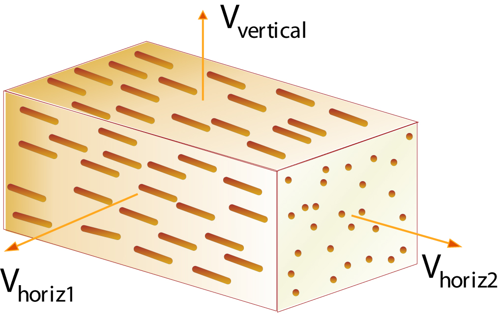
A variety of physical scenarios might give rise to either LPO or SPO. Here, we speculate on possibilities that result in waves with particle motion in the horizontal plane propogating faster than waves with vertical particle motion. [PDF]
|
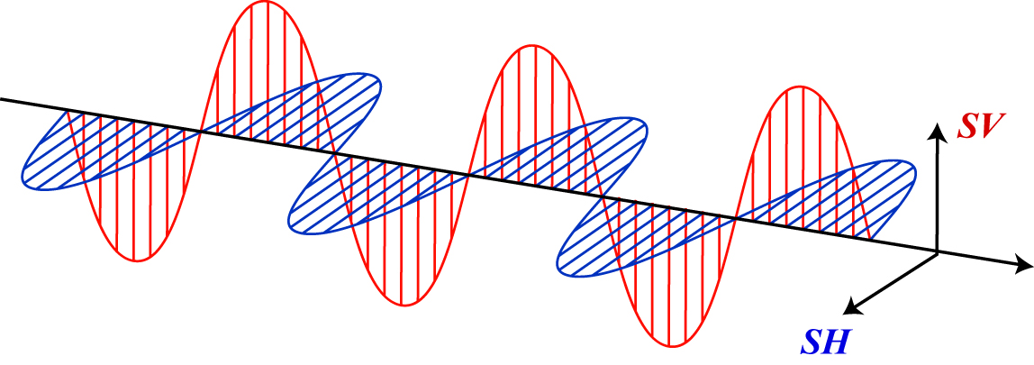
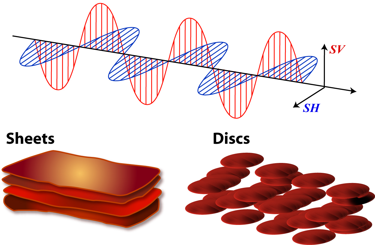
I've always liked the classic diagrams in physics books for electromagnetic waves, so I drew one for SV and SH particle motion.
|
So, why not throw in some fabric? Here we have sheets or flattened bubbles of melt.
|
Just another depiction of flattened spherical inclusions.
|
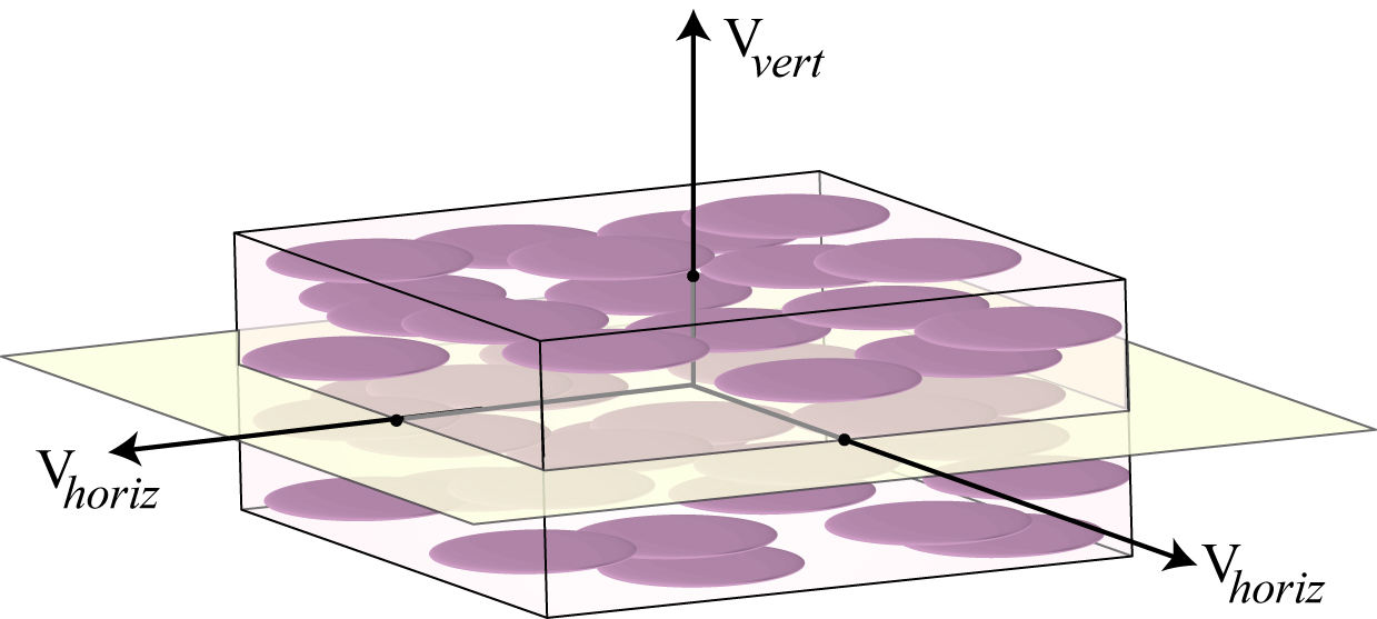
I probably shouldn't admit that I got the idea for this figure from a bar of soap with aligned lavendar pieces.
|
|
Some images relating to seismic anisotropy in Earth's interior (return to image directory page)
|
||||
 |
 |
 |
 |
 |
| AI (231 Kb) JPG (220 Kb) | AI (180 Kb) JPG (201 Kb) | AI (389 Kb) JPG (154 Kb) | PSD (16Mb) JPG (203 Kb) | JPG (486 Kb) |
|
Characterizing anisotropy is important, as it might one day permit us to map out dynamical flow in the lower mantle.
|
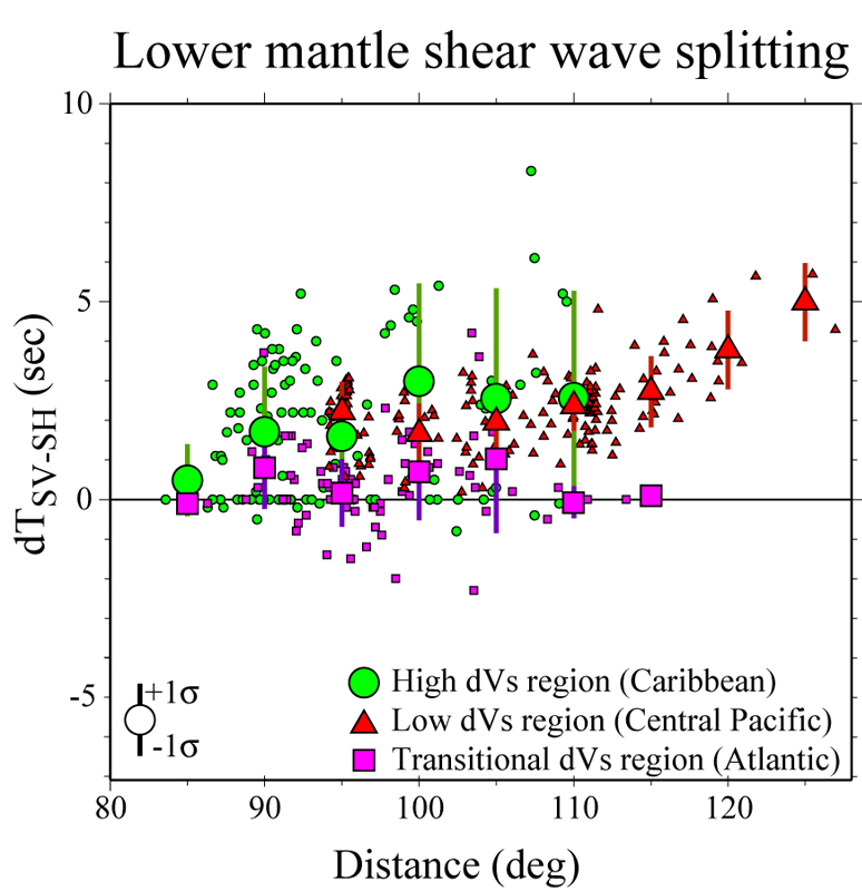
Travel times between the SV and SH components of motion of S and Sdiff waves are plotted versus epicentral distance. Larger symbols are distance bin averages. The down and upwelling regions show strong splitting, but a region presumably between up and down motions lacks strong splitting. [PDF]
|
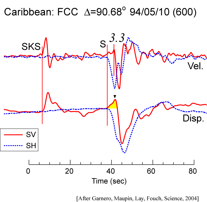
In measuring shear wave splitting, it is important to note that it may matter if you measure splits on the velocity (top) or displacement (bottom) traces -- here we show that velocity traces obscure the important SV waveform onset (yellow) used to map azimuthal anisotropy. [PDF]
|
I'm the first to admit this figure is a little overboard. Oh well, I was trying to get a certain journal to put it on their cover (unsuccesfully...). It shows a D" discontinuity (blue) underlain by a mid-D" layer (such as an exit from post-perovskite phase), and the CMB. Throw in some ULVZ melt for fun (red). [PDF]
|
In this figure I was trying to emphasize that D" is subject to the whims of the overlying mantle: subduction currents can induce topography. Speak french? This is from La Recherche, (#382, Jan 2005) JPG (437 Kb). Obviously, real artists make much prettier pictures. [PDF]
|
|
Introduction to seismology images (return to image directory page)
|
||||
 |
 |
 |
 |
 |
| JPG (210 Kb) | JPG (183 Kb) | JPG (257 Kb) | JPG (166 Kb) | JPG (275 Kb) |
|
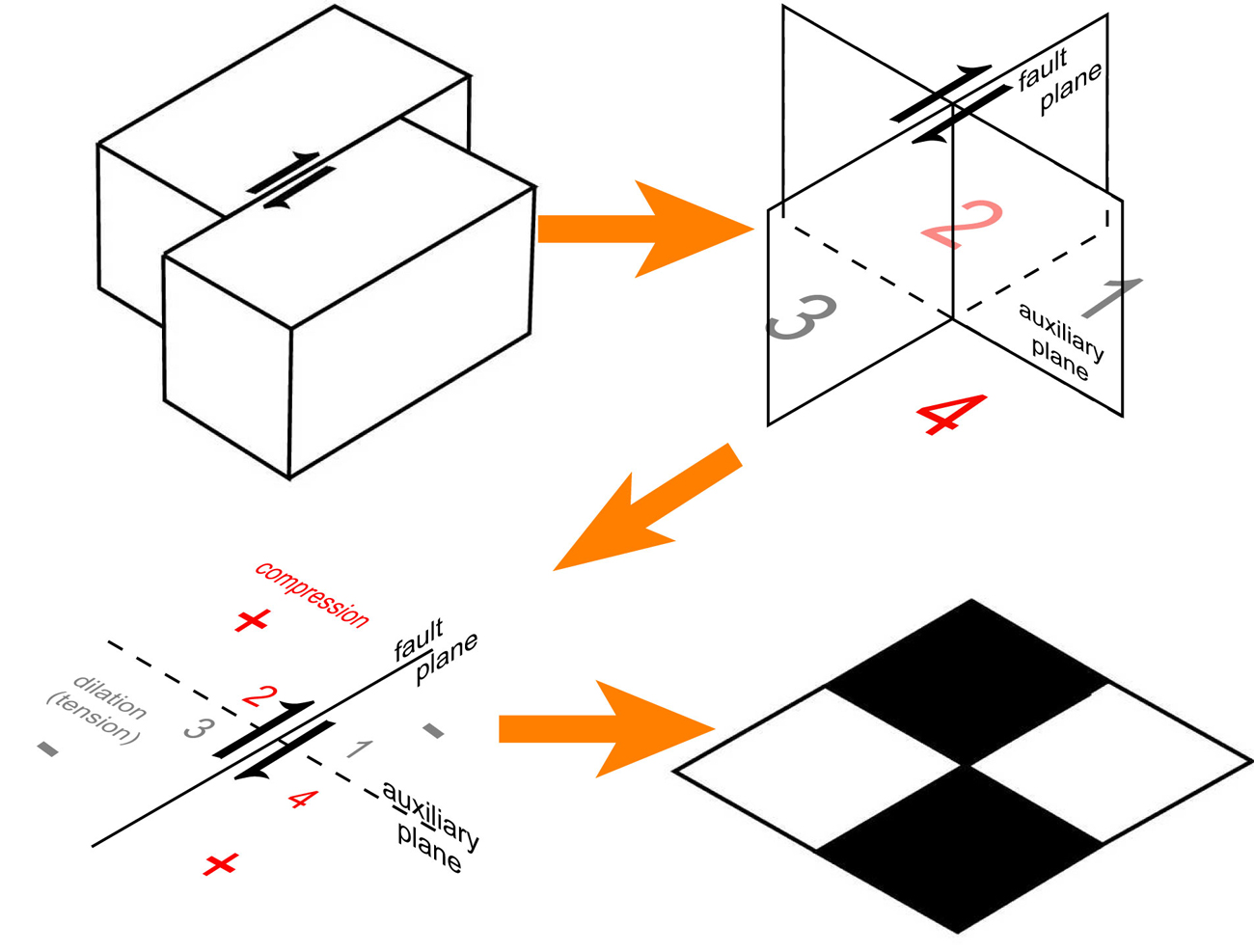
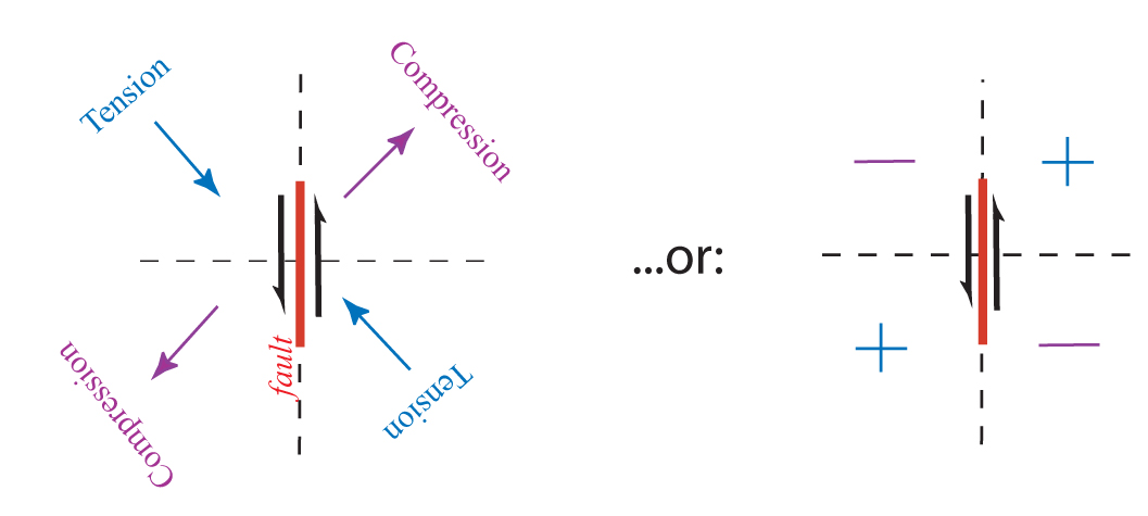
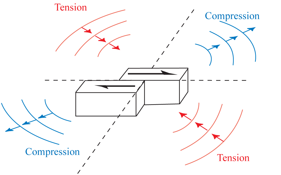
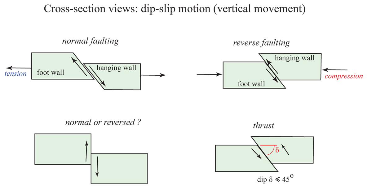
Strike-slip fault and compression and tension patterns seen in the far-field. [Apologies: I somehow lost my original artwork files for these focal mechanism images!]
|
A reverse fault and compression (C) and tension (or, dilatation "D") patterns, and the resulting focal mechanism (red = compression). NOTE: this image and others slightly misrepresent the lower hemisphere projection in the 3D perspective views,; they solely intend to help the viewer see the lower hemisphere projection of the "beachball" which is usually first incorrectly interpreted by students to pop out of the page.
|
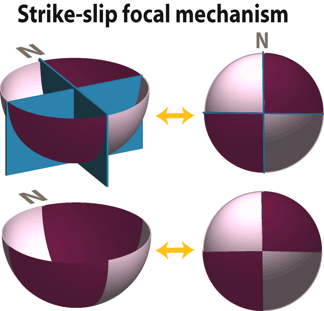
More views of a pure strike slip mechanism. NOTE: on this page I am showing focal mechanism information for the P-wave field. See also:
FOCAL MECHANISM and FOCAL MECHANISM PRIMER |
Strike-slip again, this time with blocks and planes. See also:
FAULT BLOCK FAULT TYPES |
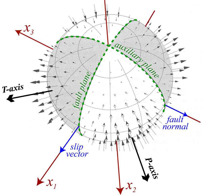
This modifies what I think is the coolest image out of Peter Shearer's book, Introduction to Seismology, a must buy if you don't have it. Here, we view the whole focal sphere. I've drawn in the possible fault and auxiliary plane, and P and T axes, coordinate system, etc. Did he do this in GMT?
|
|
Introduction to seismology images (return to image directory page)
|
||||
 |
 |
 |
 |
 |
| JPG (279 Kb) | AI (147 Kb) JPG (72 Kb) | AI (149 Kb) JPG (138 Kb) | AI (125 Kb) JPG (69 Kb) | AI (149 Kb) JPG (64 Kb) |
|
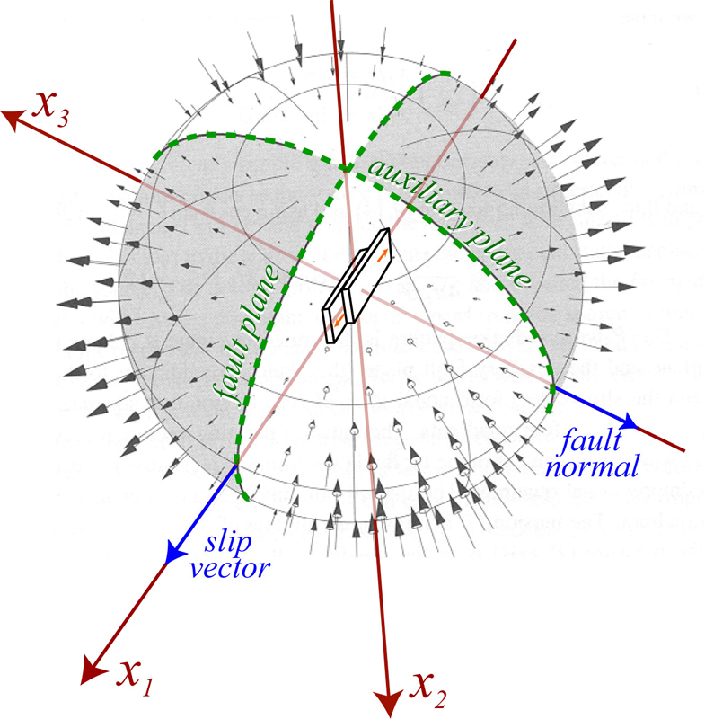
Again, doctoring up Peter's image, but this time, in the style of Hiroo Kanimori's old lecture notes, I put a mini-fault blocks slipping in the center of the sphere that could give rise to this amplitude field.
|
More on slip at the fault and compression or dilatation that we see in the far field.
|
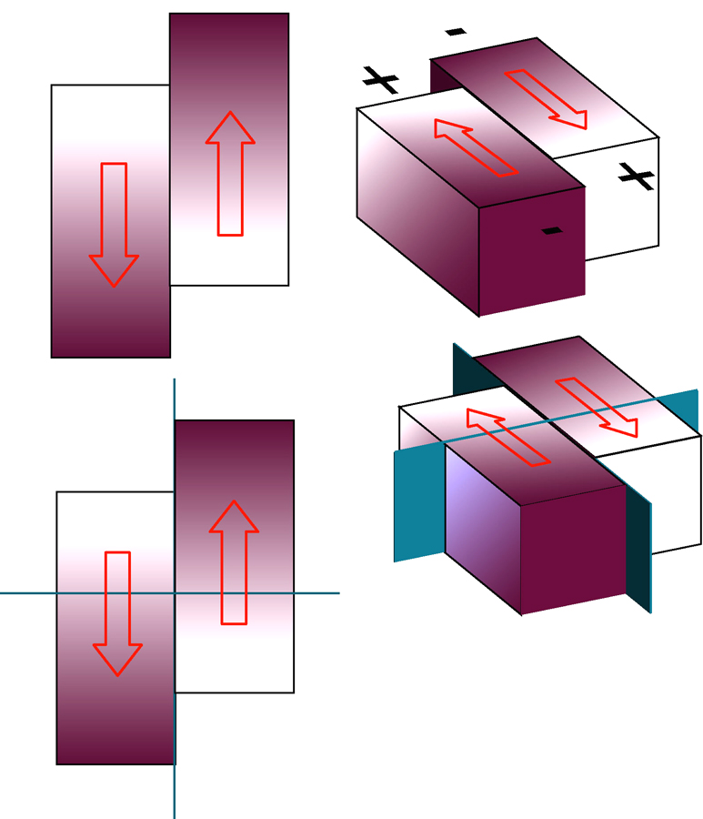
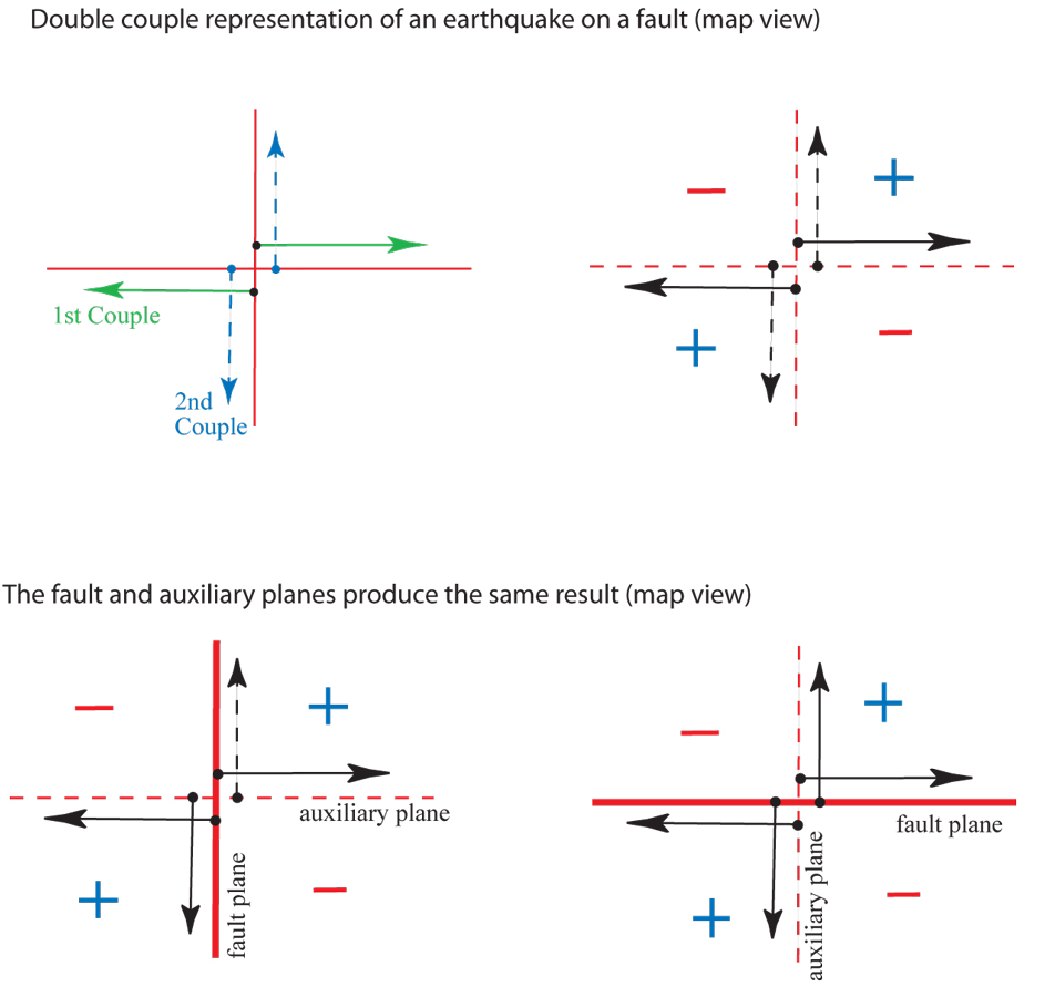
This is a "double couple" representation of slip on a fault. ...that is, a double force couple. Here we should that the fault plane has two possible positions which give the same far-field motions.
|
More on the double couple representation, from fault blocks to the two pairs of force couples.
|
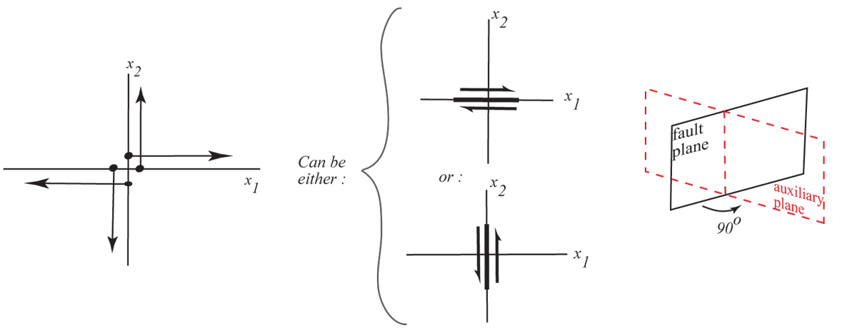
I know, these get redundant. Oh well. This defines the fault and auxiliary planes.
|
|
Introduction to seismology images (return to image directory page)
|
||||
 |
 |
 |
 |
|
| AI (138 Kb) JPG (162 Kb) | AI (162 Kb) JPG (132 Kb) | AI (176 Kb) JPG (96 Kb) | AI (211 Kb) JPG (215 Kb) | AI (184 Kb) JPG (186 Kb) |
|
Just another graphical representation of what happens in the far-field.
|
Motions in the far-field vary as a function of distance to the nodal planes (fault and auxiliary planes) in a systematic fashion.
|
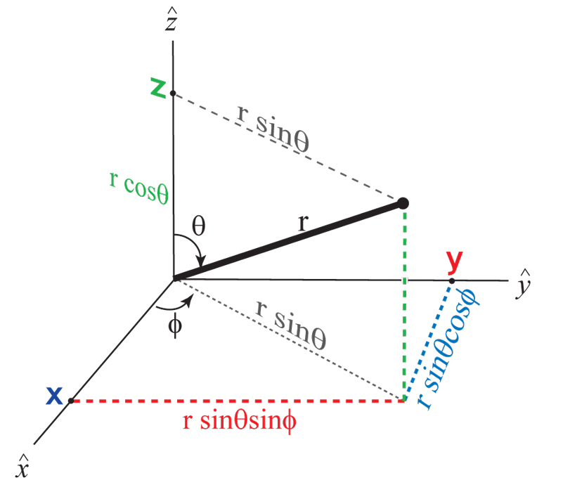
Seismologists often go between coordinate systems (Cartesian to Spherical, etc.). This image is pretty basic, but perhaps useful for teaching. I know... it is also out of place.
|
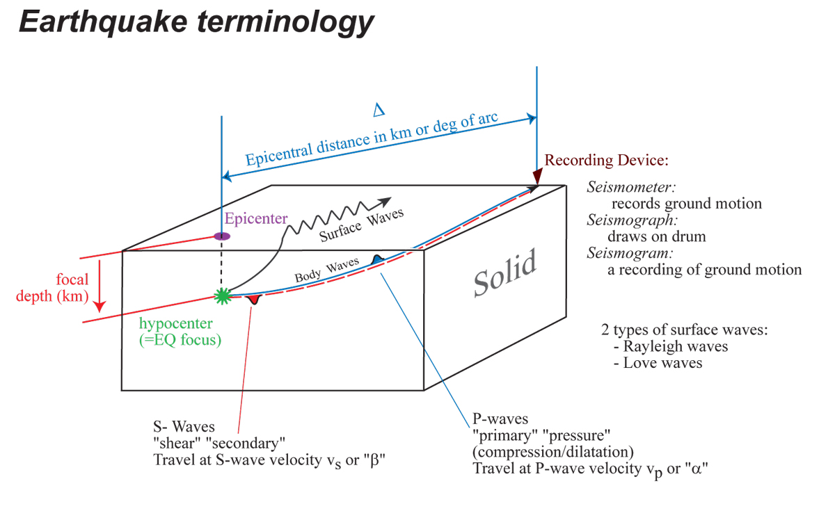
Here are some really general earthquake terms defined.
|
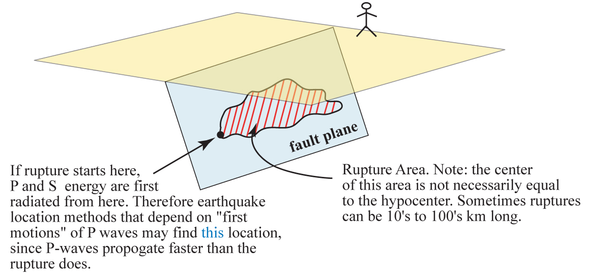
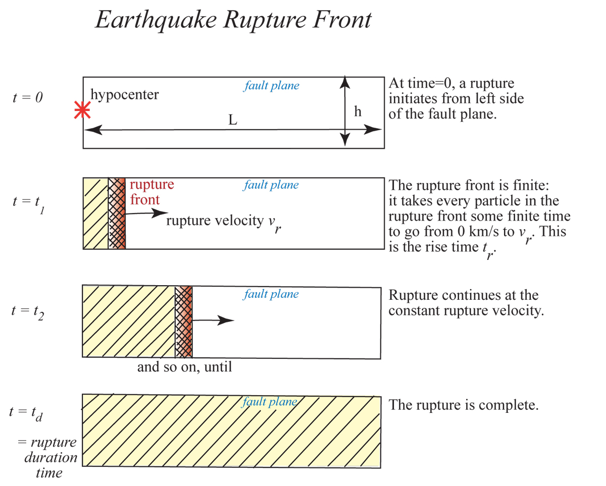
Here, the concept of rupture area, plane, and initiation are introduced. See also:
EARTHQUAKES |
|
Introduction to seismology images (return to image directory page)
|
||||
 |
 |
 |
 |
 |
| AI (150 Kb) JPG (122 Kb) | AI (164 Kb) JPG (126 Kb) | AI (164 Kb) JPG (193 Kb) | AI (200 Kb) JPG (320 Kb) | AI (116 Kb) JPG (40 Kb) |
|
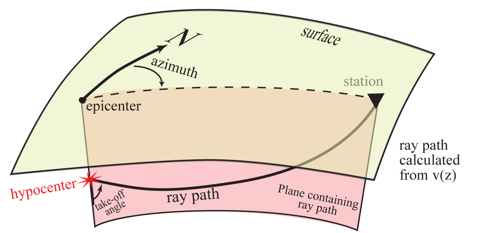
Some path geometry parameters are introduced here.
|
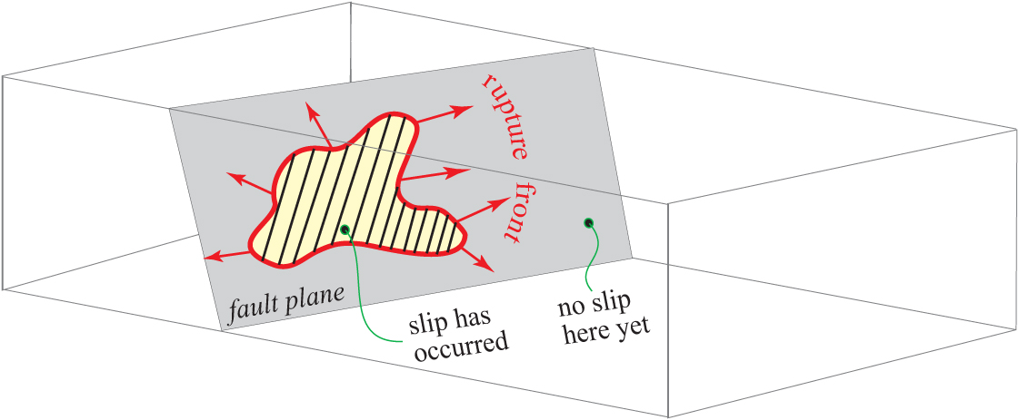
Here we introduce the concept of time during a rupture: it is a dynamic process that starts somewhere, then propagates out from that point. (Keep in mind this is a cartoon of a model of the earthquake process).
|
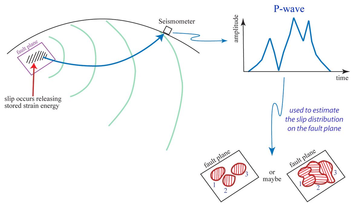
Far away from earthquakes, we have information about the earthquake process in the ground motion we observe. This shows a couple possibilities for the cartoon P-wave motion in the upper right.
|
Here is a depiction of how an area of fault might break.
|
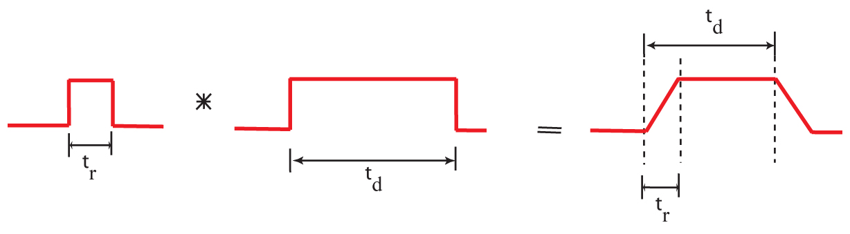
Seismologists frequently use the mathematical operation of convolving two functions together. Ground motion at some distant place from an earthquake can be represented as a convolution of the earthquake source with the "path" operator with the seismic instrument response.
|
|
Introduction to seismology images (return to image directory page)
|
||||
 |
 |
 |
 |
 |
| AI (171 Kb) JPG (113 Kb) | AI (132 Kb) JPG (109 Kb) | AI (264 Kb) JPG (218 Kb) | AI (151 Kb) JPG (235 Kb) | AI (174 Kb) JPG (210 Kb) |
|
Here are some basic definitions of fault types. See also:
FAULT TYPES |
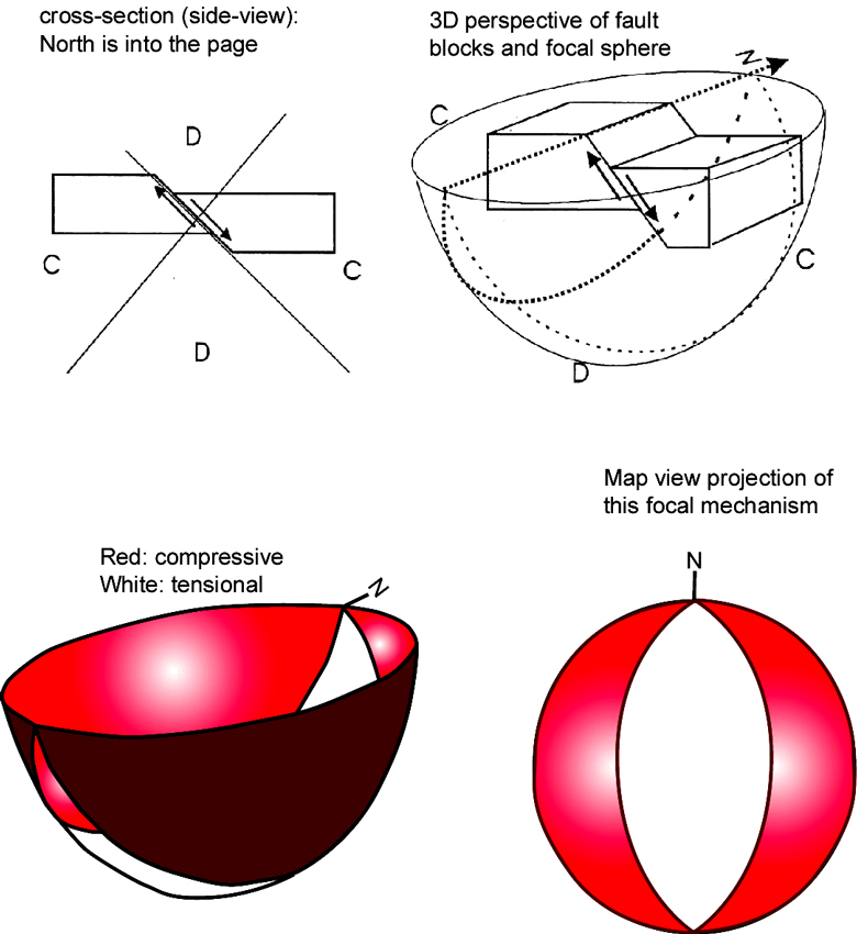
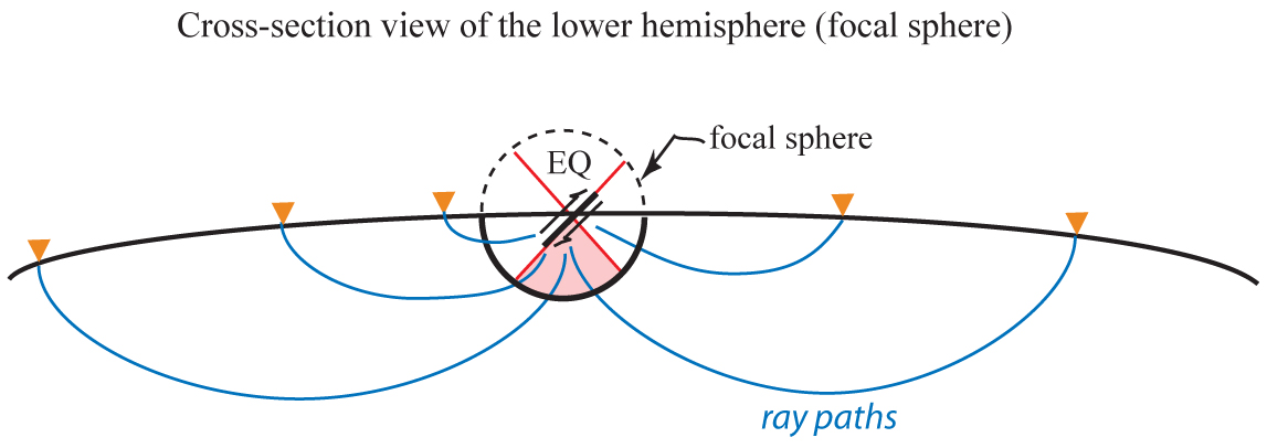
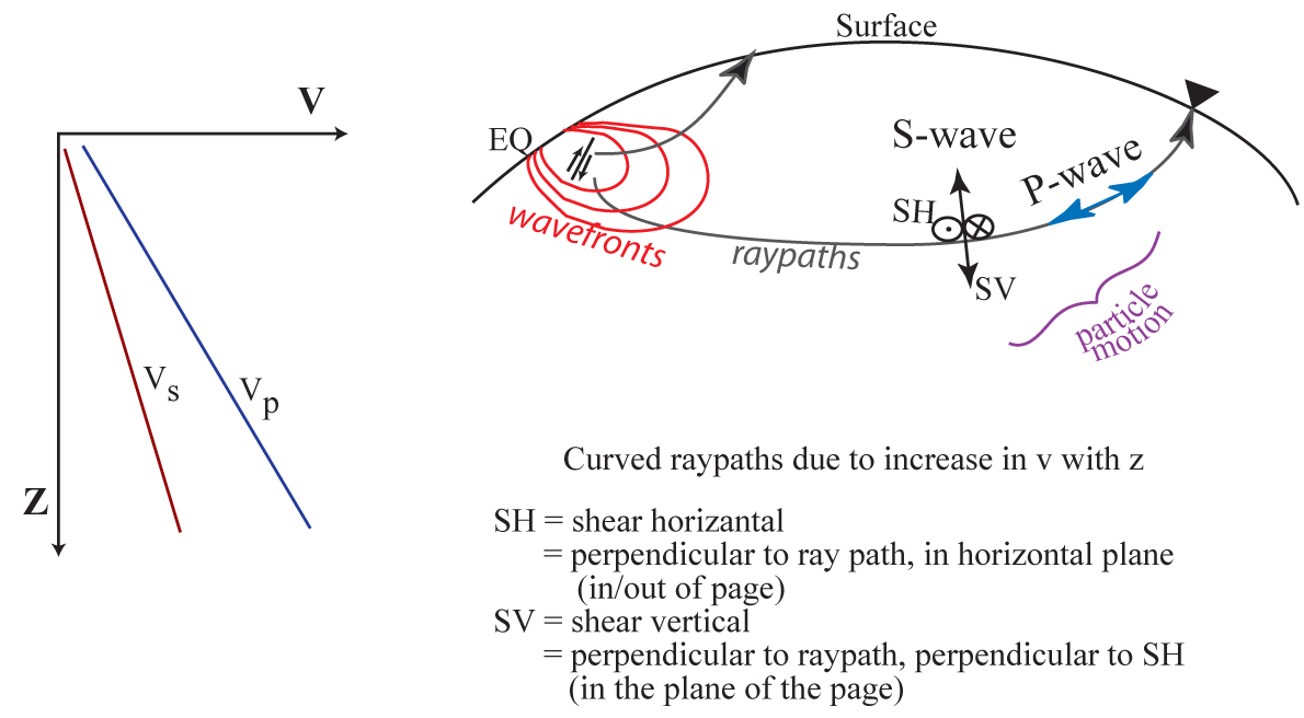
This is a side-view of a lower hemisphere focal mechanism, and shows idealized ray paths leaving the source area to distant recorders. The ray paths are curved because seismic velocity generally increases with depth in the Earth.
|
This cartoon shows one way that seismologists infer seismic velocity heterogeneities in the Earth from observed travel time variations.
|
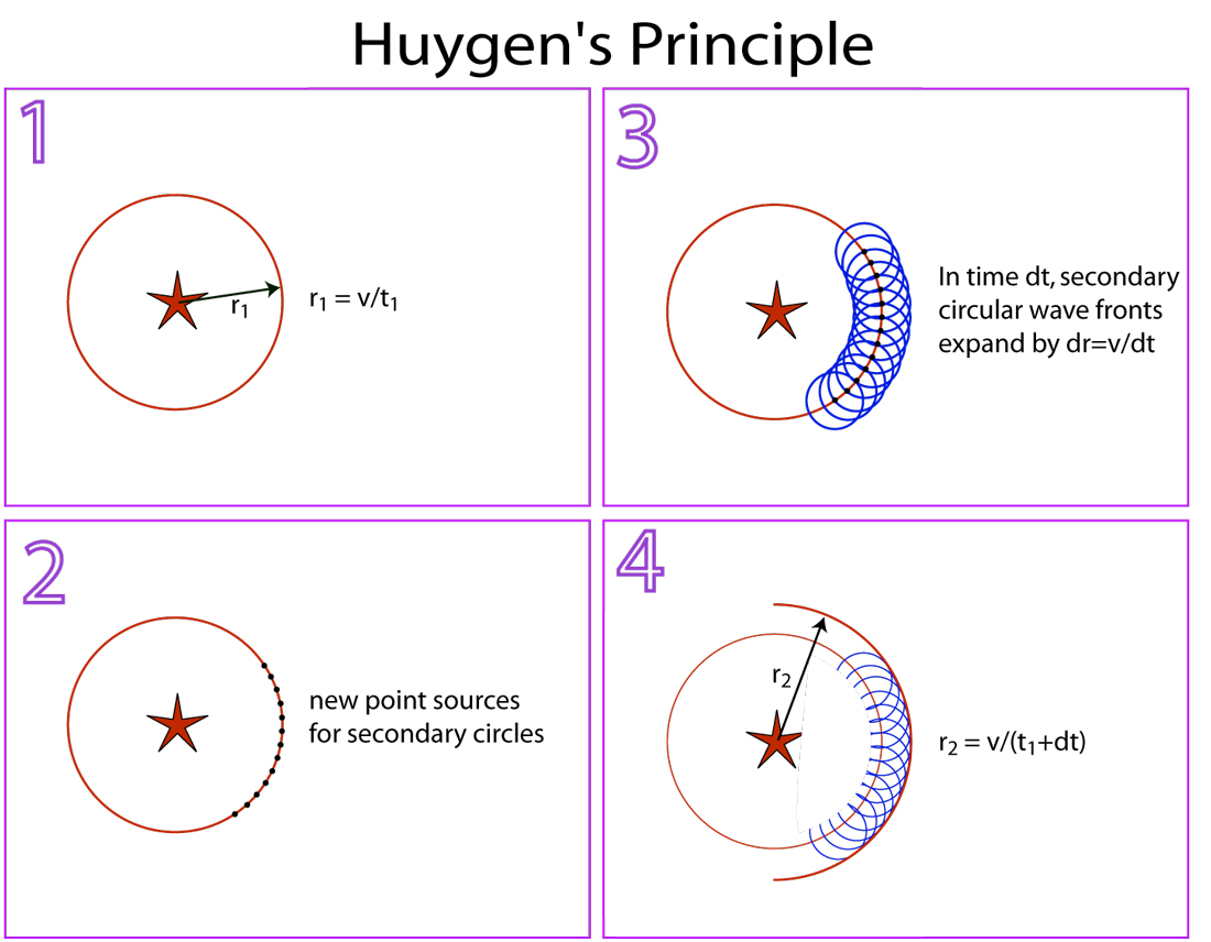
Huygens principle is illustrated here. See also:
HUYGENS-FRESNEL PRINCIPLE |
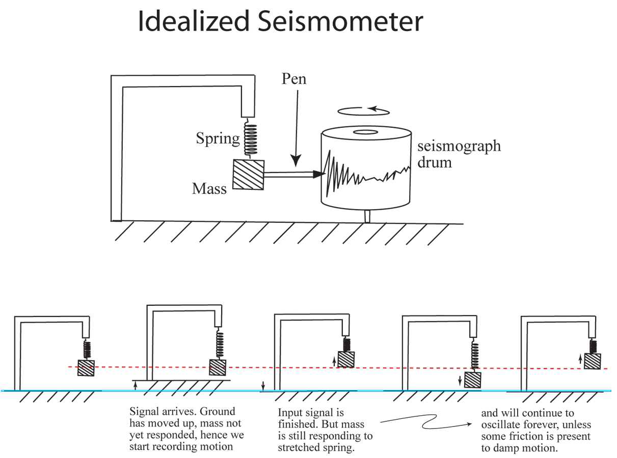
Here I try to illustrate how a seismic recorder, a seismometer, records ground motion. For a nice discussion of seismometers, see:
SEISMOMETER |
|
Introduction to seismology images (return to image directory page)
|
||||
 |
 |
 |
 |
 |
| AI (183 Kb) JPG (129 Kb) | AI (172 Kb) JPG (157 Kb) | AI (213 Kb) JPG (177 Kb) | AI (164 Kb) JPG (97 Kb) | AI (132 Kb) JPG (105 Kb) |
|
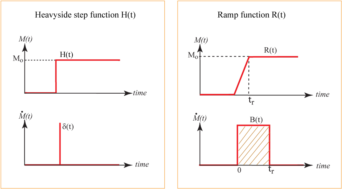
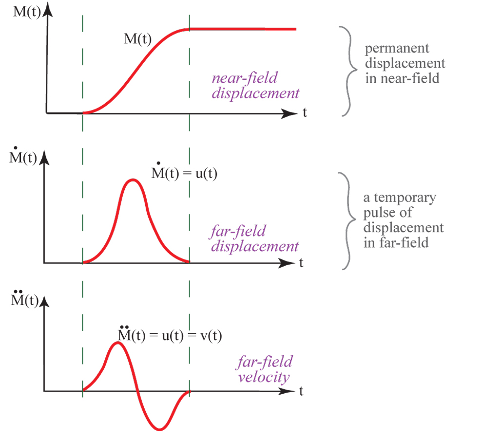
Seismic moment and moment rate functions are shown for the Heavyside and Ramp functions. See also:
SEISMIC MOMENT |
More on seismic moment.
|
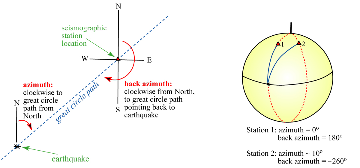
Here we define some orientation terms regarding seismic ray path from the earthquake to the seismometer.
|
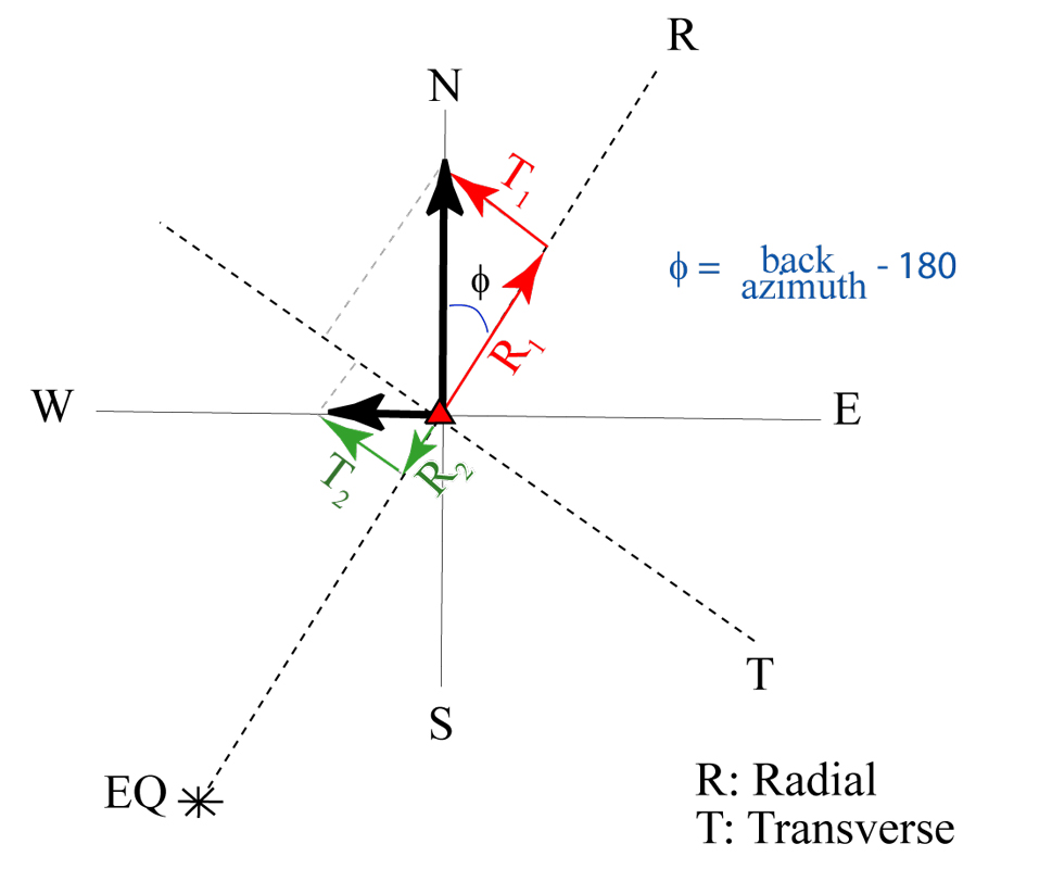
Zooming into the location of the seismometer, we see the projection of the North-South and East-West components of motion onto the great-circle plane (for the radial, or R component) and perpendicular to it, the tangential, or T, component.
|
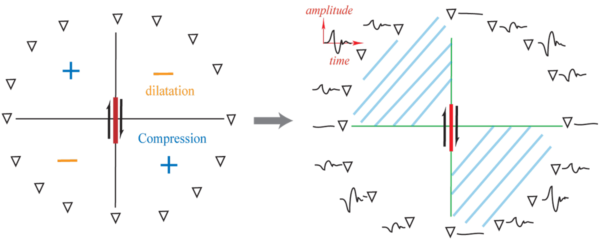
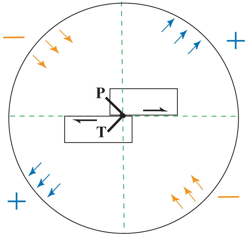
Slip on some fault blocks gives compressiive (blue) and tension (orange) motions in the far-field. Right at the source (in vicinity of slip), Tension (T) and compression (P) are experienced.
|
|
Introduction to seismology images (return to image directory page)
|
||||
 |
 |
 |
 |
 |
| AI (177 Kb) JPG (175 Kb) | AI (187 Kb) JPG (180 Kb) | AI (145 Kb) JPG (119 Kb) | AI (179 Kb) JPG (169 Kb) | AI (176 Kb) JPG (104 Kb) |
|
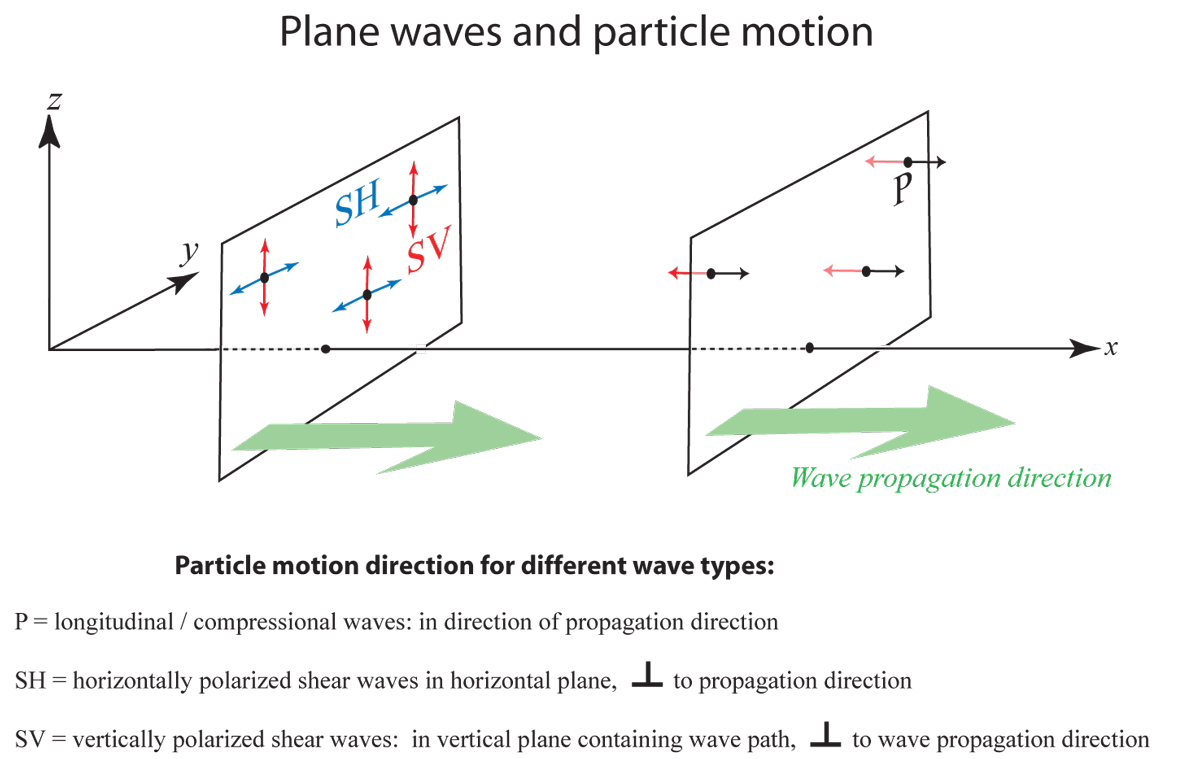
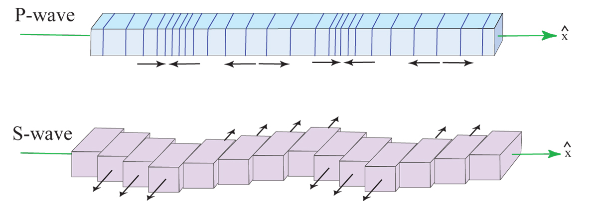
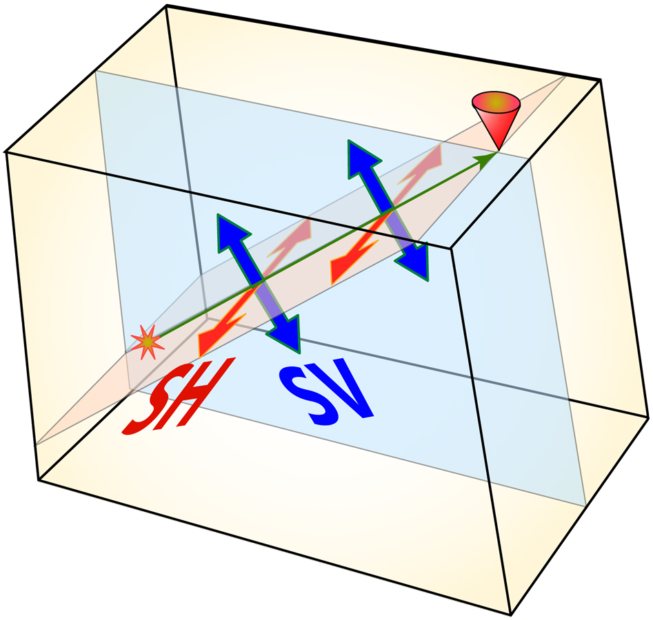
P-wave velocity (Vp) is always greater than S-wave velocity (Vs), hence P-waves arrive first. S-waves are further decomposed into SH and SV motions, which this figure defines.
|
This diagram pretty much shows the same thing as the last one, that is, the particle motion of some point as a P or SH or SV wave passed through that point.
|
This is my version of the kind of image you find in a geology 101 textbook. The P-wave and S-wave (SH, actually) vibrate rock in specific directions depending on the wave propagation direction.
|
The main reason for separately studying SV and SH waves, is that if the medium is anisotropic, that is, seismic properties depend on propagation direction, then SH and SV will travel at different speeds.
|
I always loved the famous image used in Officer's geophysics book. I redrew some parts of it in this and the next image.
|
|
Introduction to seismology images (return to image directory page)
|
||||
 |
 |
 |
 |
 |
| AI (187 Kb) JPG (90 Kb) | AI (186 Kb) JPG (195 Kb) | AI (159 Kb) JPG (69 Kb) | AI (182 Kb) JPG (214 Kb) | AI (181 Kb) JPG (181 Kb) |
|
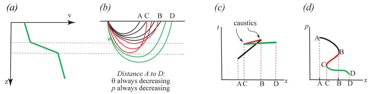
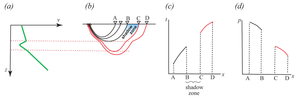
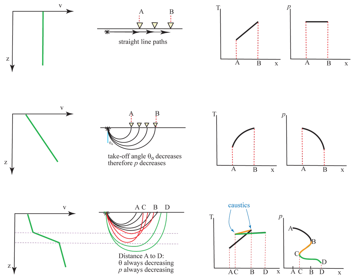
A low velocity zone results in a shadow zone (a region where no energy is transmitted to).
|
More of the same, but showing a few options all on the same figure.
|
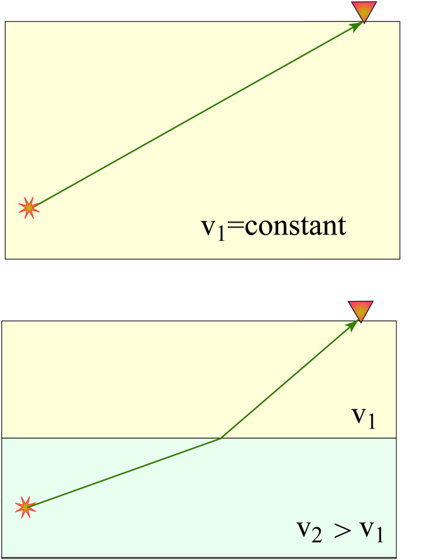
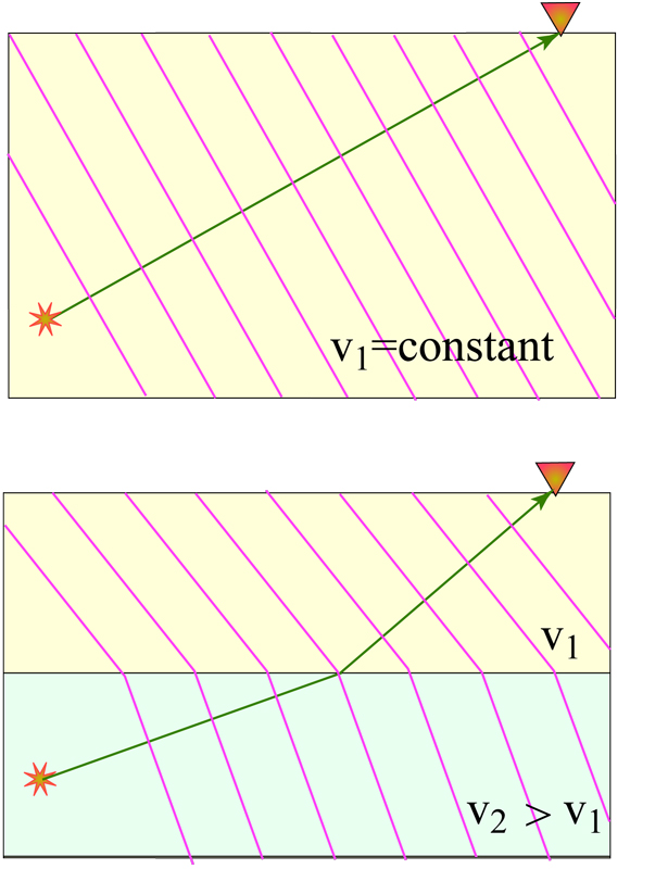
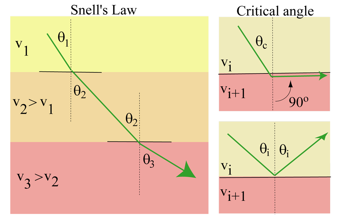
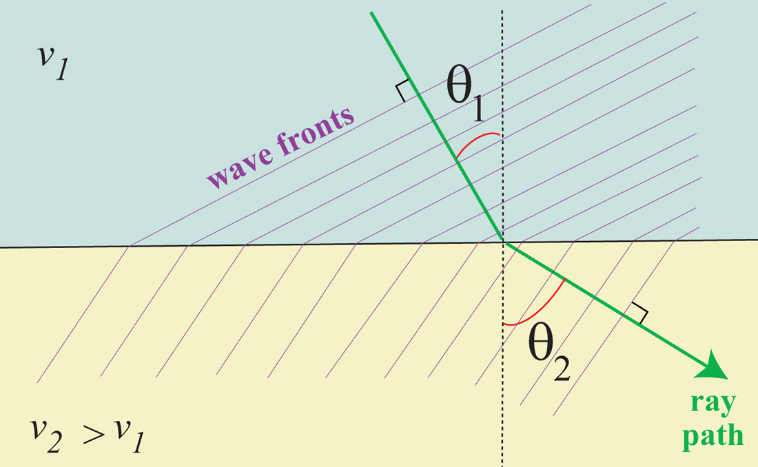
This is the simplest of my Snell's Law images. Snell's Law refers to how the seismic ray path (i.e., the normal to the wavefront) bends as you cross from one medium to another, according to the angle of approach and a ratio of the velocities.
|
Here we've just added the plane wavefronts. See also:
SNELL'S LAW REFRACTION |
There is an angle, the critical angle, that defines the steepest incident angle that allows for transmission into the lower medium. It makes a wave called a head wave that travels along the interface
|
|
Introduction to seismology images (return to image directory page)
|
||||
 |
 |
 |
 |
 |
| AI (183 Kb) JPG (152 Kb) | AI (265 Kb) JPG (314 Kb) | AI (211 Kb) JPG (227 Kb) | AI (189 Kb) JPG (111 Kb) | AI (170 Kb) JPG (147 Kb) |
|
Simply another image emphasizing Snell's law and refraction of a wave through a layered medium, in Cartesian coordinates. Here's an animation of it: GIF (40 Kb)
|
Okay, this is overkill. Whatever. Maybe someone will find it useful...
|
This is a LOT like the image in the row above, except the wave is traveling downwards.
|
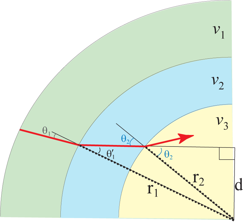
Snell's law is used in Spherical Coordinates also.
|
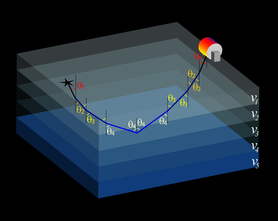
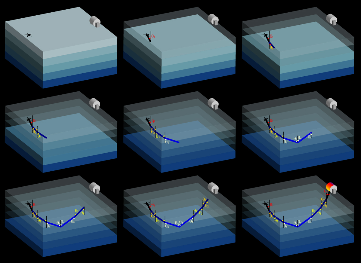
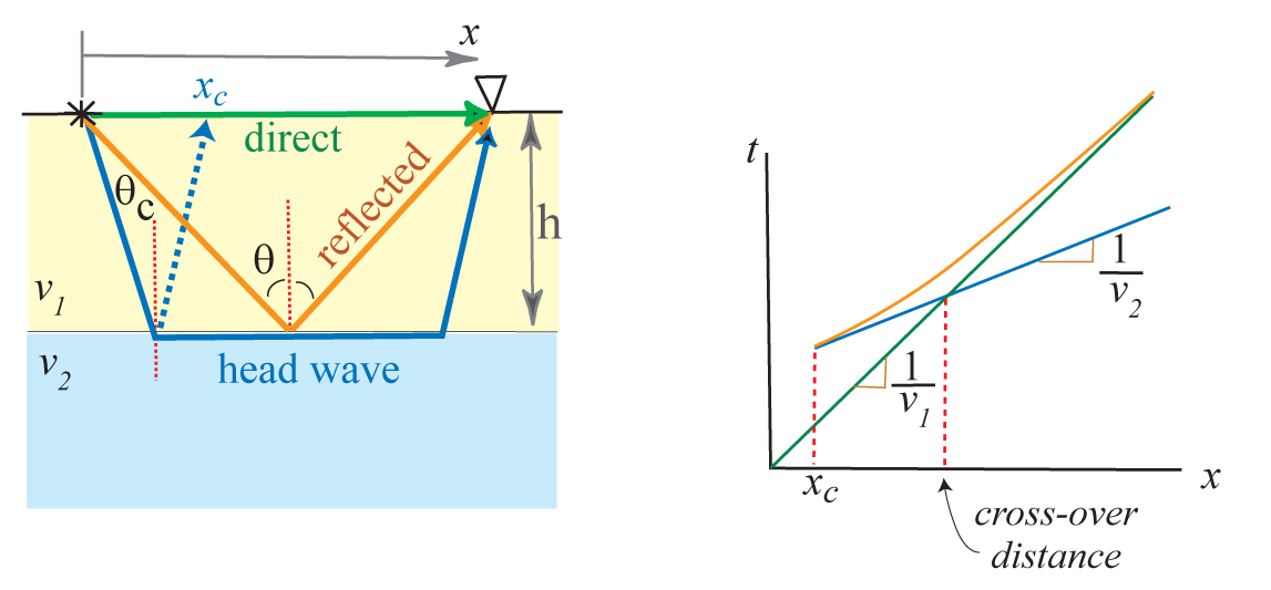
A layer on top of a higher velocity material results in 3 possible wave types, shown on the left, and in travel time we have 3 corresponding lines (or "branches") that together are called a triplication.
|
|
Introduction to seismology images (return to image directory page)
|
||||
 |
 |
 |
 |
 |
| AI (179 Kb) JPG (162 Kb) | AI (157 Kb) JPG (159 Kb) | AI (225 Kb) JPG (232 Kb) | AI (204 Kb) JPG (90 Kb) | AI (163 Kb) JPG (77 Kb) |
|
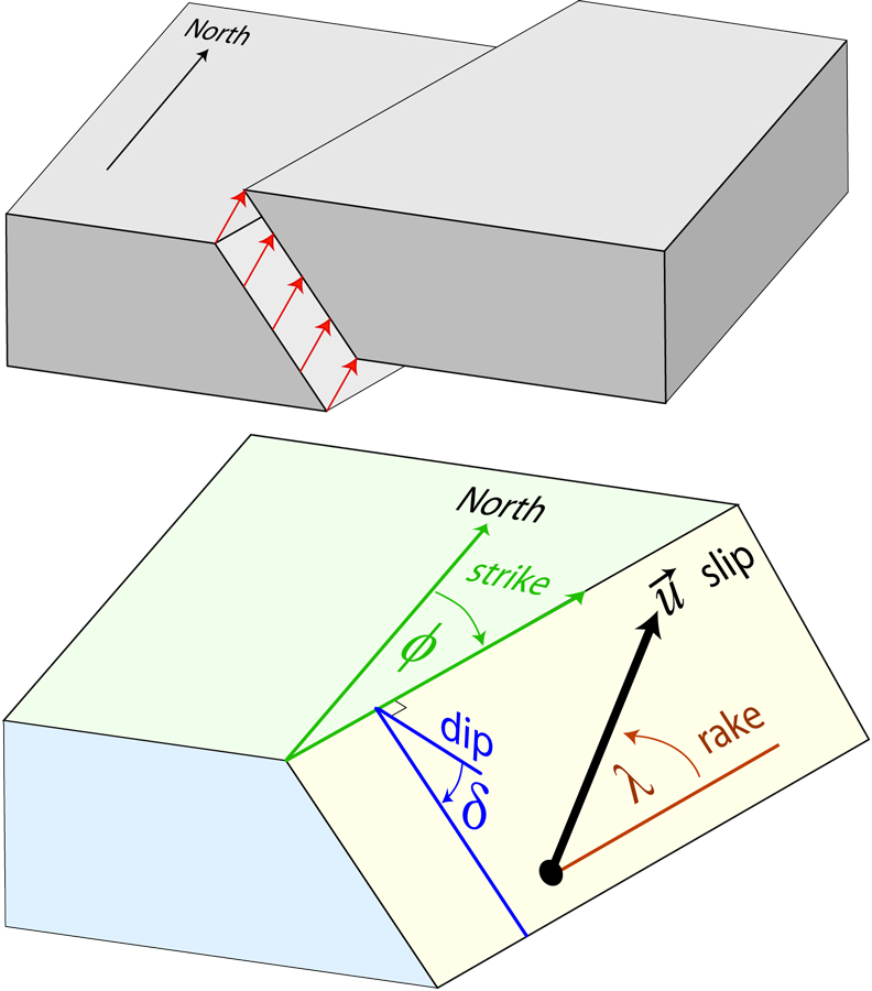
Here we define strike. dip, rake, and slip, in the so-called Aki & Richards convention. These terms fully define slip on a fault plane of some geometry.
|
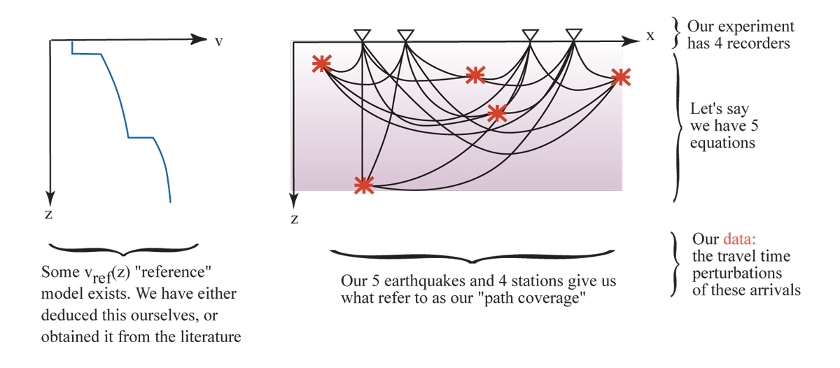
Seismic Tomography is the field that concerns itself with inverting lots and lots of seismic data to yield an image of the interior. To do this propertly, we need lots of earthquakes and lots of recorders.
|
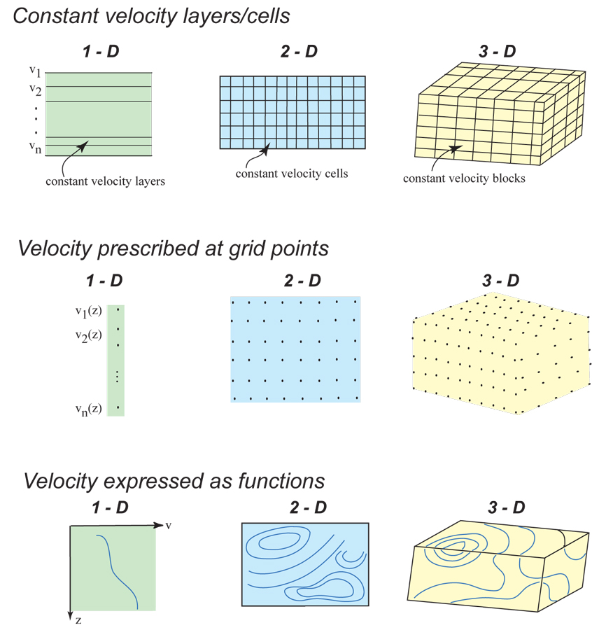
The seismic tomography has to decide ahead of time how to set up the problem. This image shows several possibilities. Here's a PowerPoint file that illustrates the tomographic method using ultrasound PPT (575 Kb)
|
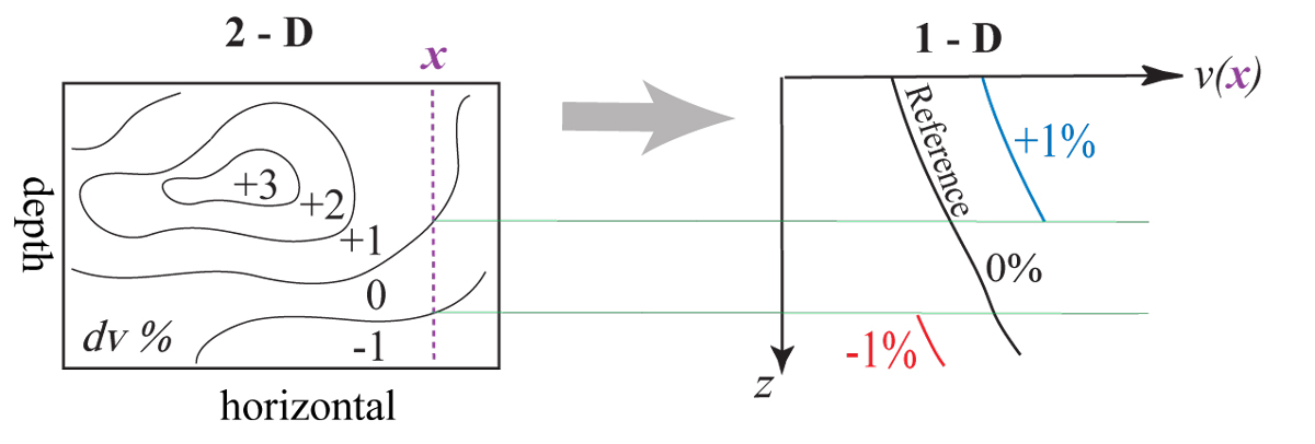
Here we look at a 2D cross-section with some velocity model (imagined to be from tomography), and how we interpret a 1D velocity-depth slice.
|
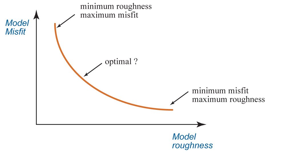
As with any inversion problem in mathematics, there are strong trade-offs. This image is meant to illustrate the classic trade-off between model roughness and misfit.
|
|
Introduction to seismology images (return to image directory page)
|
||||
 |
 |
 |
 |
 |
| AI (181 Kb) JPG (89 Kb) | AI (211 Kb) JPG (230 Kb) | AI (155 Kb) JPG (251 Kb) | AI (194 Kb) JPG (294 Kb) | AI (161 Kb) JPG (251 Kb) |
|
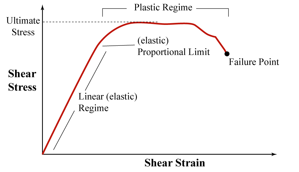
Stress and resulting strain is depicted for some medium. Most of seismology concerns itself in the linear part of the curve.
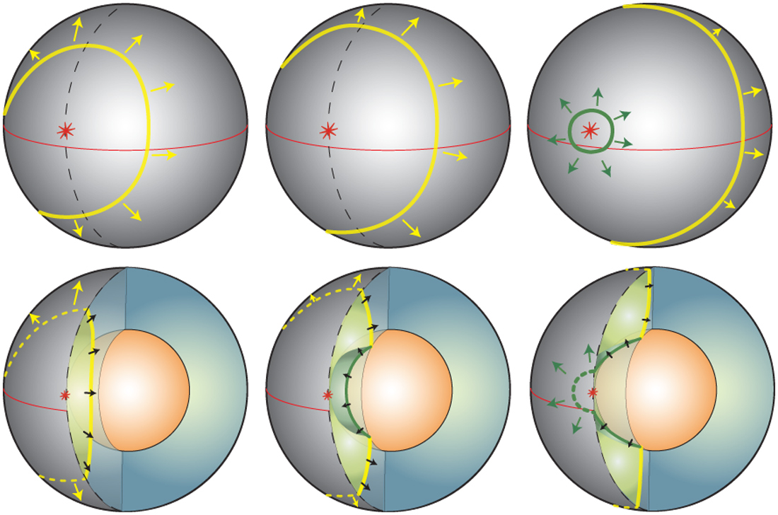
|
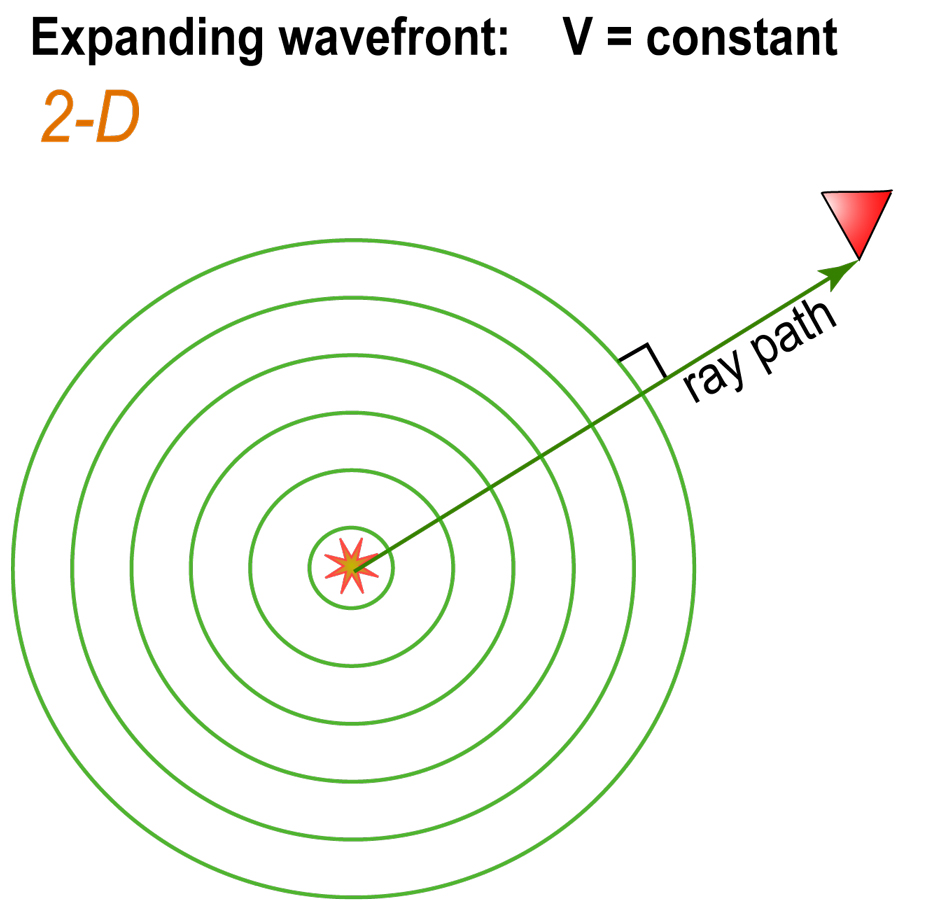
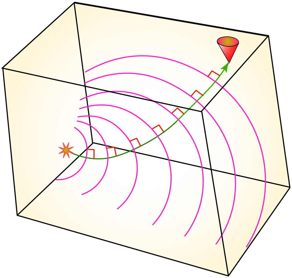
Yes, this is a "starting at square 1" image, to define the ray path as a normal to the wave front (circular in this case).
|
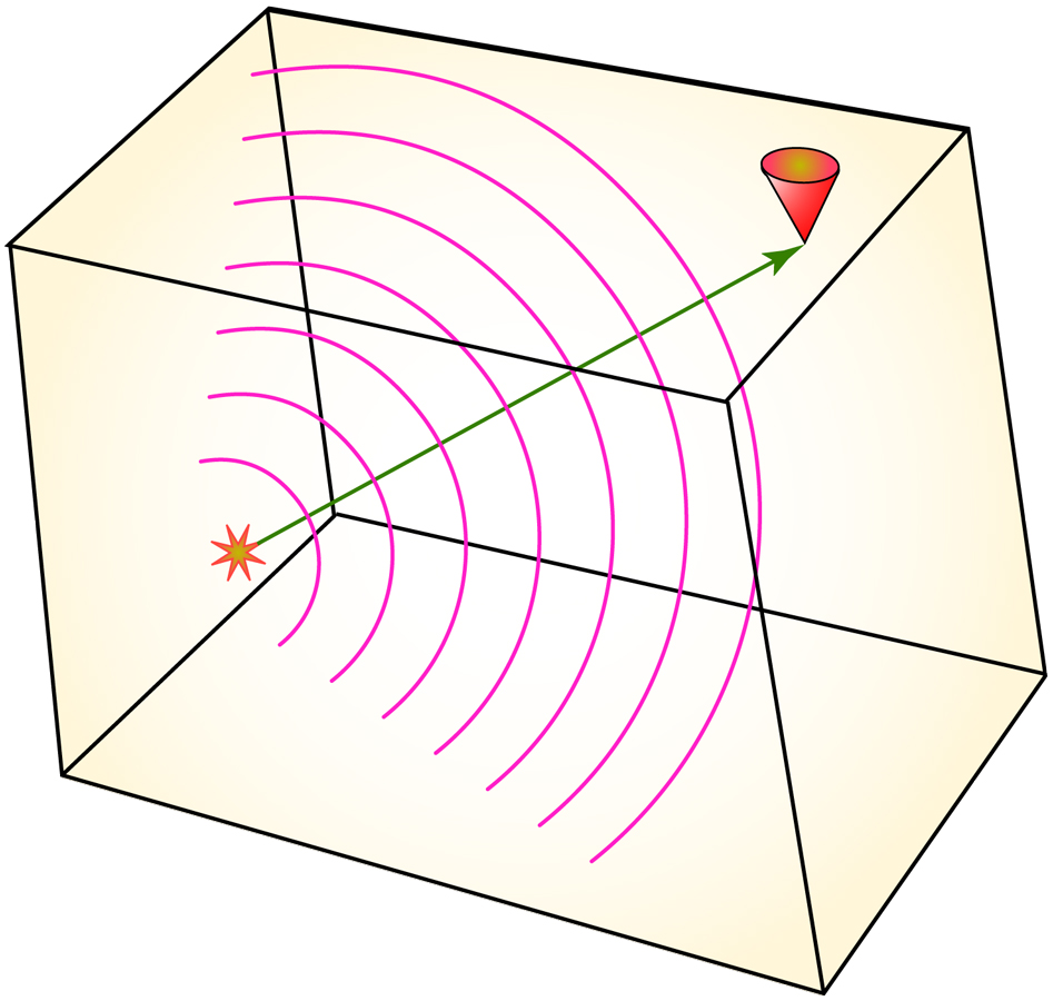
Same thing as the last figure, but in a constant velocity box.
|
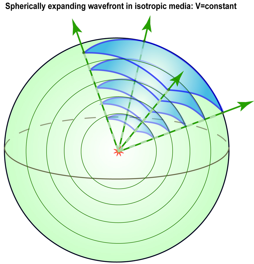
I'm scratching my head wondering why I made this figure. I think it was to illustrate geometric spreading (since the same cone of energy fills an increasing area, you get diminishing amplitudes).
|
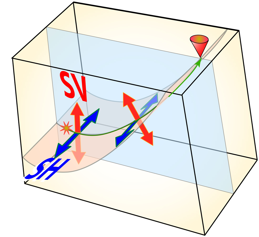
This should be about 4 rows up... Anyway, we see the SH and SV particle motion directions for a constant velocity medium.
|
|
Introduction to seismology images (return to image directory page)
|
||||
 |
 |
 |
 |
 |
| AI (143 Kb) JPG (251 Kb) | AI (150 Kb) JPG (246 Kb) | AI (200 Kb) JPG (144 Kb) | AI (643 Kb) JPG (262 Kb) | JPG (210 Kb) |
|
In this box, the velocity increases with depth. This results in a distortion of the expanding spherical wavefronts, and hence the "ray path", i.e., the normal to the wavefronts, is bent.
|
Much like the last image in the row above, except the velocity is increasing with depth.
|
Here is my "wave basics" image. It is essentially a redrawing from an image in Bruce Bolt's intro book "Inside the Earth". My very 1st geophysics class was from Bolt, and about a week into it, I changed my major from geology to geophysics!
|
Just in case someone has trouble visualizing a wave front as expanding spheres, I made this image. Though I can't imagine there being such a person. Or maybe this was during my phase of making drink cups from old coconut shells for Helmberger's group meetings.
|
Mantle, outer core, inner core? Other than the inner core being too big, it's not too bad, eh?
|
|
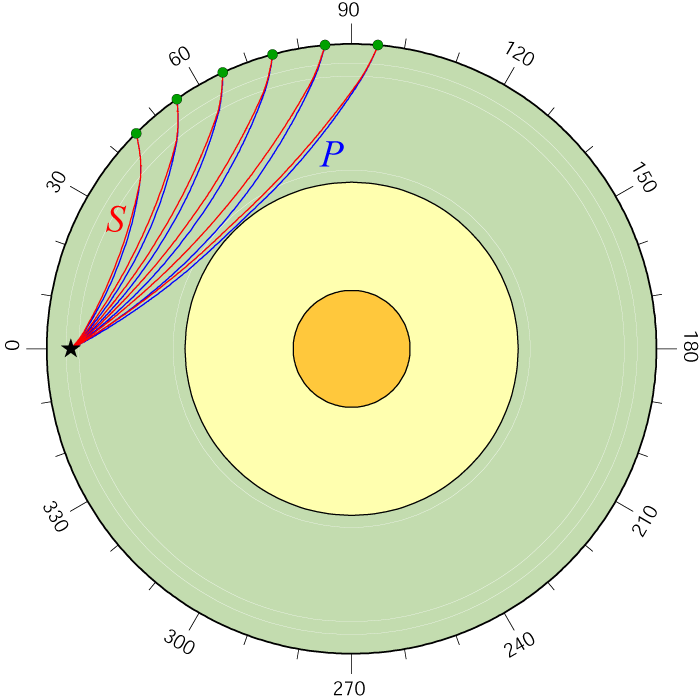
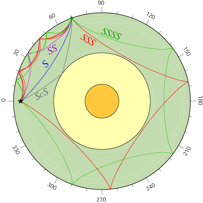
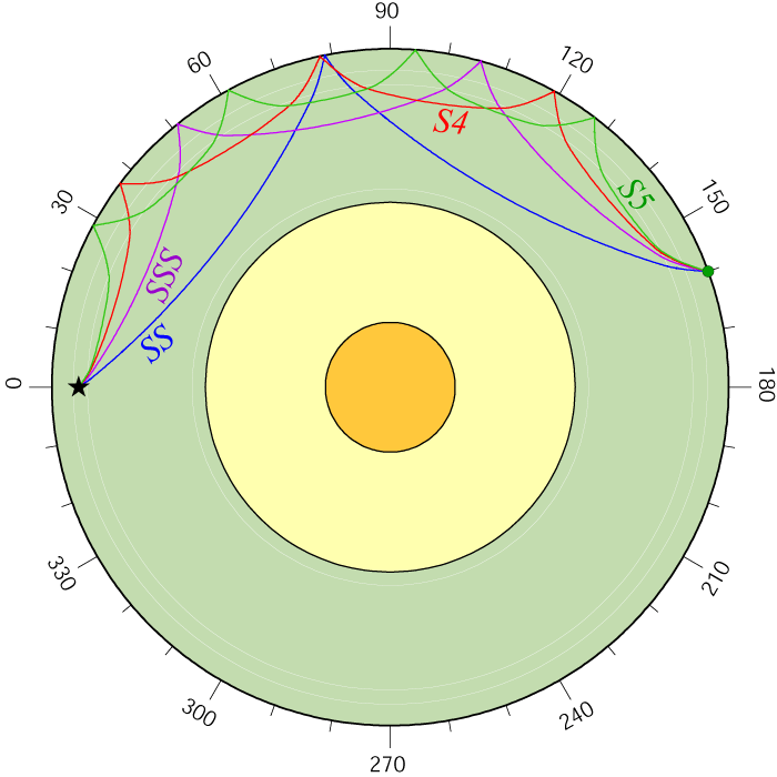
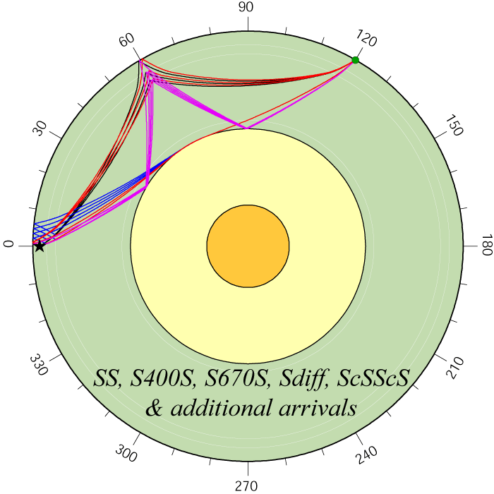
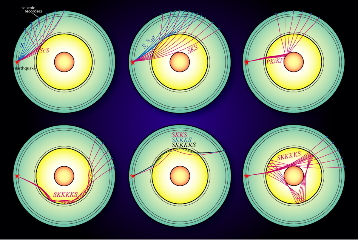
These plots show the paths of various seismic waves that can be used to study Earth's interior (return to image directory page)
NOTES: GIF gives a GIF format image of the AI plot (or click image) |
||||
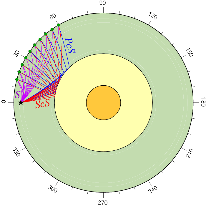
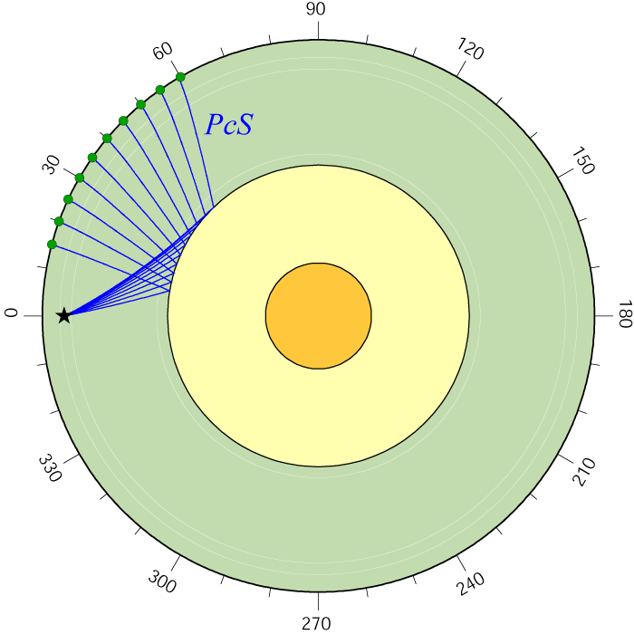
| P PcP | S ScS | ScP PcP P | PcS ScS S | PcS |
 |
 |
 |
 |
 |
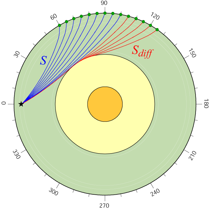
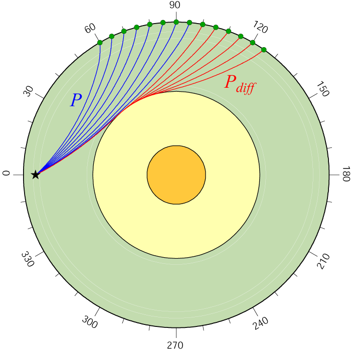
| ScP | ScP PcS | S Sdiff | P Pdiff | S P |
 |
 |
 |
 |
 |
| S SS S3 S4 ScS | SS | S3 | S4 | SS S3 S4 S5 |
 |
 |
 |
 |
 |
| SS S400S S600S | SS etc | ScSn | SKS | SKS S Sdiff |
 |
 |
 |
 |
 |
|
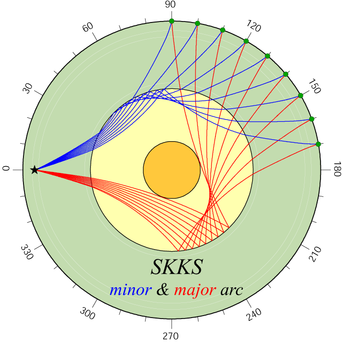
SKS SKiKS
|
SKKS
|
SKKS
|
SKKS
|
S3KS
|
 |
 |
 |
 |
 |
|
S3KS
|
S3KS
|
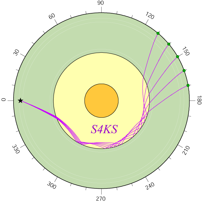
S4KS
|
S4KS
|
S4KS
|
 |
 |
 |
 |
 |
|
S4KS
|
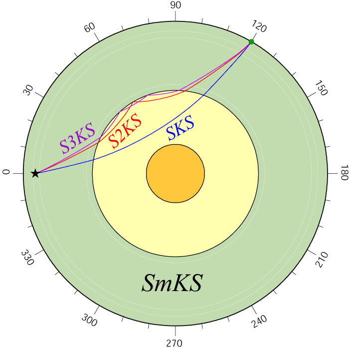
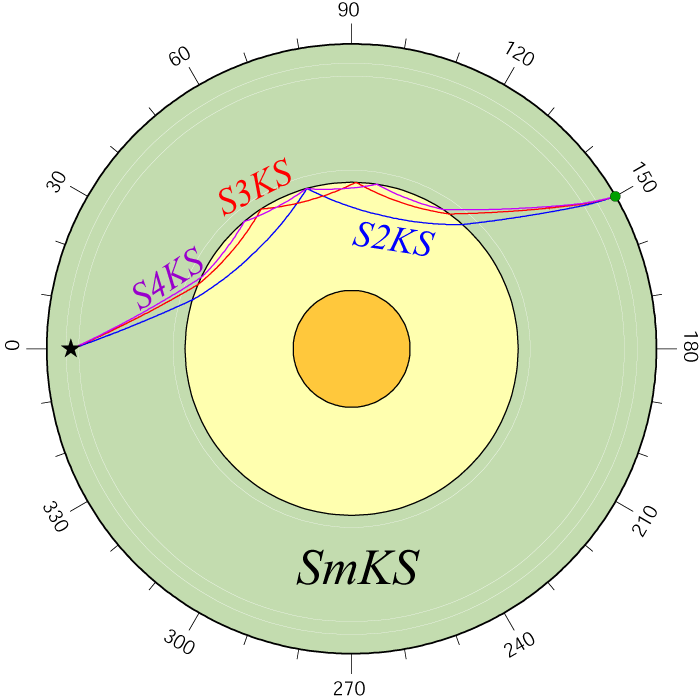
SmKS
|
SmKS
|
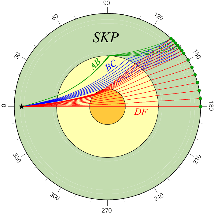
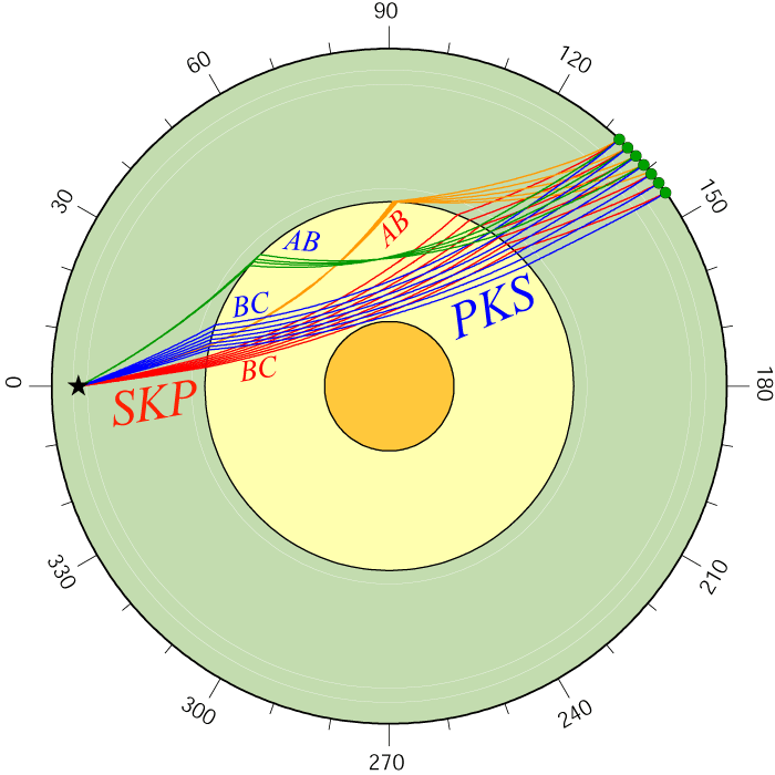
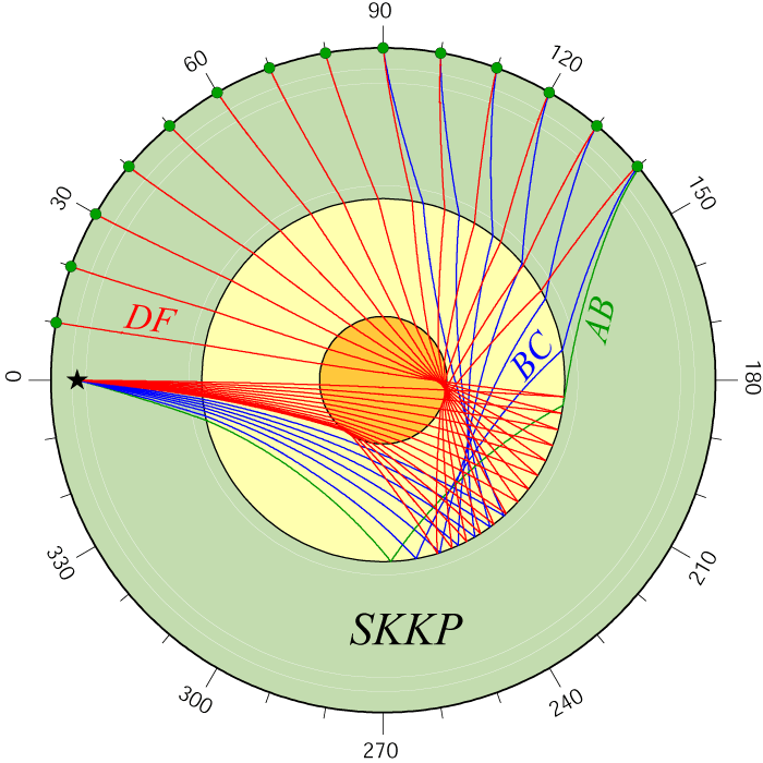
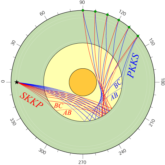
SKP
|
SKP PKS
|
 |
 |
 |
 |
 |
|
SKP PKS
|
SKKP
|
SKKP PKKS
|
SKKP PKKS
|
SKiKS
|
 |
 |
 |
 |
 |
|
PKiKP
|
PKiKP SKiKP
|
PKiKS SKiKS
|
PcP PKiKP
|
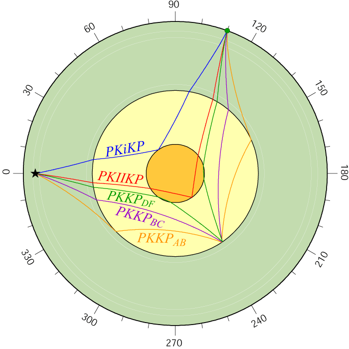
PKiKP PKKP PKIIKP
|
 |
 |
 |
 |
 |
|
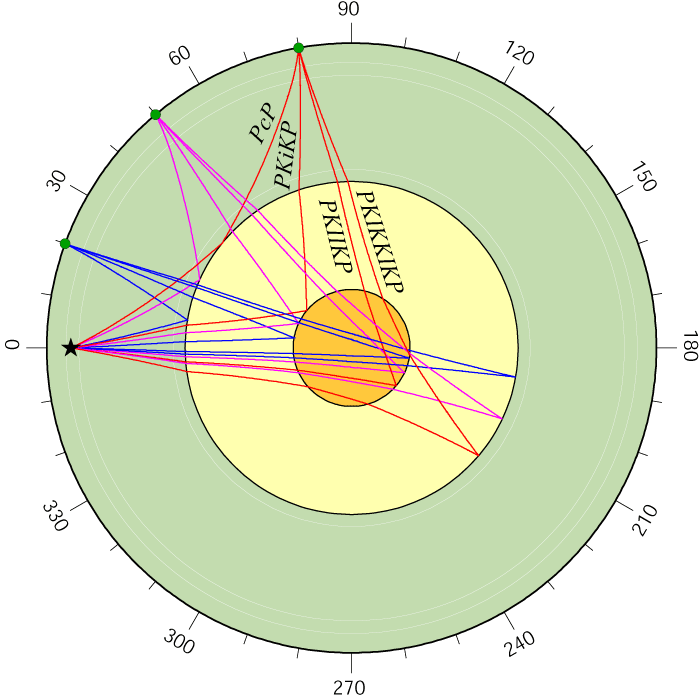
PcP PKiKP ...
|
PKIIKP
|
SKIIKP
|
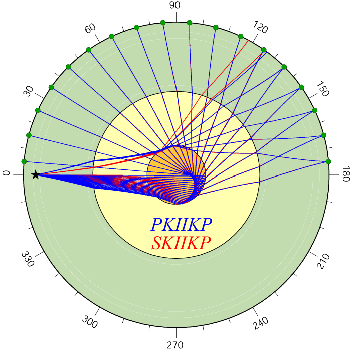
PKIIKP SKIIKP
|
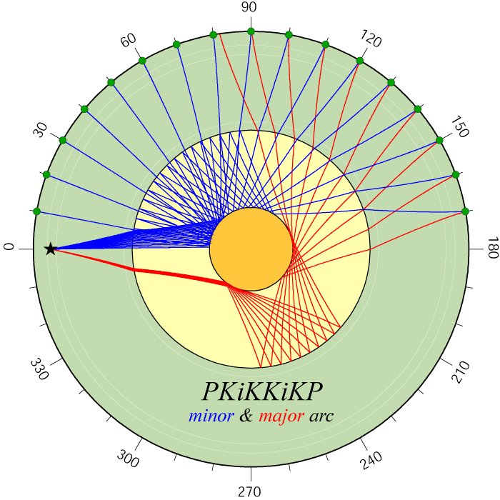
PKiKKiKP
|
 |
 |
 |
 |
 |
|
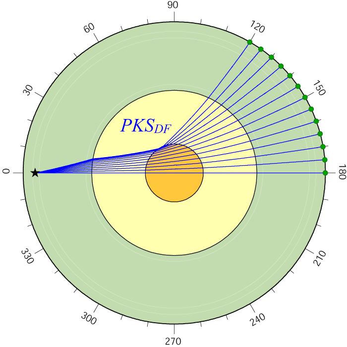
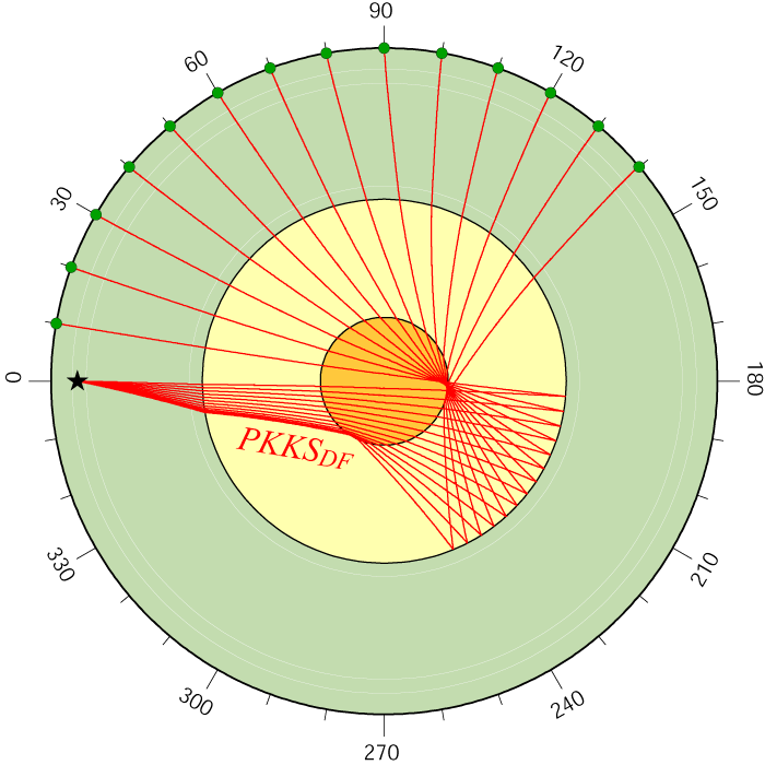
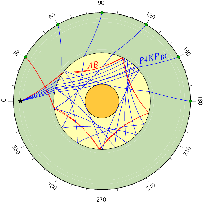
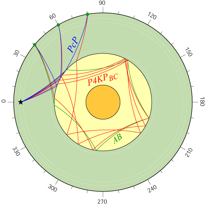
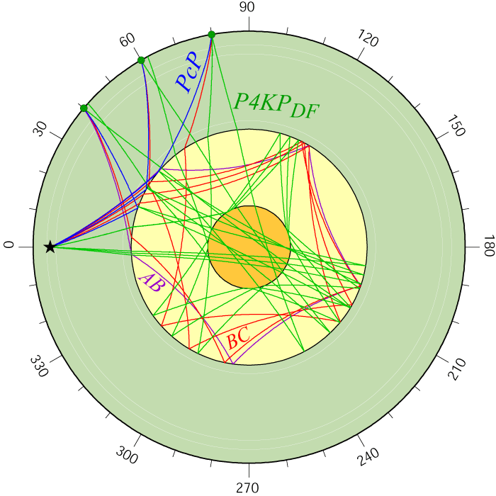
PKP ab,bc
|
PKP df
|
PKS ab,bc
|
PKS df
|
PKS ab,bc,df
|
 |
 |
 |
 |
 |
| PKKP ab,bc | PKKP df | PKKP ab,bc,df | PKKS ab,bc | PKKS df |
 |
 |
 |
 |
 |
| GIF AI CSH PS | GIF AI CSH PS | GIF AI CSH PS | GIF AI CSH PS | GIF AI CSH PS |
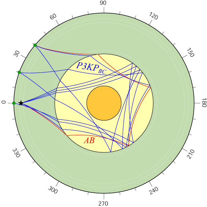
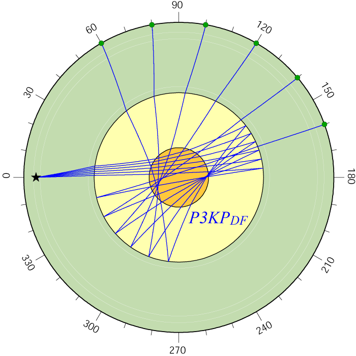
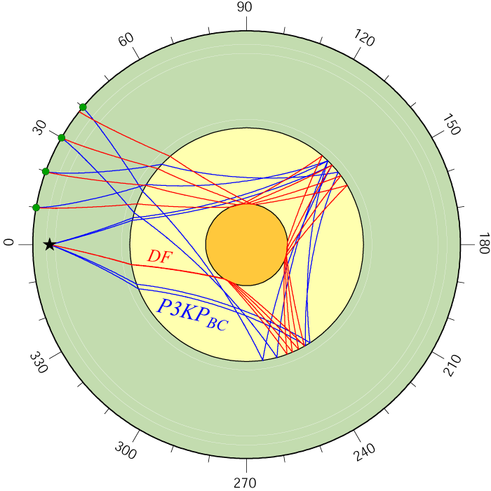
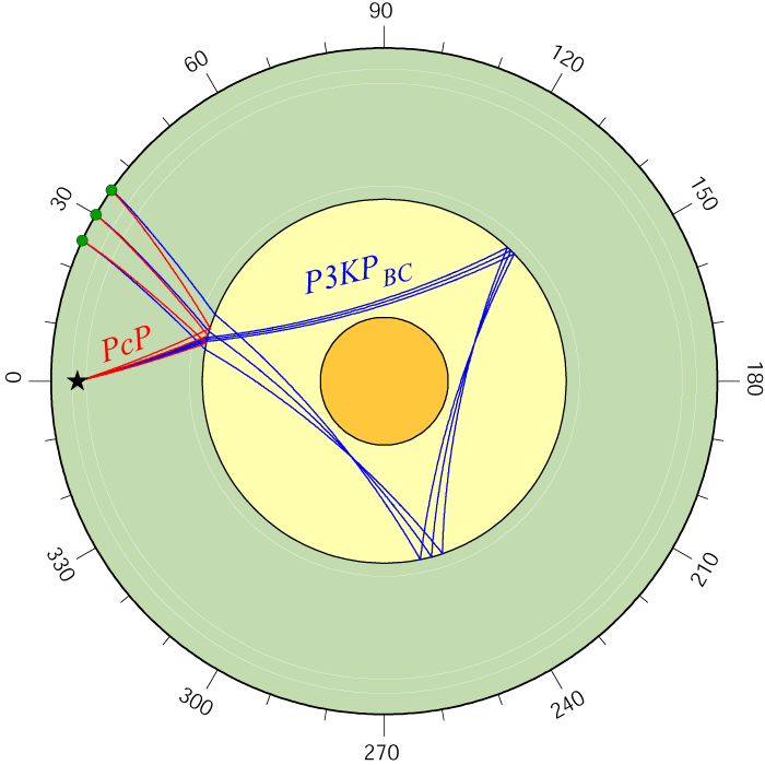
| PKKS ab,bc,df | P3KP ab,bc | P3KP df | P3KP bc,df | P3KP PcP |
 |
 |
 |
 |
 |
| GIF AI CSH PS | GIF AI CSH PS | GIF AI CSH PS | GIF AI CSH PS | GIF AI CSH PS |
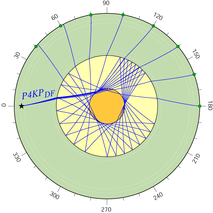
| P4KP ab,bc | P4KP df | P4KP ab,bc,df | P4KP PcP | P4KP PcP |
 |
 |
 |
 |
 |
| GIF AI CSH PS | GIF AI CSH PS | GIF AI CSH PS | GIF AI CSH PS | GIF AI CSH PS |
|
Some Images Relating to Models of Earth's interior (return to image directory page)
|
||||
 |
 |
 |
 |
 |
| AI (3.2 Mb) JPG (450 Kb) | AI (3.9 Mb) JPG (388 Kb) | AI (1.0 Mb) JPG (471 Kb) | AI (1.6 Mb) JPG (397 Kb) | AI (1.2 Mb) JPG (322 Kb) |
|
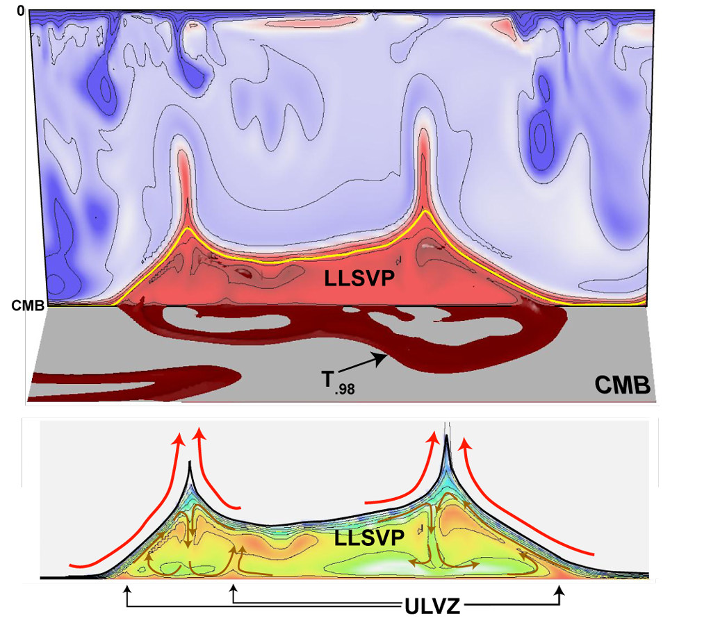
Here we start off with a geodynamics prediction for a chemically distinct pile of material at the base of Earth's mantle, from Allen McNamara. This figure was made to emphasize that these "Large Low Shear Velocity Provinces" (LLSVPs) may have really interesting internal convection [PDF]
|
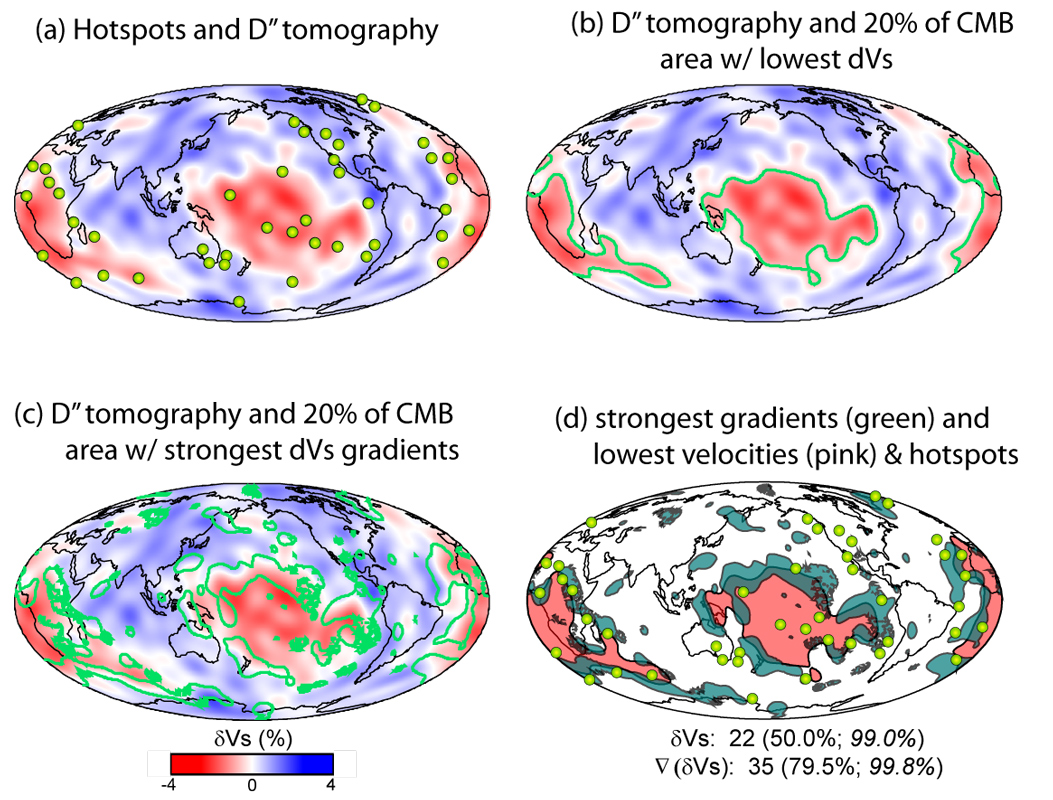
Mike Thorne's 2004 paper (PDF) demonstrated that hot spots are nearly twice as likely to overly the edges of the large low shear velocity provinces in the deep mantle (as measured by lateral Vs gradients) than the low velocities themselves. We argued this is evidence for a chemical nature to the regions.
|
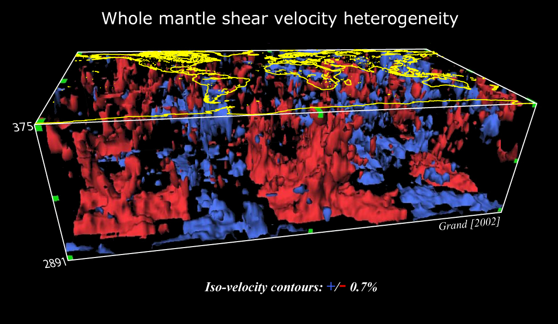
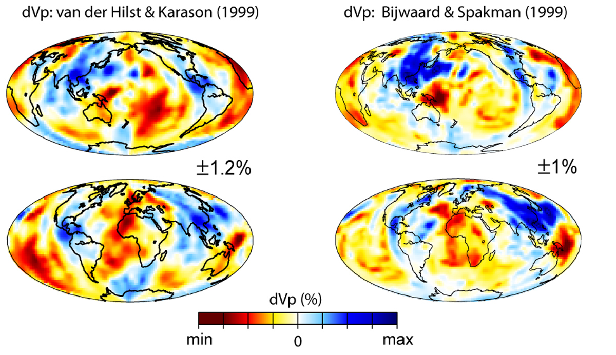
These blobs are due to iso-surfacing shear velocity perturbations throughout Earth's mantle. Here it is done with Steve Grand's model from 2002.
|
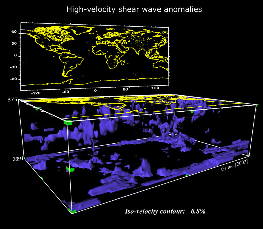
Iso-surfacing programs are really fun. Here, I just show the highest velocities, to hunt for subducted slabs. By the way, an amazing freeware program that does this is called "Data Explorer", or DX. Go HERE to see and explore. Allen is our resident expert at it, and keeps telling me to learn it.
|
|
|
Some Images Relating to Models of Earth's interior (return to image directory page)
|
||||
 |
 |
 |
 |
 |
| AI (522 Kb) JPG (543 Kb) | AI (693 Kb) JPG (627 Kb) | AI (2.1 Mb) JPG (754 Kb) | AI (875 Kb) JPG (629 Kb) | AI (398 Kb) JPG (452 Kb) |
|
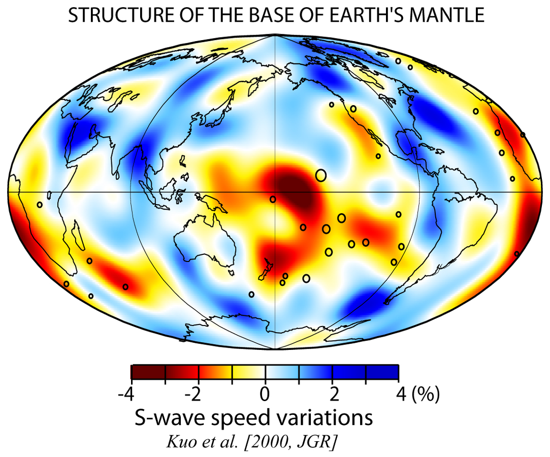
The shear velocity in the deep mantle is determined globally from tomography. This paper was led by Ban Kuo. It employed a 2-step approach: (1) low order spherical harmonic inversion, and (2) smaller scale block inversion. [PDF]. Be sure to check out Allen's Spherical Harmonics page!
|
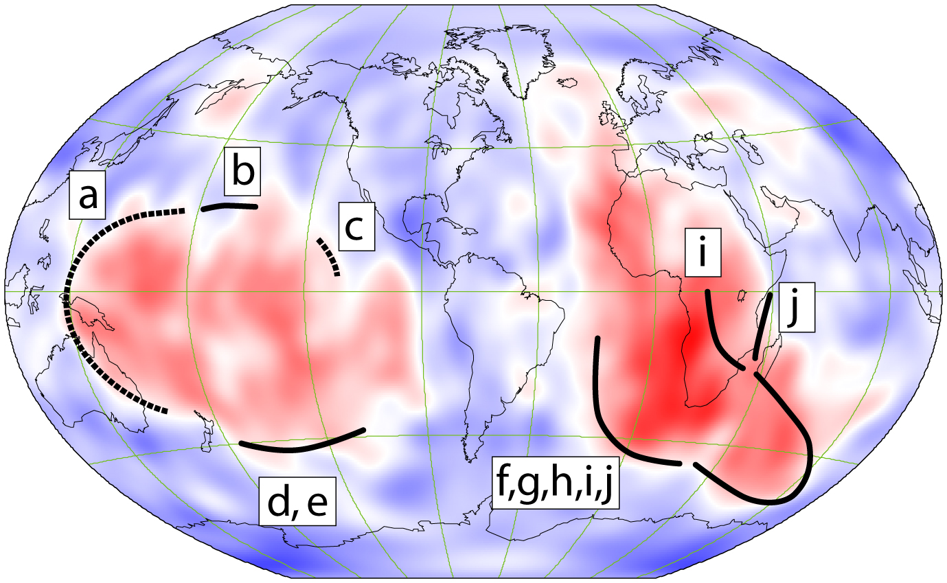
Have you heard the news lately? The large low shear velocity provinces in the deep mantle have sharp edges! (the black lines above). That supports the notion that the low shear velocities owe their existence in part to being chemically distinct from the rest of the mantle. [PDF]
|
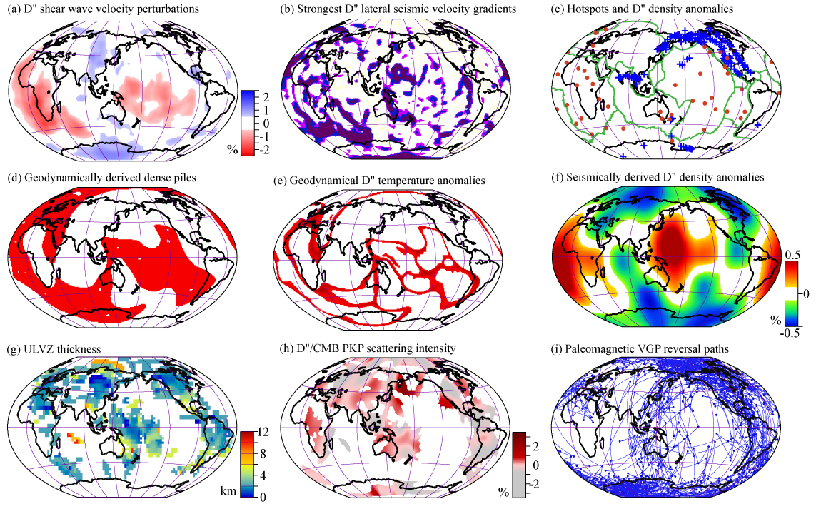
This figure is a busy as it gets... But there are some remarkable correlations between seismic, geodynamic, geochemical, and geomagnetic studies. Please refer to the paper that discusses these phenomena [PDF]. Multidisciplinary approaches are the only way to sort these things out.
|
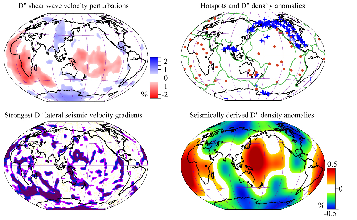
Here we show just 4 of the 9 panels of the image to the left. Can you see the correlations?
|
This is an old image, but I still see it getting used, so I'll leave it posted. Are the cross-sections showing us that slabs descend all the way down to the core-mantle boundary?
|
|
Some Images Relating to Models of Earth's interior (return to image directory page)
|
||||
 |
 |
 |
 |
 |
| AI (995 Kb) JPG (293 Kb) | AI (1.1 Mb) JPG (296 Kb) | AI (2.7 Mb) JPG (485 Kb) | AI (1.3 Mb) JPG (594 Kb) | AI (5.4 Mb) JPG (774 Kb) |
|
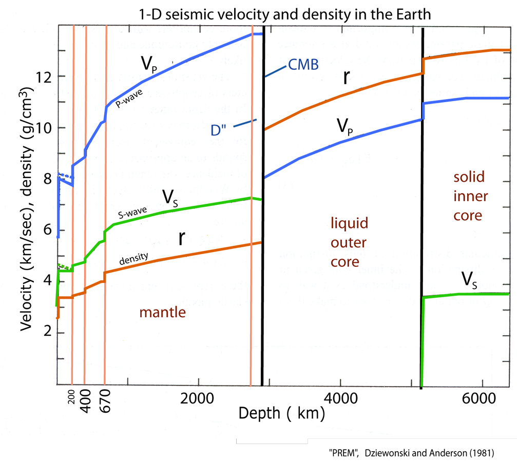
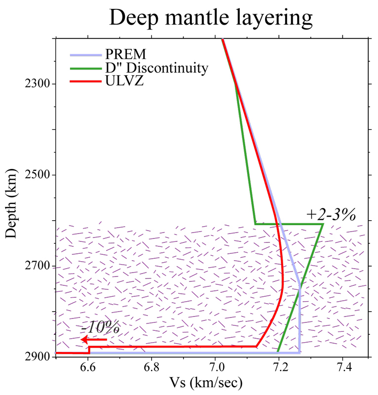
The Preliminary Reference Earth Model (PREM), by Dziewonski and Anderson (1981, Phys. Earth Planet. Int). Look at the next step REM page by Gabi Laske. This is the most used 1D model of seismic values. Here is PREM in ASCII and in Microsoft's EXCEL
|
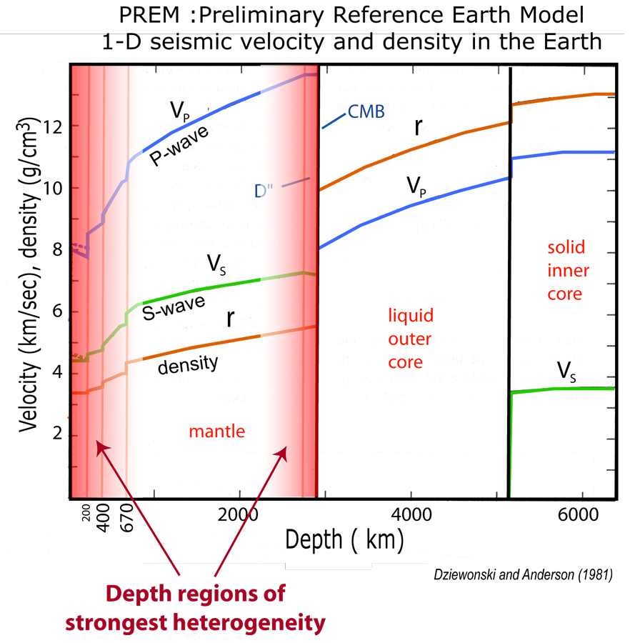
PREM again. This emphasizes where in Earth we have the greatest heterogeneities: at the top and bottom of the mantle. Here's a PowerPoint file that shows PREM (upper left), then the above image.
|
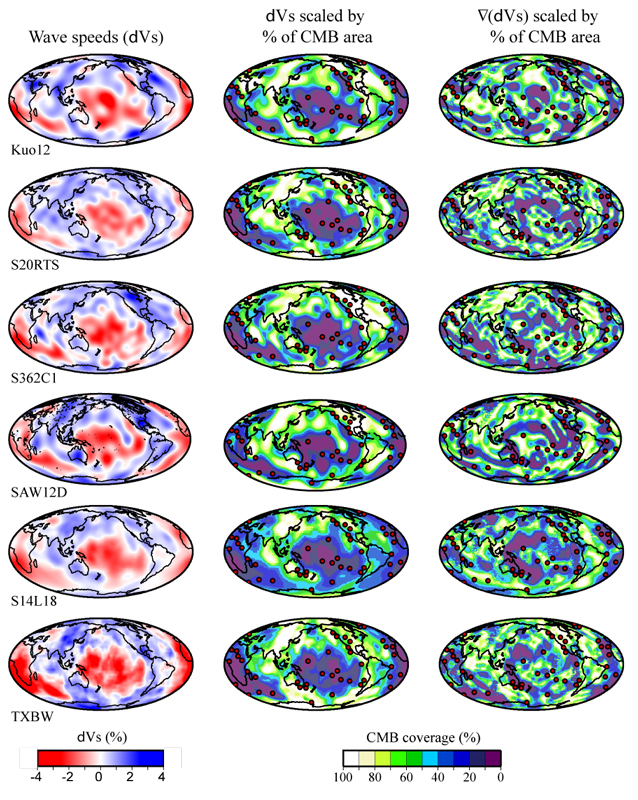
Here's another way Mike Thorne developed to look at tomography models (D" is shown here): scale the heterogeneity and lateral gradients of it by area. This then permits direct comparison of models (of different amplitudes) from different researchers. [PDF]
|
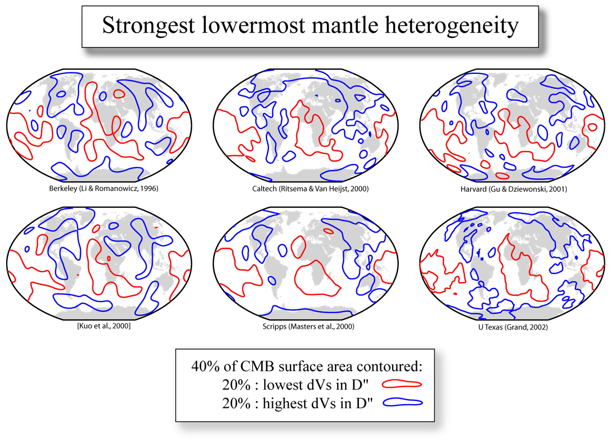
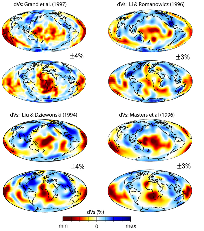
I compare 6 shear velocity models of D" to each other, using the area scaling approach (as in the figure to the left). Do they agree?
|
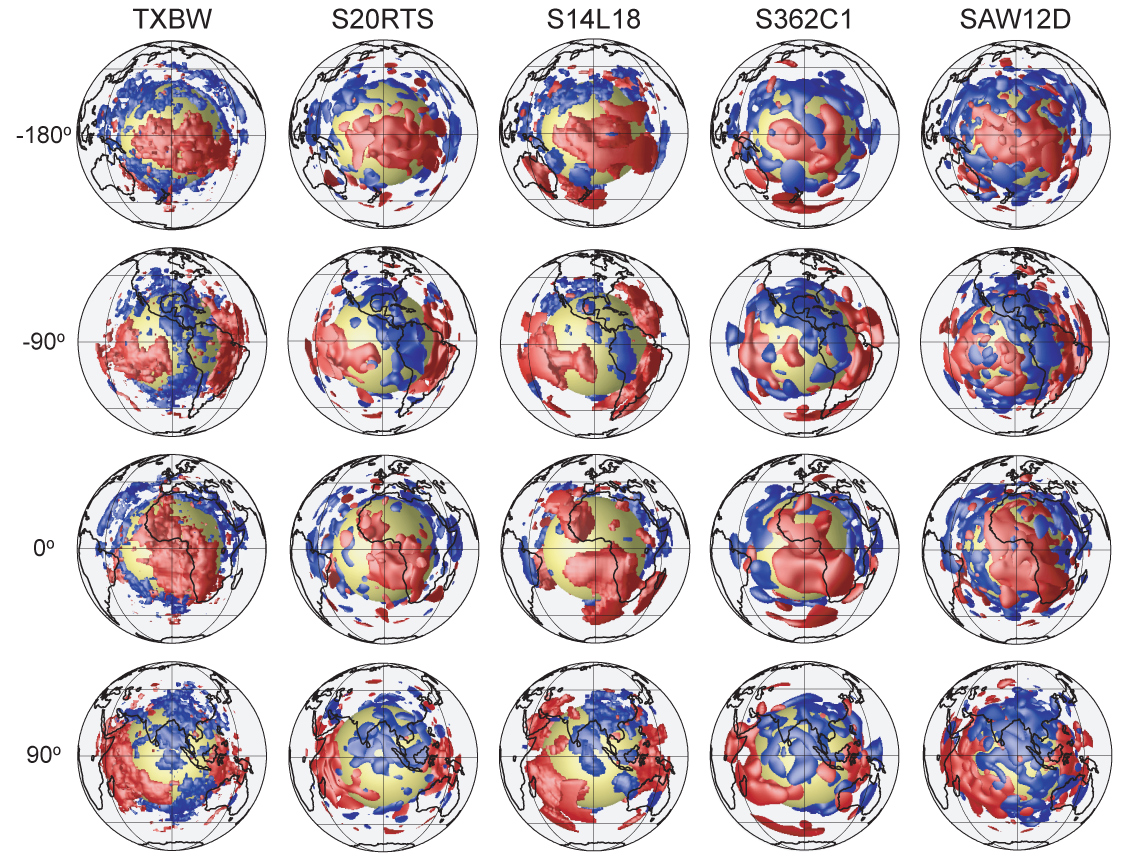
Using iso-surfacing, shear velocity perturbations are shown from 5 different researchers, with different rotations of the globe. I think at this type of scale, the models agree pretty well.
|
|
Some Images Relating to Models of Earth's interior (return to image directory page)
|
||||
 |
 |
 |
 |
 |
| AI (4.3 Mb) JPG (622 Kb) | AI (992 KMb) JPG (344 Kb) | AI (840 Kb) JPG (422 Kb) | AI (4.3 Mb) JPG (649 Kb) | AI (4.4 Mb) JPG (624 Kb) |
|
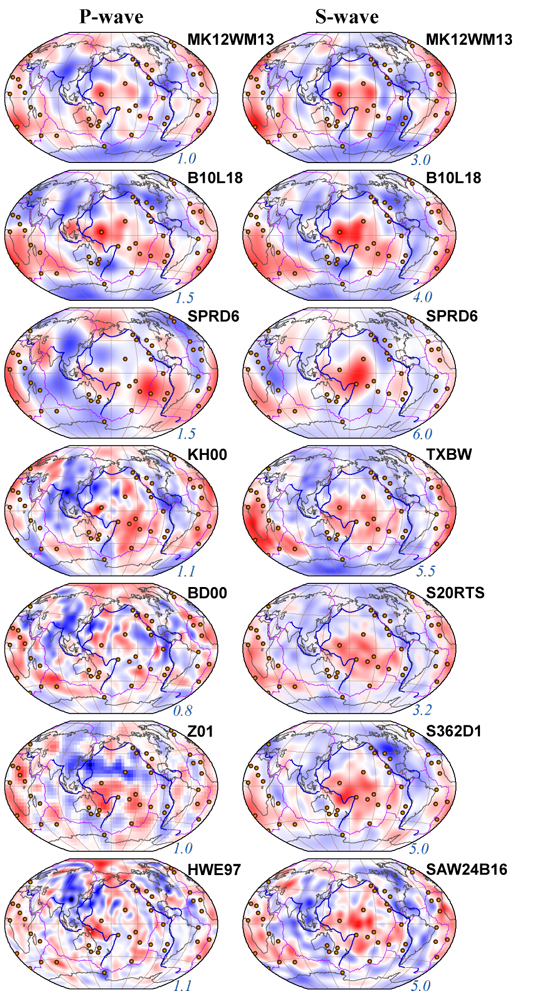
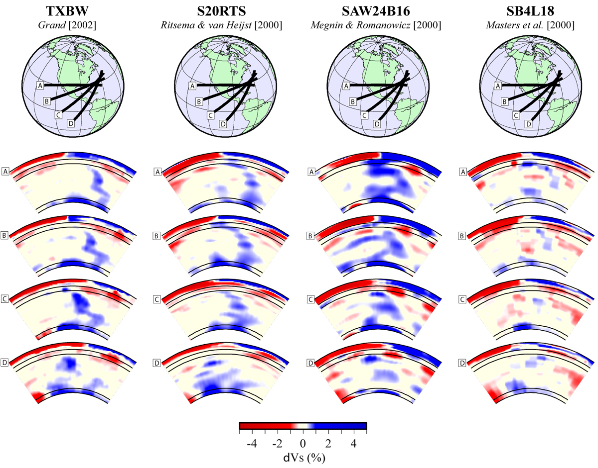
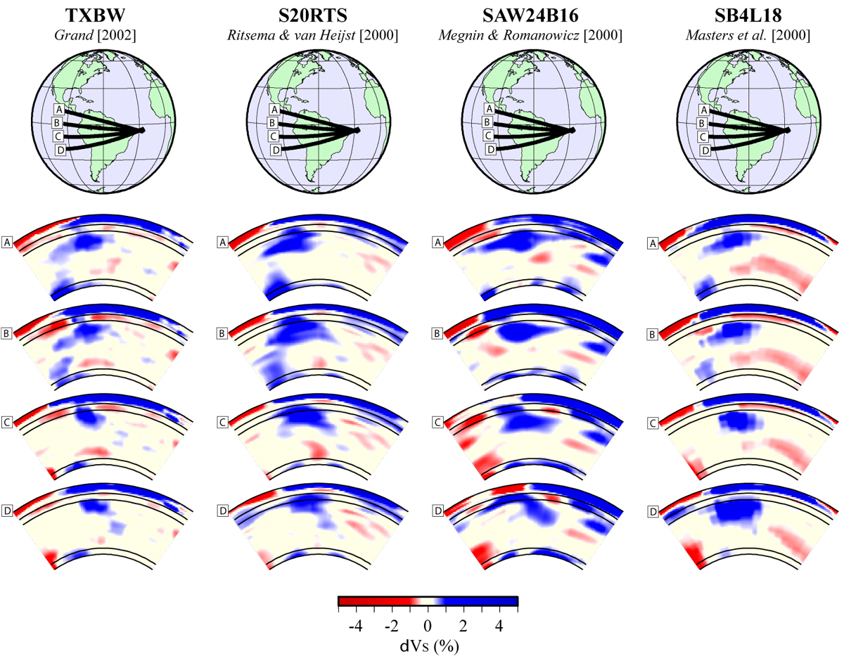
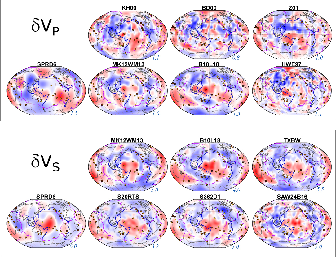
After all the previous images in 3D, this probably looks boring and old fashioned. NOT! Anyway, 7 P-wave models and 7 S wave models are shown, from PDF. I have to admit, Thorsten Becker gave me many of the models, from his nice paper comparing tomography models.
|
Just another view of the same thing, P models are shown here, from an older review paper.
|
The same, but S-wave models from the same older review paper.
|
Where's Waldo? Or, rather, the slab? I think these cross-sections so pretty compelling evidence for high seismic wave speeds extending from a subduction zone to the CMB. Perhaps fuzzy here and there, especially to the south. Is the slab gone? or is our ability to see it gone?
|
Here I show the same thing, but for northern South America. Take a look. The story may not be so clear here.
|
|
Some Images Relating to Models of Earth's interior (return to image directory page)
|
||||
 |
 |
 |
||
| AI (169 Kb) JPG (169 Kb) | AI (215 Kb) JPG (247 Kb) | AI (4.3 Mb) JPG (765 Kb) | ||
|
Here is a garden variety image of lowermost mantle seismic phenomena, including a D" discontinuity, and an Ultra-Low Velocity Zone. Here's a PowerPoint vingette showing similar things: PowerPoint File
|
P and S models of the lowermost mantle again. This may actually be the same as an image above, but shifted around...
|
|||
|
Ultra-Low Velocity Zone (ULVZ) images (return to image directory page)
|
||||
 |
 |
 |
 |
 |
| AI (344 Kb) JPG (324 Kb) | AI (122 Kb) JPG (210 Kb) | AI (979 Kb) JPG (408 Kb) | AI (122 Kb) JPG (120 Kb) | AI (119 Kb) JPG (122 Kb) |
|
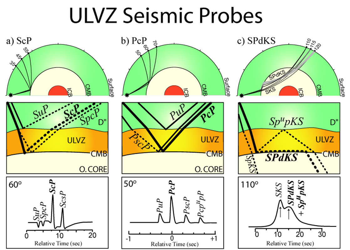
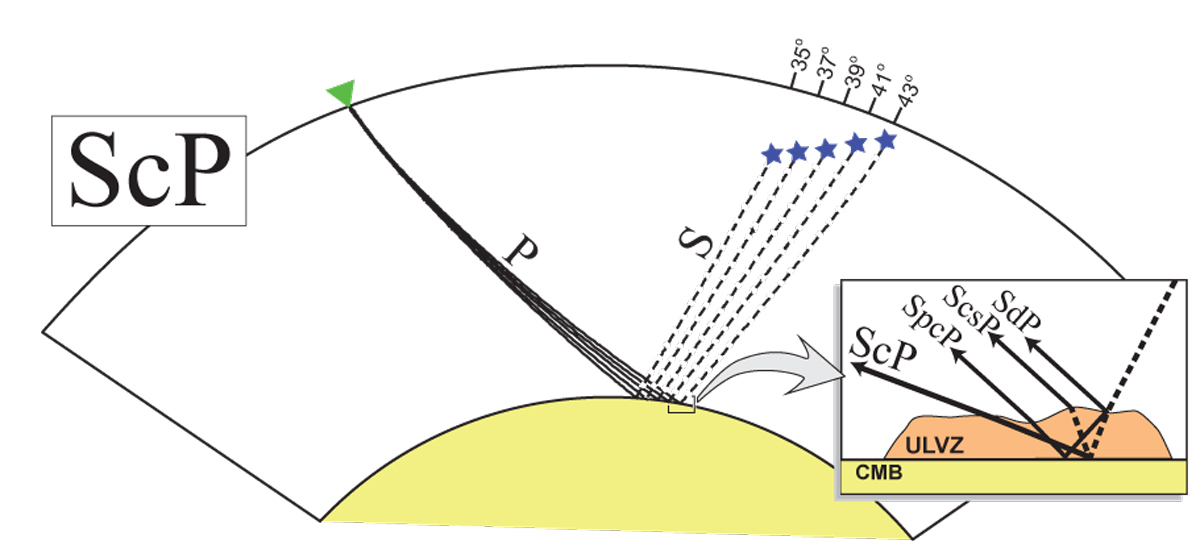
There are a number of ways to probe the core-mantle boundary region for fine scale layering. Here are some of the more common ones. Sebastian Rost has some additional probes he has developed. [PDF]
|
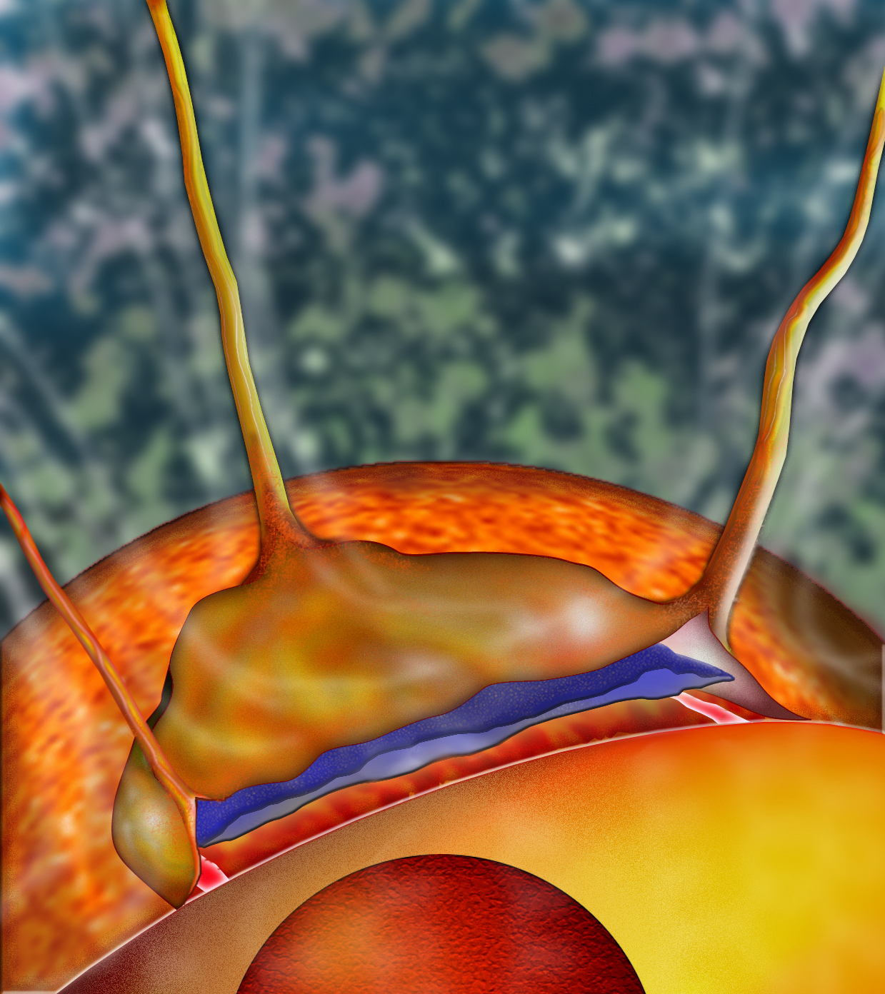
If you have a skinny layer with anomalous properties, it introduces additional seismic arrivals. Here we see some of those associated with PcP
|
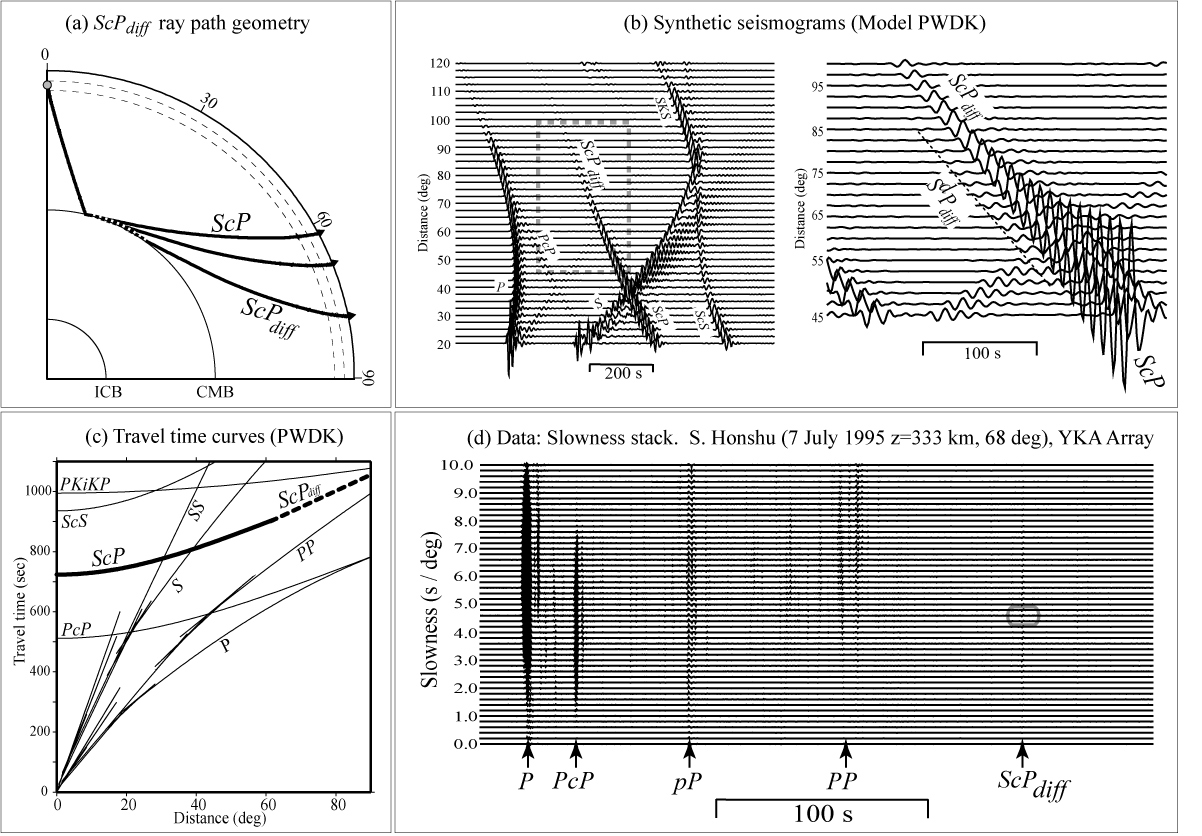
Sebastian Rost and I have worked a bit with this phase, and extension of ScP called ScPdiff.
|
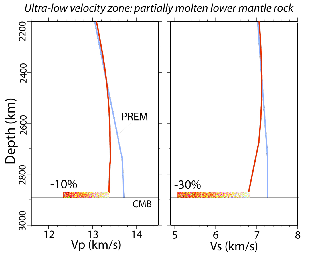
Raymond Jeanloz is really the one that pointed out that depending on the seismic properties, partial melt is not really possible, given our understanding of deep mantle properties. Little known fact: Raymond is reputed to have dubbed the term "ULVZ". [PDF]
|
|
|
Ultra-Low Velocity Zone (ULVZ) images (return to image directory page)
|
||||
 |
 |
 |
 |
 |
| AI (657 Kb) JPG (319 Kb) | AI (243 Kb) JPG (211 Kb) | AI (1.1 Mb) JPG (418 Kb) | AI (956 Kb) JPG (312 Kb) | AI (4.4 Mb) JPG (201 Kb) |
|
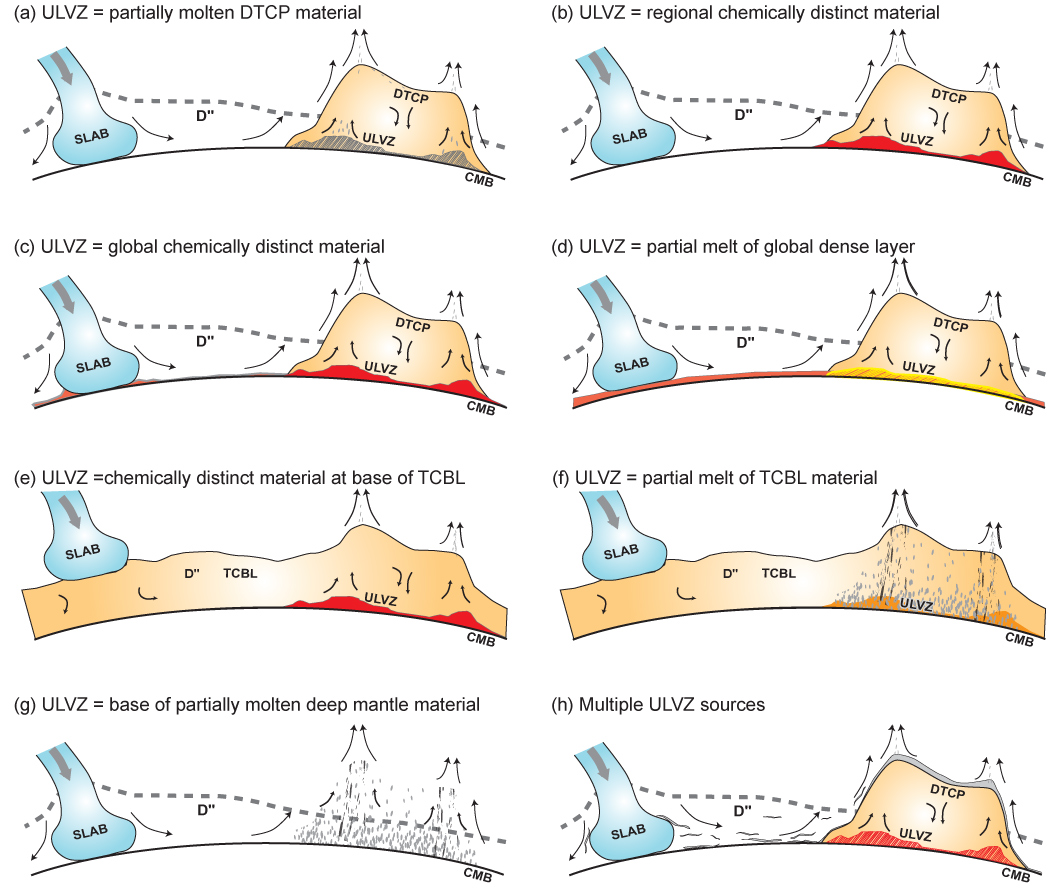
Here we show some of the many possibilities that might be related to the cause of ULVZs. Make note, with this many cartoons, it is usually admission to not being very sure about things... [PDF]
|
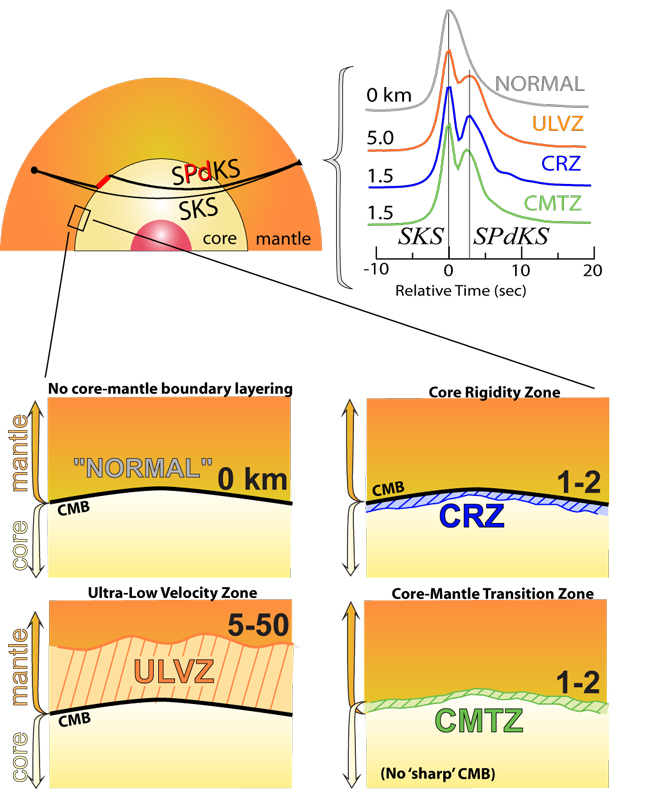
"Will the real core-mantle boundary please stand up?" At the instigation of Raymond Jeanloz, I became increasingly curious about the various ways we might model our data. There are some significant trade-offs depending on the seismic probe you use. [PDF]
|
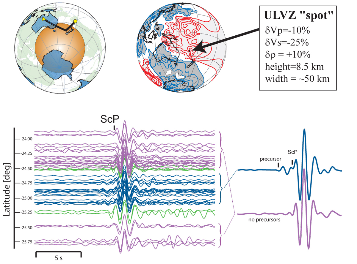
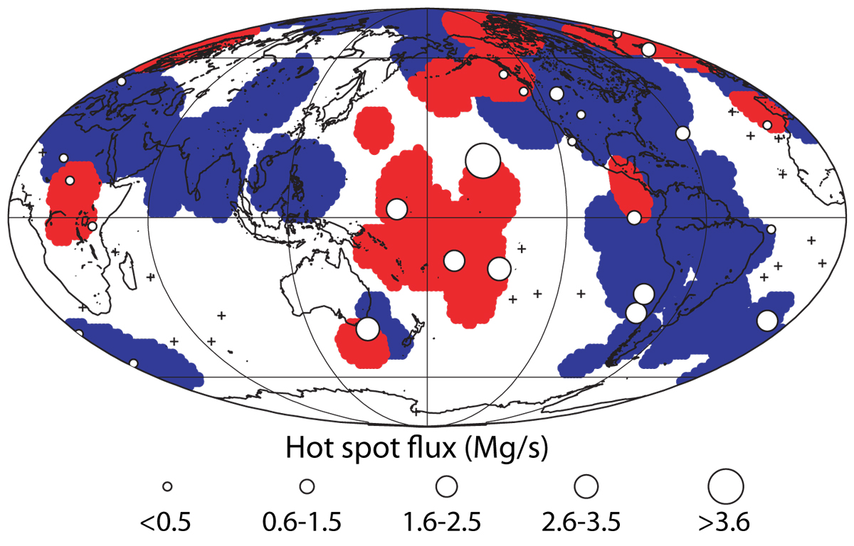
Hot spots are shown here, scaled according to Norm Sleep's flux estimations, on top of "yes we think we see ULVZ" and "no we do not see ULVZ" zones. [PDF]. Mike Thorne updated this image in one of his 2004 papers.
|
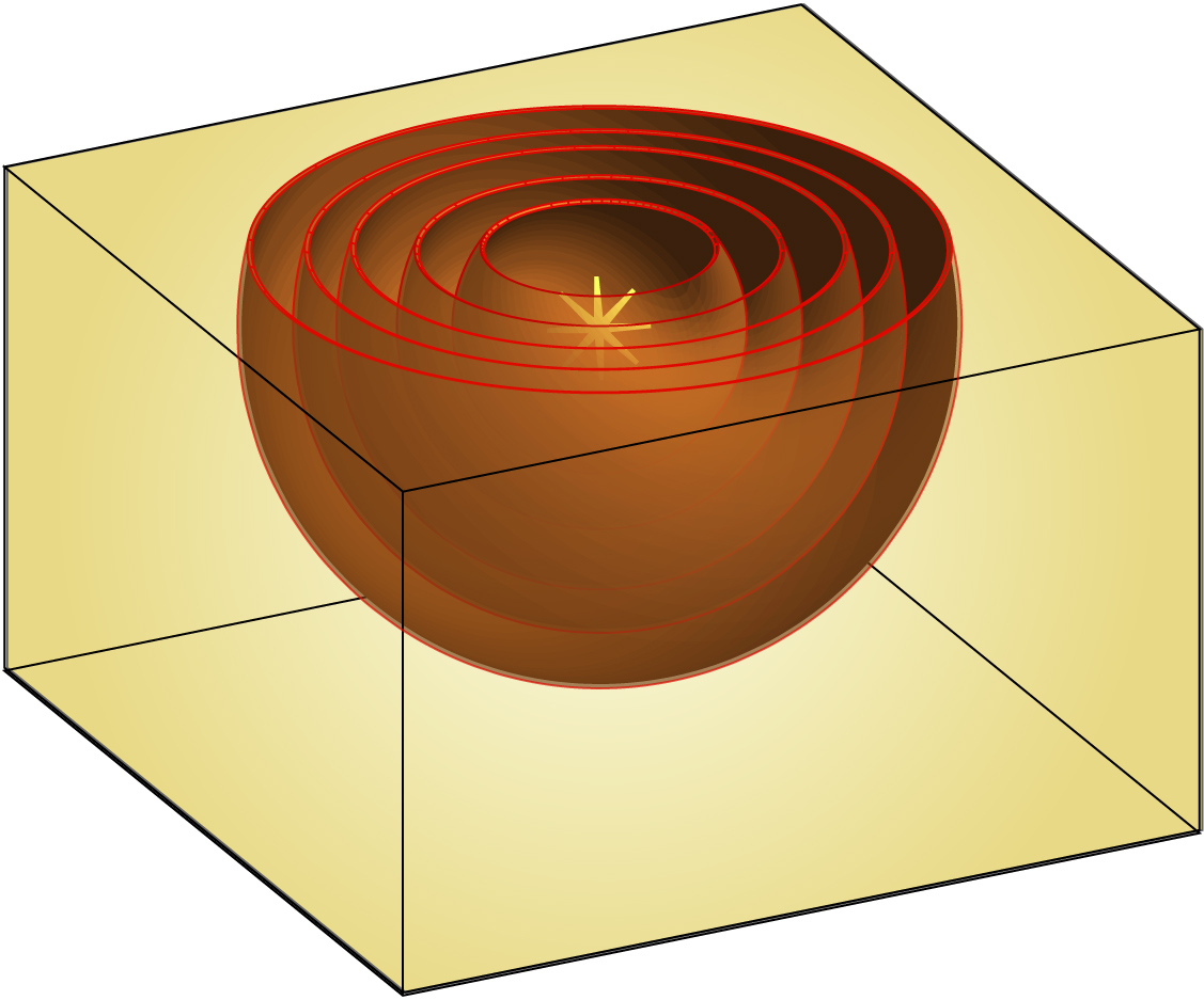
Another cartoon, in case one needs to emphasize an expanding wavefront.
|
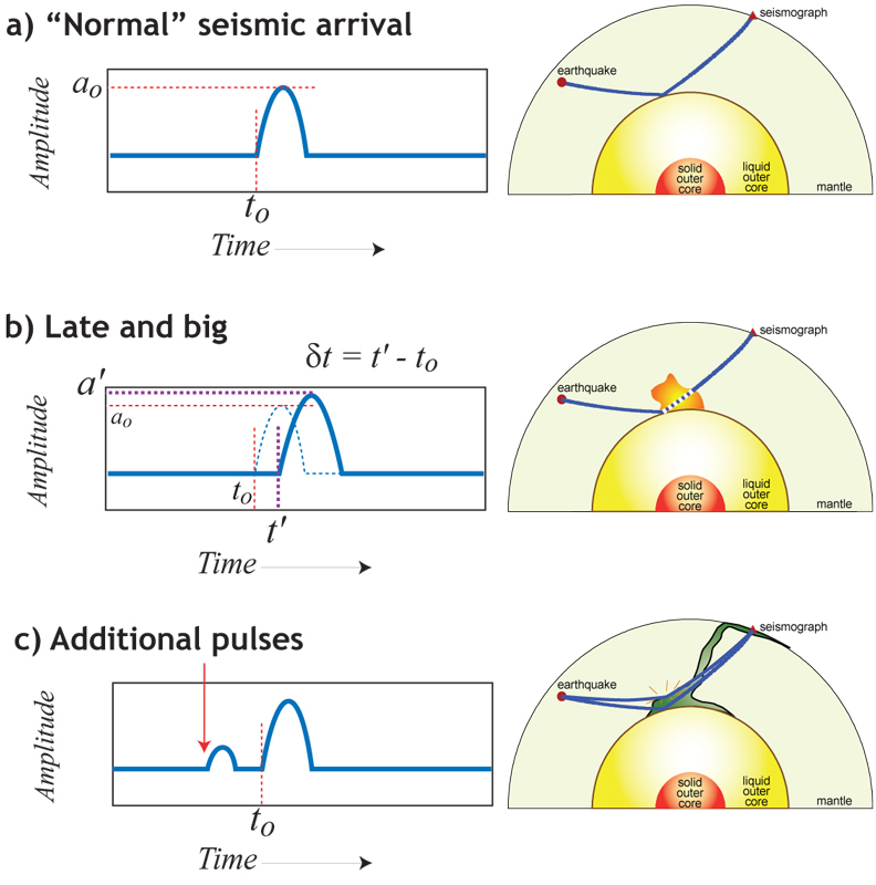
This is a simple schematic I show in general audience talks to illustrate two things: travel time perturbations due to some internal anomaly, and extra (unanticipated) energy due to some internal reflector of energy. Here is a PowerPoint file that has those slides plus some others that relate to similar basics.
|
|
Images about Seismic Waves and Wave Propagation (return to image directory page)
|
||||
 |
 |
 |
 |
 |
| AI (956 Kb) JPG (312 Kb) | AI (4.4 Mb) JPG (201 Kb) | AI (5.0 Mb) JPG (696 Kb) | AI (649 Kb) JPG (501 Kb) | AI (239 Kb) JPG (276 Kb) |
|
Eight time steps are shown in Mike Thorne's SHAXI finite difference code. Go to Mike's animation page for some really nice movies of this. This calculation is for the SH wavefield, in an axi-symmetric calculation (hence, the name "SHAXI"). Download the code from HERE!
|
Again, from Mike Thorne. Here we see the SH-field with the multiple S energy (e.g., SS, SSS) displaying prominantly.
|
Using a 1-D reflectivity method code, Nick Schmerr made these SS (and precursor) synthetic seismograms. You can see the interference caused by all the depth phases!
|
Ok, these are not "waves", but instead raypaths. But I stuck them here as a reminder that the wave field in data has more information in there than just our garden variety P and S waves!
|
This is a cartoon, but I found it useful for a general audience.
|